9 Ways to Reduce Friction on Mobile Ecommerce Sites
Today I’m going to walk through 9 ways to reduce friction on mobile ecommerce sites. In ecommerce, friction means anything that inhibits the customer buying process. When retailers eliminate friction points, shoppers are more likely to convert sales. This article will show how to do this specifically for mobile sites.
To give context, Mobile Payments Today recently published an article, The Mobile Shopping Experience Needs an Overhaul. It noted that mobile shopping has grown by leaps and bounds in a few short years, but “the experience still isn’t where it should be.” Agreed.
The article made another crucial point for retailers: the future is in optimized mobile sites. Not apps. There are several reasons for this, including the fact that people are no longer downloading apps at a fever pitch. But more importantly, “7 in 10 consumers who research products on mobile devices use search engines, which bring them to mobile websites.”
When shoppers open a merchant’s email on their phone, the links usually take them to a mobile site as well. The infrastructure for directing shoppers to mobile sites is strong. Now it’s up to retailers to welcome customers with effective, easy-to-navigate sites. Here’s how to do it.
1. Get Up to Speed
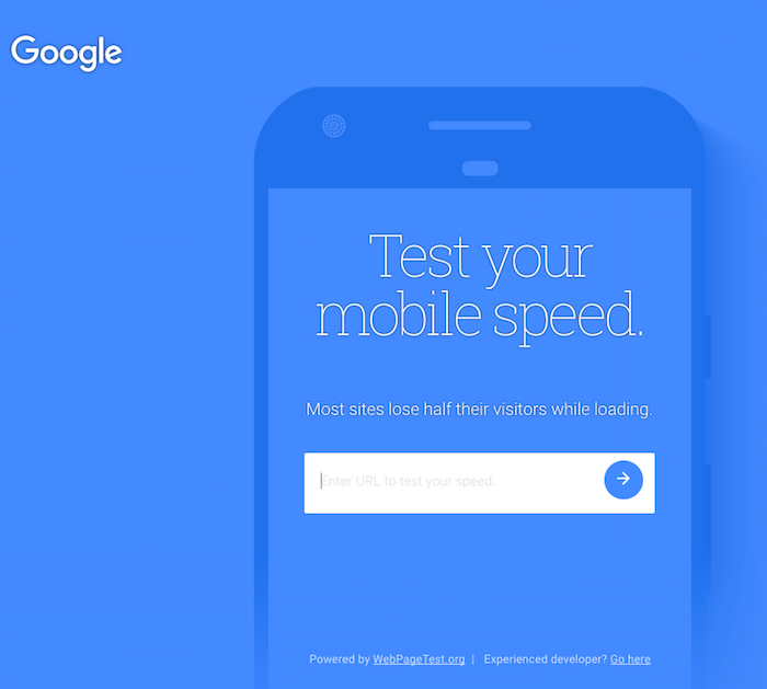
According to Google (who ought to know), “As page load time goes from 1 – 7 seconds, the probability of a visitor bouncing increases 113%.”
The good news is Google’s Mobile Speed Test helps people understand their site speed. After retailers enter their URL, the test site takes a couple of minutes to check things like Javascript code, optimized images, and text readability. If there’s an issue(s) with any of these, it will slow down the site. The test ends with a diagnosis and Google’s top fixes to improve speed. Retailers can also sign into the site and request to receive a detailed report following the test.
2. Avoid Interstitials (aka Pop-Ups) at All Costs
When I asked Tiffany, Command C’s Tech Lead, for her advice on this article, the first line of her email came back in all capitals: INTERSTITIALS AND MODALS ARE TO BE AVOIDED AT ALL COSTS!
The word interstitial was new to me. In looking it up, I learned that it derives from interstice which has a Latin root meaning “to stand between.” In ecommerce, this term and modals refer to pop-ups and overlays. It makes sense because clunky pop-ups literally rise up and stand between the shopper and her intentions on a retail site.
Note: This true for photos as well. The traditional zoom feature on desktop doesn’t translate into mobile. We don’t want photos that bounce around. Instead, think pinch and grab.
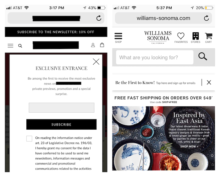
Take a look at the two landing pages pictured above. On the left, an email pop-up (with strange legalese) immediately overtakes the landing page when I go to this site. I don’t get a sense of the products; only a full screen of pop-up. On the other hand, Williams Sonoma also has an email sign-up, however, it doesn’t stand between me and the content.
3. Communicate Clearly – and Inspire – from the Landing Page
When shoppers land on a mobile site, retailers want to communicate their products clearly and quickly. But they also want to communicate the emotion behind the brand.
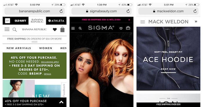
Above is a collage of three different landing pages. On the left, when I land on the Banana Republic site, I barely know where to begin. Also, I get that they are running a 40% off sale, but I don’t get a sense of what it’s like to wear Banana Republic.
Moving to the right, (after an email pop-up – let’s talk!) Sigma Beauty begins with a singular image on a dark-colored background. The page is smooth and uncluttered. Its simplicity gives a feeling of easy glamour.
Mack Wheldon also has a clean and inviting landing page. As I scroll down, the site shows large images of their best sellers, each with a Shop Now button. The ease of this site from its start makes me feel like their products will work well, too.
4. Help Shoppers Find Products Through Simple Navigation
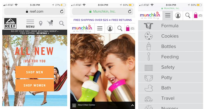
Like the landing page, mobile site navigation should also be clear and direct. Here, in the left example, Reef presents shoppers with one easy choice when they arrive: Shop Men or Shop Women. They’ve made this decision as streamlined as possible. (They’ve even taken out the apostrophe “S” in these categories. Mobile screens are small and every bit matters.)
The baby site Munchkin’s landing page begins with full images of cutie pie kids. When I click on the hamburger menu (the 3 short bars next to the logo), a drop-down menu of all their product categories appears. With this list as my starting point, I can quickly navigate to what I want to buy.
Also note that nearly every site in this article has a magnifying glass icon for product searches near the top of the page. It’s essential to keep the search option accessible. In fact, Shopify Plus recently shared that “users who complete an onsite search are 1.8x more likely to convert.”
5. Establish and Maintain Context
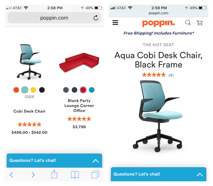
As I scroll through all the office chairs on the Poppin site, the Cobi Desk Chair catches my eye. Right from this category page, a.k.a. the Product Listing Page, I’m able to click on a color and see the chair in every color variation.
Next when I click on the chair itself, I’m directed to the Product Detail Page. The chair is already in the color I selected. This is a perfect example of establishing and maintaining context on a mobile site. When I add a filter, in this case a new color, I see that the product gets changed. Then my selection is maintained throughout my shopping. Well done.
6. Clearly Show Added to Cart
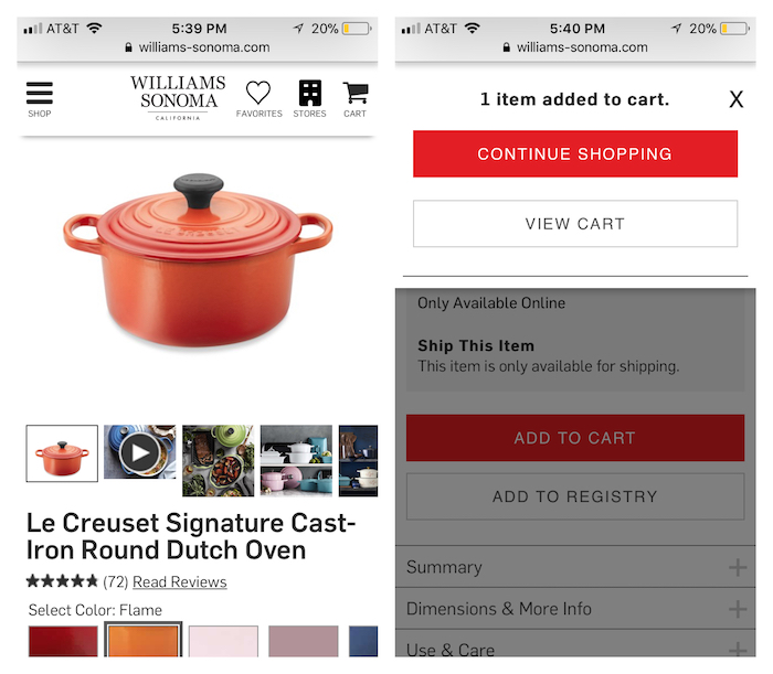
The 22 Rules of Online Checkout apply to mobile sites as much as they do to desktop sites. With mobile sites, however, retailers have a lot less space to communicate important information, such as notifying shoppers that their item has been Added to Cart.
Williams Sonoma does a really nice job of this. When I added my Le Creuset Dutch Oven to my cart, a notification popped up. I could easily Continue Shopping or View Cart–note how these buttons fill the width of the mobile screen. A lot of mobile sites simply add a “1” next to the cart icon when I added products, but this example was more effective. By clearly stating, “1 Item Added to Cart,” I know the site is moving my purchase forward.
7. Use Geo-Location to Better Serve Customers
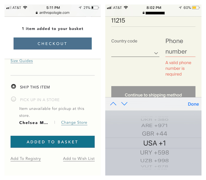
In the example above, even before checkout, the mobile Anthropologie site (left) determined that I was shopping in New York City. They offered me the option to ship my dress or pick it up at a nearby physical store. I see that the dress is unavailable at the Chelsea Market location, but I can easily see if it’s available at their other local stores.
In the right example, this mobile site has given me an extra, location-based step at checkout. Merchants want to avoid this. Checkout–especially mobile–should be as swift as possible. No extra steps, no matter what. Here, even though I’ve entered my Brooklyn zip code, I still have to scroll through a long wheel of international phone codes to checkout.
8. Clearly Show (Short!) Checkout Progress Map
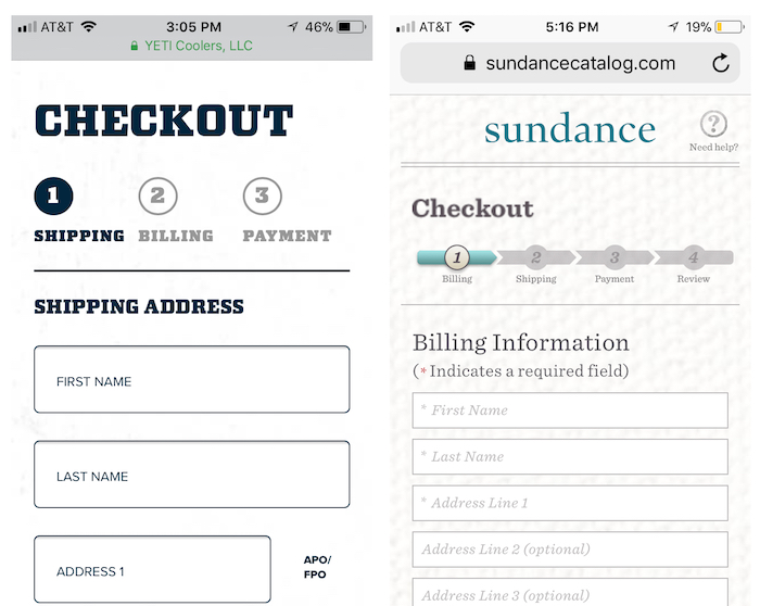
Question: Which mobile checkout appeals to you more? Both Yeti Coolers (left) and Sundance Catalog (right) clearly outline the steps to checkout, as well as the shopper’s progress. This is crucial for conversions. Sites that don’t show checkout progression can leave shoppers feeling lost. Keep them engaged with a progression map.
Back to the question, my vote is for Yeti because they’ve simplified the entire checkout process into 3 steps. The clear lettering and spacing conveys a feeling efficiency on the small screen. I’ll be able to checkout quickly and easily here.
9. Remember Shopper Actions & Information Whenever Possible

Both Magento and Shopify have put a lot of great work into making mobile checkout as efficient as possible. Last year at Shopify Unite, Shopify introduced Shopify Pay. It allows shoppers to enter all their information once (credit card, address, etc.) into a Shopify store and then save for use across all Shopify stores. This vastly speeds up checkout for customers visiting Shopify stores.
On the Magento platform, in their current version of 2.2.2, they introduced Magento Instant Purchase. For the past 10 years, Amazon had a patent on “one click purchases.” Now that patent has expired, and Magento offers this tech for retailers on their platform. They say it makes checkout 90% faster, and checkout fields are reduced from 5 to 2.
Also, think about persistent shopping carts for your site. This means that a shopper can add something to his cart on his phone, and then finalize the purchase later on another device or desktop. It’s such a help to busy people (a.k.a everyone). For instance, sometimes people are shopping on their phones, and they get a call or text. This causes them to leave the mobile store. A persistent cart lets them return later and pick up where they dropped off in their shopping process. YES.
In conclusion, the ecommerce personalization experts at Dynamic Yield started 2018 by publishing 50 Research-Backed Personalization Statistics. Twenty-three of the 50 stats address personalization in mobile ecommerce sites. In particular, stat #50 caught our attention: 9 out of 10 shoppers believe that mobile shopping experiences can be improved.
Let’s talk about how we can create a better mobile experience for your customers–and turn this statistic around.