Best In Class 2021: 5 Brands that Communicate Ecommerce Luxury
As a retailer, your online store needs to be both efficient and inspiring. The mechanics have to be seamless, while speaking to your customers in a personal way. This is especially true for luxury companies.
Luxury brands often attract generations of loyal customers. They’ve done this through years of impeccable product quality and white-glove customer service – things that are hard to translate from a physical store to an online experience. In fact, when Vogue Business surveyed 8400 luxury consumers, they learned that most people were “generally unimpressed” by the brands’ online stores.
It’s clear that luxury companies have a lot of room to grow in the ecommerce experience. Nonetheless, we have several frontrunners to turn to for inspiration. Last year we featured several companies that achieved a plush experience from landing to checkout. Based on that article’s popularity, we’re following it up for 2021 with all new examples of luxury online. As you’ll see, these successful ecommerce stores reflect the core truth of luxury itself: it’s all the details.
Best Overall Luxury Ecommerce Experience: Fendi
Providing a superb experience means that every step of the buyer journey, from the homepage to checkout, feels as luxurious as an in-store experience. This is not an easy task. Translating a high-touch, in-person service into a website is difficult, but Fendi makes it look simple.
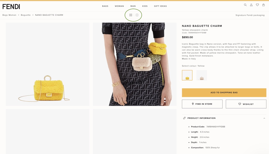
From the moment you land on the site, a live chat greets you. They staff their live chat with actual in-store employees who can send videos and photos of actual products. Talk about quality customer care!
Aside from live chat, they prominently display their contact number and availability throughout the site. A high-ticket product such as their handbags requires a personal touch. Fendi makes it clear that they are available for their customers.
The website itself is minimal, yet feels very on-brand for Fendi. Large, high-quality photos are the focal point of the product pages. Minimal product descriptions are used, mainly just a few specifications, as the photos, product videos, and 360 degree view let the products speak for themselves.
Visitors can also choose the photo layout they would prefer on product pages. Just another unique touch from Fendi.
The site makes it simple to order. You can have your purchase shipped to you or look up product availability at a store near you and pick it up. This is tricky for many retailers, but Fendi makes it look effortless.
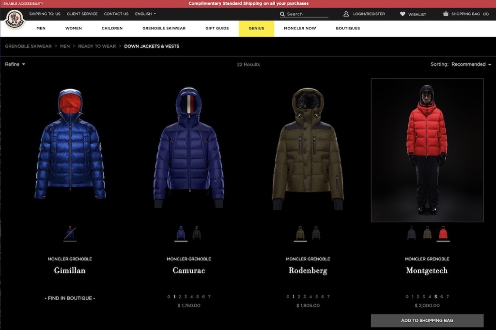
Best Product List Page: Moncler

Product list pages (ie. category pages) are a staple of every ecommerce store. While many stores stick to the conventional grid of products and sidebar of filters (hey, nothing against those!), we hunted around for unique examples that showcase the high-quality products that luxury sites offer.
Moncler, known for their high-end skiwear, has taken the product list page up a notch.
Taking a look at their Down Jackets & Vests, you’re immediately struck by the strong black background. Moncler breaks the mold of products on plain white backgrounds by showcasing theirs on black.
Hovering over each image provides you with an image of a model sporting the piece. You can also toggle between variants, see which sizes are available, and quickly see when a jacket is out of stock. They’re providing the most important information so visitors can make a decision, without needing to “pogo-stick” between the product and product list page.
Product list pages tend to be quite standard across many ecommerce stores, which is why we’re enjoying this elevated design from Moncler.
Best Product Details Page: Canada Goose
Product details pages are where your company really shows off its products. But you have to balance between showcasing high quality photos and helping to resolve any fears, doubts, or uncertainties a customer might have.
Canada Goose, maker of ultra-popular parkas, has nailed the balance. They both persuade customers with high quality photos, videos, and top-notch copy and tend to their questions and concerns.
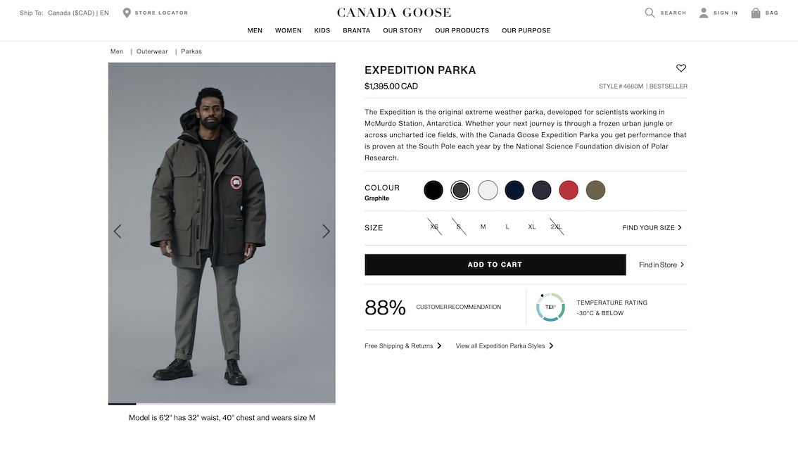
Take a look at the Men’s Expedition Parka. We’re first greeted with a video of a model wearing the parka. He turns around, letting a visitor see the item from all different angles. You can get a sense of the heft of the jacket, as well as the extra little details you can’t see in a stand-alone photo.
Canada Goose packs a lot of information above the fold on desktop, and just below the fold on mobile. Customers get a short description, sizing, colors, price, availability, customer recommendation, and temperature rating. The rest of the page contains answers many people ask including materials, extra features, number of pockets, and warranty info.
Despite all of this information, it does not feel overwhelming. On desktop, you can jump between sections using the sticky bar at the top. On mobile, the information is neatly categorized and hidden behind tabs.
They also utilize a sizing guide, powered by Bold Metrics. Throughout our research, it was surprising to see how many stores are still using static charts to convey sizing. These charts often don’t give customers enough information. Online sizing features give people greater confidence to make a purchase, and hopefully, reduce returns.
Canada Goose’s product pages are a top-notch mix of luxury (videos, photos, copy) and utility (materials, reviews, temperate ratings). Whether you’re actually heading to the Arctic or just want a warm, high-quality coat for winter, you’ll find your questions answered on these pages.
Best Online Cart Experience: Bergdorf Goodman
The cart can be an oft-forgotten page. Nowadays with the rise of side carts, where visitors can head straight to the checkout, it can feel like there is little innovation in the actual cart page.
Bergdorf Goodman does an excellent job of performing a few key functions in their cart: allowing for gifting options and letting visitors select between shipping and curbside pickup. Bergdorf puts the options front and center in the cart, likely to avoid adding extra steps into the checkout.
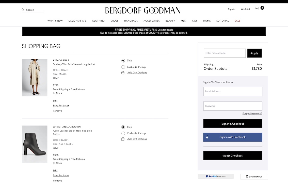
Visitors can select to have only certain products in their cart shipped, and pick up others at the store. This allows for a more customized shopping experience. Perhaps a customer is buying an item for themselves with curbside pickup and is ordering a gift for a friend and needs to ship that item. For many stores, doing an order like that would either not be possible or very confusing for visitors.
Selecting curbside will pop up a modal informing customers of the availability in store and whether an item needs to be added to cart and shipped to store.
The gifting option also presents great choices. Customers can pick gift packaging, see what the packaging will look like, and get a code for free gift packaging for orders over $500. Bergdorf’s little touch is a blank note in case you want to write in a gift message in your own handwriting.
This cart provides a great overview of the items being purchased, and lets customers make important decisions (gifting, in-store pickup) before they get to the checkout, likely eliminating any need to pause their checkout process.
Best Checkout Experience: Kate Spade
This year, we decided to split up the Cart and Checkout categories. While you’d assume that a great cart likely means a great checkout experience, we found there were a few areas Bergdorf Goodman could improve their checkout. This includes allowing visitors to enter one address for shipping and billing. (They currently split this out which forces visitors to type an address twice).
Our top pick for checkout experience goes to Kate Spade. Their one-page accordion style checkout makes the process feel smooth and simple, something all ecommerce checkouts should aspire to be.
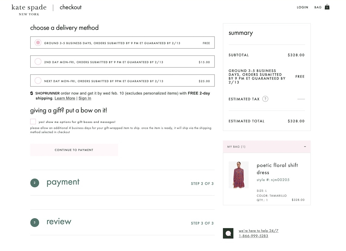
In 2019, Baymard Institute found that the average ecommerce checkout has 12.8 form fields. Kate Spade’s checkout contains only 9 fields a visitor must fill out (there are other optional fields), meaning a faster checkout and less friction.
For addresses in the United States, you can enter the zip code first, and the site will populate city and state.
Another strong feature in the Kate Spade checkout is the gift option. This is a small checkbox at the bottom of the first step. If you select gifting, a modal appears allowing you to add a free card and enter a message. It is unobtrusive, making it unlikely to distract customers who aren’t interested in gifting.
On mobile and desktop, checking out through Kate Spade felt like a breeze. That’s why they are our pick for Best in Class checkout.
In these luxury ecommerce examples, brands facilitate the buying experience that customers have come to expect. This include features like Add to Cart notifications, sizing tools, gifting options, and other options. Yet there is more: every example also adds unique touches to their site, so the experience feels special.
There are many unique ways to get your ecommerce store to feel like it truly represents your brand. Experiment with what you’ve discovered here and test some new ideas.