Retention-Focused CRO Ideas for an Economic Downturn
In any economic slowdown, retail companies want to reduce costs strategically – strategically being the keyword. If you abandon investing entirely, you could jeopardize your business. If you fail to cut back, however, you could jeopardize your business. It’s true that in times of constrained cash flow, budgets tend to shrink. There is extra pressure to direct all remaining resources on activities that will boost conversions. But, as every online merchant knows, knowing which levers to pull is quite the challenge. So, how do you ensure you’re investing wisely in the right things?
When budgets get diminished, it’s critical to focus your growth efforts on retention of existing customers over acquiring new ones (unless of course you are pivoting substantially). Research shows that it’s five to 25 times more expensive to gain a new customer as it is to welcome a returning one. That’s because new customers have to overcome several barriers to buy: trust in the company, uncertainty about the product and experience, etc. It takes a lot of marketing dollars to convince them to make their first purchase.
Meanwhile, you have a leg up with existing customers: they have experience with your retail company, website, and product. They are more likely to spend their money with companies they already know and trust. Now is the time to make sure your pages are as optimized as possible for these visitors specifically. Often, you end up improving conversions for new visitors in the process, but the key is to ensure you’re running tests that are focused on your existing customer base. So, where to start?
Experimentation is Everything
When determining what works and what doesn’t on your company’s ecommerce site, the key strategy is test, test, and then test. What works well for one company isn’t what will necessarily work best for yours. So, you have to test for your audience specifically. For instance, if you change the order of dropdown menu items on the homepage, does your site see more traffic go through to key product pages? What if you change the order of promotional blocks on the homepage? These kinds of subtle changes often come with surprising results.
To help you and your team brainstorm CRO (conversion rate optimization) experiments for your site, try some of these examples.
Does Your CTA Really Call Customers to Action?
Call to Action (CTA) buttons and/or links are a key area to focus CRO efforts. Experiment with changing wording, trying to use text that is more benefit-oriented. For example, “Get the eBook” may solicit a different response instead of “Download.” Or “Show Me More” may intrigue customers to keep learning about your products, rather than the more staid “Continue.” Experiment with different colors and make sure that the primary CTA on the page stands out and is distinct. Subtle changes, like adjusting the verbiage on CTA buttons, can have a surprising effect on click-throughs. This is an area where a little bit of effort can have a big impact.
Do You Give Customers Enough Product Info – or Too Much?
When looking to boost CRO, merchants can also benefit by experimenting with product copy and images on product pages. Too much copy can be overwhelming, so consider optimizing or organizing descriptive text. Try using bold or italics to highlight key phrases in large blocks of text. Focus on a product’s benefits instead of features. But if features are important, find a way to incorporate a full feature list without overly cluttering the page.
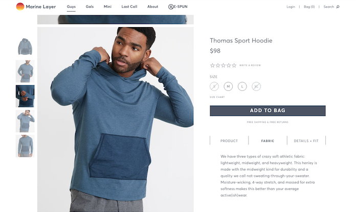
Apparel retailer, Marine Layer, does a great job of presenting a lot of product description text in an organized, easy-to-digest way. On the product details page for the Thomas Sport Hoodie, they separate the description into three sections: Product, Fabric, and Details + Fit. Customers aren’t overwhelmed by seeing all this text written out at once. Instead, they just click on one section, such as Fabric, and get that information. Then they can move on to the next section and get that specific information.
Also on the PDP (product details page), ensure there is text size hierarchy. You want large text on your add-to-cart CTA, so it really stands out from other font sizes. Experiment, too, with your primary product photos. Include a person in the photo, as that gives viewers a sense of product scale, as well as connection to the company and the product. (But don’t let it get in the way of seeing the product itself.) Also consider featuring actual customer photos, collected from social media (with permission).
Do You Communicate Out-Of-Stock Inventory from Collection Pages?
Another area that often shows benefit is the View Details / Add to Cart section on collections pages. Try hiding the View Details button if a product is out of stock, so customers have to focus on in-stock products. However, this must be tested thoroughly, balancing current and future conversions, particularly if your business relies heavily on back-in-stock notifications. Some websites have had success by adding in-stock vs. out-of-stock text or badges on collections pages, and extending that by expressing scarcity by including an “only a few left” message. This could backfire, however, if products consistently have low stock levels or are purchased infrequently, so it’s important to test.
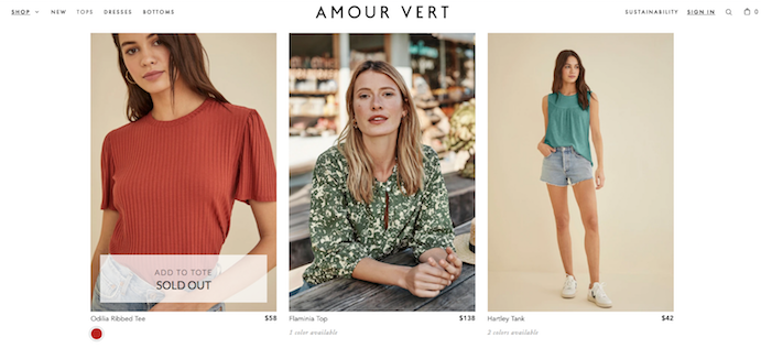
Womenswear retailer, Amour Vert, does a great job of showing what sizes are in stock from their collection pages. Here, while browsing Tops & Blouses, the Sold Out notification appears whenever a customer hovers over the Odilia Ribbed Tee. The sold-out announcement does not appear until engaging with the photo. Upon landing on this page, all the product photos are big and clear without any wording in them. But, as people shop and hover over each image, words appear to show what sizes are in stock or if the product is sold out.
How Can You Highlight Product Reviews?
Reviews often help customers get over the hurdle of deciding to purchase, so find ways to highlight them. Consider adding review stars to the collections pages, but be mindful of clutter. On product pages, try adding review star ratings above the fold, and make sure the review stars link to the full reviews. Experiment with customer testimonials or featured reviews. In the process, think about your existing customers coming to the page. They’ve already gotten over the hurdle of purchasing with your company. Now what will it take to get them to purchase this next product?
What Optimizations Can You Make to Checkout?
During cart and checkout, consider adjusting checkout/continue button positioning, color, and text. See what text works best for your customers: “Next Step” or “Continue Checkout,” for example. If your site has a minicart, experiment with whether the minicart checkout button goes to the full cart or directly to checkout. If customers rely heavily on features of the full cart (ex: discount codes, shipping estimator, return policies, etc.) then bypassing the full cart may be detrimental. Alternatively, reducing checkout steps is always recommended, so it is important to experiment to learn what produces the best results with your customers.
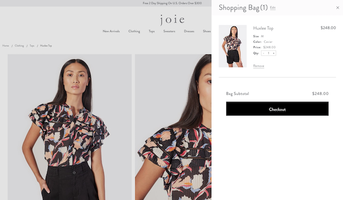
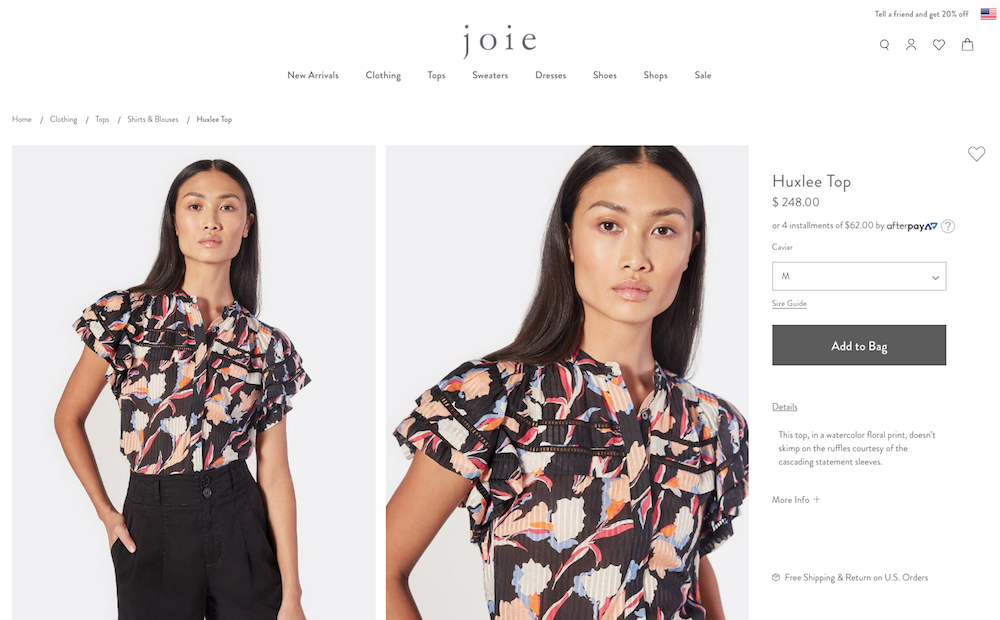
Joie, a womenswear apparel company, has a nice, smooth example of a minicart to review. When a customer adds the Huxlee Top to their shopping bag, the minicart flies out instantly and confirms that the product has been added. The minicart details also show the product’s size, color, and price. Plus customers can either add quantities or remove the item all together. And if customers want to keep shopping, all they have to do is click back on the product page, and the minicart disappears.
How to Identify Where to Start Forming Hypothesis and Running Tests
As we shared in the beginning, every ecommerce merchant has countless potential changes to try when working on CRO. With this in mind, identifying where to start forming a hypothesis for running your CRO tests is half the battle. We recommend a three-pronged approach to start.
1) Work with What You Know to Be True (and Ask Other Team Members)
First, a good ole brainstorming session. As ecommerce marketers and directors, you’re going to be most familiar with your site and the current challenges your customers face. Query your customer service team for their input as well. Create a list of issues or challenge spots. Think of things that may be frustrating your customers or getting in the way of them checking out. From there, list these areas for improvement in terms of which could have the most financial impact. Make sure you’re considering your mobile users and the unique challenges they face as well. Take these issues to your dev team and ask for their input, too.
2) Dig into Your Ecommerce Site Analytics
Second, review analytics data. Focus on your repeat visitors and get a better understanding of their behavior on the site. Are some pages converting better than others? Consider why that might be: could it be the content, the layout, or the product itself? Look at the checkout funnel to determine where customers are leaving the site before completing checkout.
3) Explore Heatmapping
Third, gather heatmap data of your site to determine if there’s an area where customers are getting lost or frustrated. Tools like HotJar, CrazyEgg, and Lucky Orange can be super helpful here. Are there images that customers are expecting to be able to click on? Are product pages so long that customers are giving up, rather than scrolling back to the top to add to cart? Is your more popular content further down the page where fewer customers go? You can also compare heatmaps and click maps from high and low performing pages identified when reviewing the analytics. These are just a few of the answers that can be gathered via heatmapping, which can give guidance for optimization opportunities.
After gathering those insights, it’s time to make some of the changes that have been identified as possible improvements. Some of the changes may be minor but have a substantial impact. Some changes may not result in any improvement. The only way to find out is to perform tests. A/B tests are the best way to determine how much of an impact minor changes have, provided the pages in question receive enough visits to come to a conclusion. If you don’t have enough traffic to justify A/B testing, be sure to have the correct analytics events set up on the areas you’re testing. Then review before vs. after analytics data to determine the impact of the changes. And finally, prioritize these things by the estimated impact they will have on your bottom line.