22 Rules of Online Checkout: What Converts Vs. What Diverts
Last year consumers crossed a threshold: for the first time ever, more people purchased online than in physical stores. Yet, despite the growth in ecommerce, the rate of abandoned online shopping carts hovers around 70%. Imagine if 70% of the time people went to a grocery store and discarded their groceries right before the register. Or if we tried on clothes for 15 minutes, brought them to the cashier, and then walked out with nothing in hand. It simply doesn’t happen. So why do customers leave the online checkout behind?
It may be surprising to read this, but too often retailers put up barriers to sale. They may not even know they’re doing it, but something in their store disrupts the conversion. In fact, it likely leads to a customer diversion – to a competitor.
Related: 22 Product Page Optimization Tips
In this article, we’re going to walk through several examples of what works and what doesn’t: What Converts Vs. What Diverts. We’ll show real-life examples, not with the goal of scolding, but rather to offer tough love in hopes of improving online sales conversion. Along the way, we’ll share our 22 Rules for Optimized Online Checkout.
Let’s start with some blue ribbon checkouts:
Conversion: Clear Communication Wins
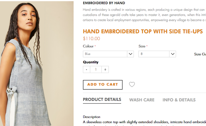
For starters, a good product page is the prelude to a good checkout. Here’s the store for Anita Dongre of Grassroot, recently billed by the New York Times as “India’s favorite designer” who has come to America. On this page for their Hand Embroidered Top, the buttons to select color, size, quantity, and add to cart are easy to find and navigate. Now to the checkout.
When we added the shirt to our cart, Grassroot split the screen to show the shopping cart next to the product page. Then they showed us the first rules of online checkout fulfilled:
1. Communicate that the item has been added to the cart.
2. List the product details, including the variation selected — size, color, etc., and a thumbnail image in the cart.
3. Prompt customer to enter promo code, if applicable.
4. Give the option to Checkout or Continue Shopping.
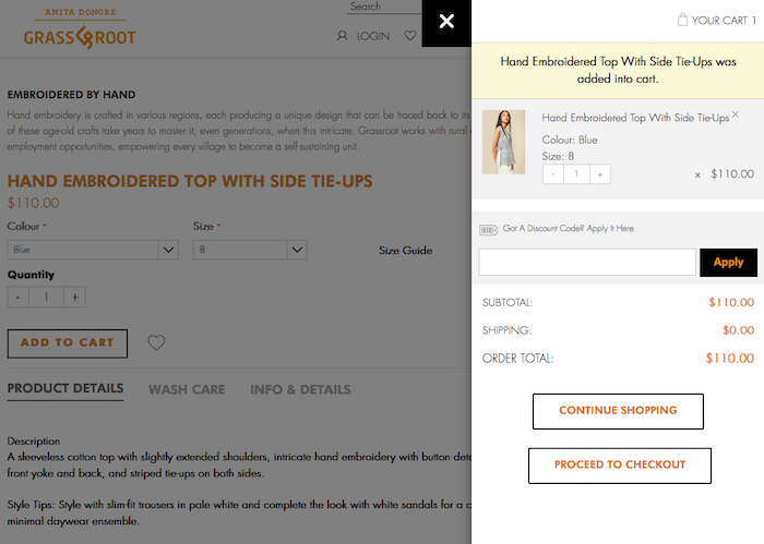
Conversion: Make Shipping Costs Known ASAP
As strong as the Grassroot store is, we have a recommendation. When we proceeded with checkout, we learned that the shirt came with free shipping. Rather than list the shipping at $0.00, which suggests another cost is coming up, promote free shipping throughout the site — especially at Add to Cart. This brings us to our next rules:
5. If offering FREE SHIPPING, sing it loud and proud!
6. If NOT offering free shipping, let the shipping costs be known as early as possible.
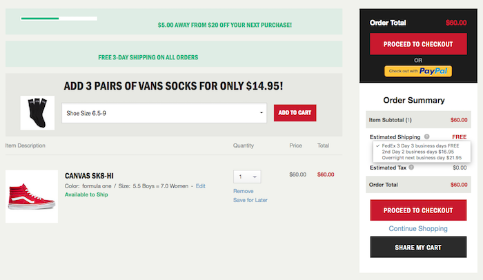
Take a look at how Vans handles this in their shopping cart. First, we’ve seen their free 3-day shipping offer several times in our browsing. Then when we add a pair of shoes to the cart, it reads FREE estimated shipping in the final cost. The shipping quote also has a drop down menu, so if we needed these shoes tomorrow, we can see how much that would cost.
7. Offer a shipping calculator (if it’s right for your business).
Also, note the strong cross-sell with Vans. First, we’re told at the top of the page that we only have $5 to go until we get $20 off our next purchase. We want it. Then, we’re shown the perfect socks to compliment our shoes and get that deal. Vans wins with a few other rules here, too.
8. Think about ways to upsell and cross-sell at checkout. (without disrupting the flow with pop-ups, too many choices, etc.)
9. Link the product image and name in the cart back to the main product page in case customers want to revisit the page for any reason.
10. Provide the option to Save for Later. Think about Wish lists or Gift lists.
11. Make it easy for shoppers to change the product quantity.
12. Provide the option to Remove an item from the cart, rather than update or delete it.
13. Give customers the ability to share the product in their cart.
14. Make the Proceed to Checkout button really clear and accessible (here it’s given twice!).
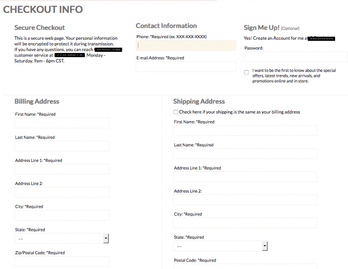
Conversion: Give Customers a Checkout Map
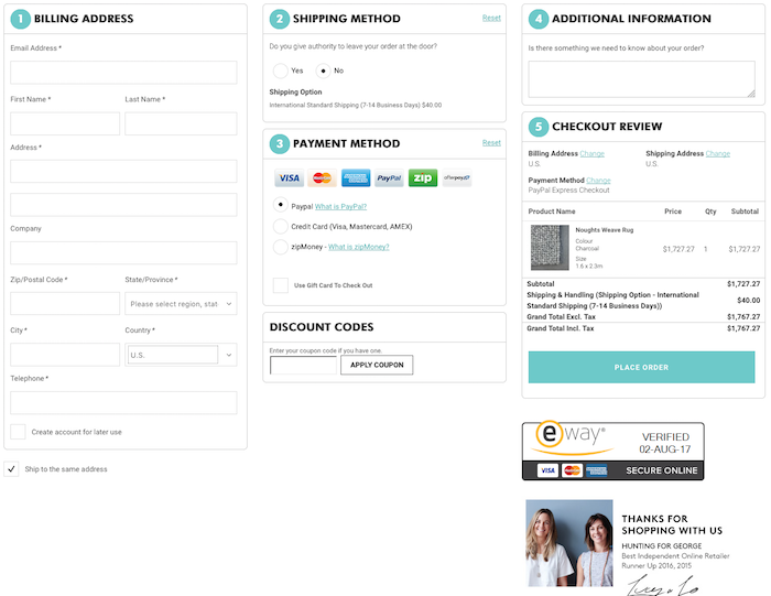
Hunting for George, an Australian retailer, has an online store full of beautiful products. The best part is when we get to the checkout, it’s graceful, too. As soon as we land on the checkout page, we take in the entirety of the process. On this page, we see several rules for conversion nicely done:
15. Make checkout progression clear at all stages. Let customers know how close they are to the finish line.
16. Keep checkout succinct. Keep typing to an absolute minimum.
17. Allow customers to give their billing address as their shipping address without having to type it in again.
18. Provide flexibility through a good selection of payment options.
19. Do NOT provide distractions at the finish line. No email pop-ups, etc. More on this below.
20. Confirm all aspects of the purchase in the final step: Product bought, specific variation, shipping, tax, final cost — everything.
21. Be certain to communicate the security of the transaction. Here they did it with a 3rd party certification.
22. Thank your customer for shopping at your online store!
Diversion: When Bad Checkouts Happen to Great Companies
Now we’re going to talk about some checkouts that aren’t working and provide suggestions on how to fix some of the issues at hand.
The screencap above is from a retailer that sells really cool products that are in vogue now. This is the Express Checkout, the second page of the process. We’ve already been asked to select from three options: Returning Customers, New Customers, or Express Checkout. We jumped hurdle #1. Now that we’re here, several questions come up:
- What am I buying again?
- How much will shipping and taxes be?
- How far do I have to go until I’m done?
The bottom of this page has a button that says, “Save and Continue.” But we worry that the lack of clarity here will keep customers from doing so.
Diversion: Forced Account Registration
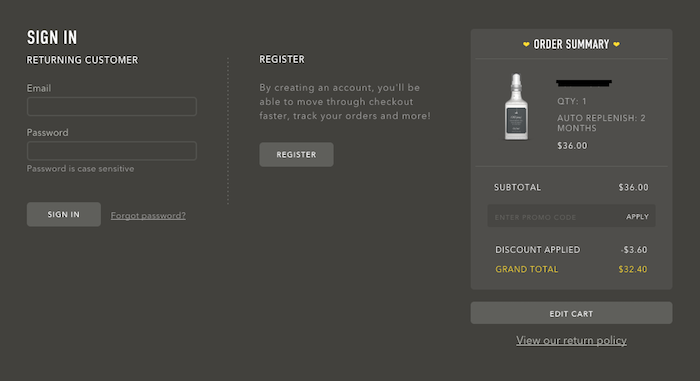
The screencap above is from another innovative company, and we see a lot of their greatness communicated in their store. For example, on their product pages, they offer an option for auto-renewal. It’s easy to select, and the shopping cart shows the discount applied with auto-renewal.
But when we go to check out, we are taken to a fork in the road: Sign in or Register.
Research consistently points to forced registration as the #1 case for cart abandonment. Most recently, an article on the Shopify Partners blog underscored this diversion. Please don’t do it.
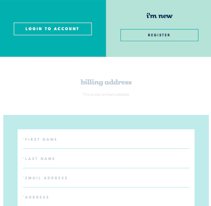
Here’s another great company putting up a forced registration wall. What we really want – to start entering our info to buy a product – is shadowed out just below the forced registration. We can’t begin the checkout until we log in or open a new account. Unfortunately, this extra hurdle may have customers buying these products elsewhere.
Conversion: Fold New Accounts into Checkout
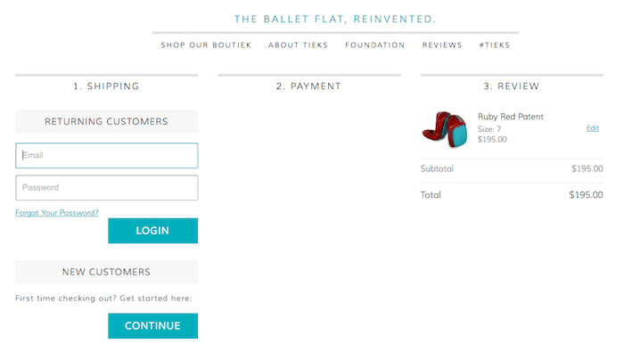
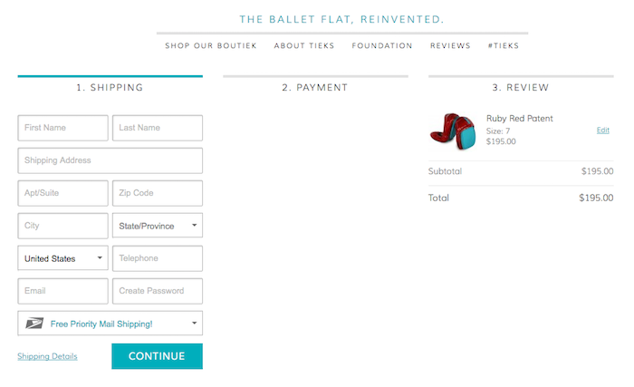
Customers share information in the checkout process that is almost everything a merchant needs to create an account for them. With this in mind, it’s easy to make these inputs part of an account registration.
Take a look above at how Tieks, purveyors of the modern ballet slipper, does this. Yes, they ask us if we are a new or returning customer. But when we click on the Continue button for new customers, we are immediately directed to enter our shipping information. As part of the shipping info, we’re asked to give a password. This will create a new account. The barrier feels lower since we’re already in the shipping information, rather than in the netherworld of opening an account.
Conversion: Suggest Customers Create Account AFTER Purchase
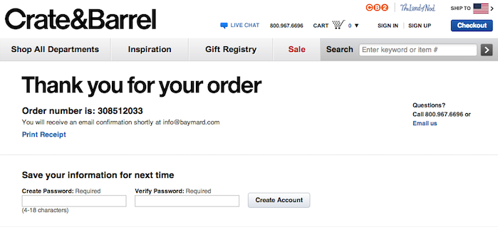
As the Tieks example above shows, the information a merchant collects to complete a sale is usually everything needed to register an account, with the exception of a password. But rather than put up a password wall before a sale, how about afterwards? Here Crate & Barrel says customers can save their info “for next time.” We like their confidence in the customer returning. It also gives the customer incentive to create an account — presumably it will save them time when they buy again. We’ve also seen discount incentives for setting up an account after purchase. Think about your customer and what would motivate him or her to create an account and provide that offer after checkout. (Image source: Baymard Institute)
In summary, retailers have long given attention to every detail of the physical store buying process. The products are merchandised, the store music is curated, and the shopping bags are branded. We understand the importance of all touch points between the store and its customers.
In online retail, sometimes this is still in development. Yet, just as with the physical store, every step of the buying process reflects the merchant. No part is an afterthought. If you want to optimize your online checkout for higher sale conversions, let’s talk.