22 Rules for Optimizing Product Pages to Increase Online Sales
As people begin the third decade of online shopping, we’ve collectively created an experience that shoppers have come to expect – and trust. Appealing product pages are a key element of this experience. How can merchants optimize their online product pages to entice shoppers to buy?
Through Command C’s 12+ years of ecommerce experience, we’ve honed our secret sauce for product pages that convert online viewers to buyers. There are several main ingredients: Product Images, Product Description, Add to Cart, and Upselling/Cross-Selling. And just like every great recipe that gets passed along, new interpretations keep it fresh.
Here are our 22 Rules for product pages that convert, along with some of our favorite current takes on them.
Product Imagery
There is a well-established foundation for Product Imagery. Our first 5 product page rules are all about it:
1. Products should to be shown in big, clean, and clear photos.
2. Customers need to be able to zoom in/see photos much larger.
3. Images should reflect variant selection, e.g. color. It’s a must for the main image, but hopefully for other images, too.
4. Show products from every angle, and consider 360 imagery, if applicable.
5. Show photos in lifestyle context – especially photos that illustrate scale.
Highlight: Show Products to Scale
The Baymard Institute, an organization that studies web usability, recently published an article, All Products Need at Least One ‘In Scale’ Image (28% Get It Wrong). It explains a reality that we’ve all witnessed: in a physical store, we quickly grasp a product’s scale. Online, however, this can be tricky to discern.
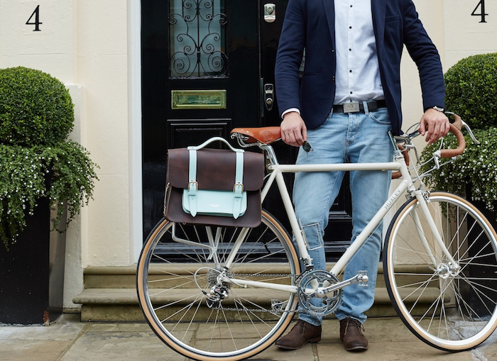
Hill & Ellis makes leather bags for bikes and personal carrying. The product page for their Brown & Mint Satchel Bike Bag shows a nice variety of photos for the bag, and we’re able to click on any photo and make it much larger. The bag is shown from every angle, including the inside and the bike attachment hardware on the back. And we have a clear sense of scale! Here are their “for scale” product shots, both on a bike and on a person.

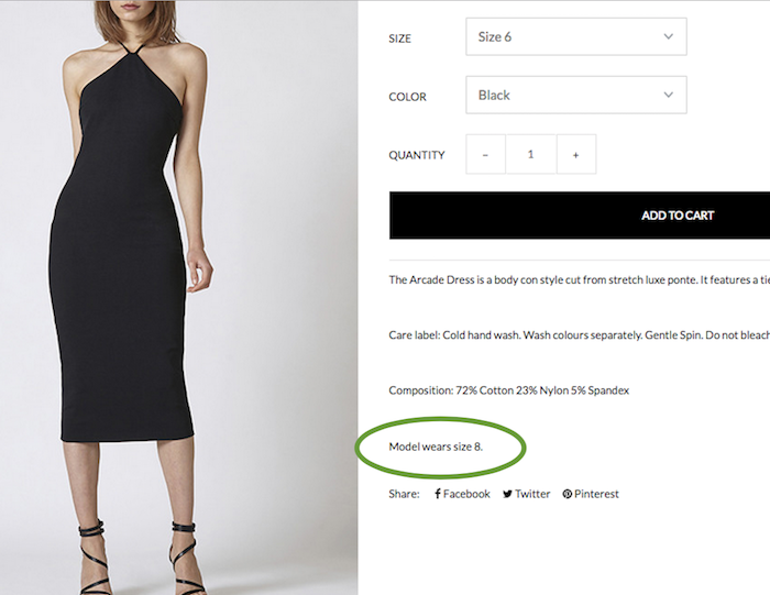
On another fashion note, merchants are increasingly listing the size of the model pictured. For example, Australian clothier Ruby Sees All has a lovely Arcade Dress available on their site. But how will it fit? To give us a sense, they add a helpful line to the description: Model wears size 8.
Highlight: Show Product at Multiple Angles & Variations
One of the reasons we love what we do is because it’s ever-changing. Yes, it’s true that merchants have been sharing photos of product variations for a bit. But, more and more, online entrepreneurs are grabbing the opportunity to trailblaze within the architecture of online shopping.
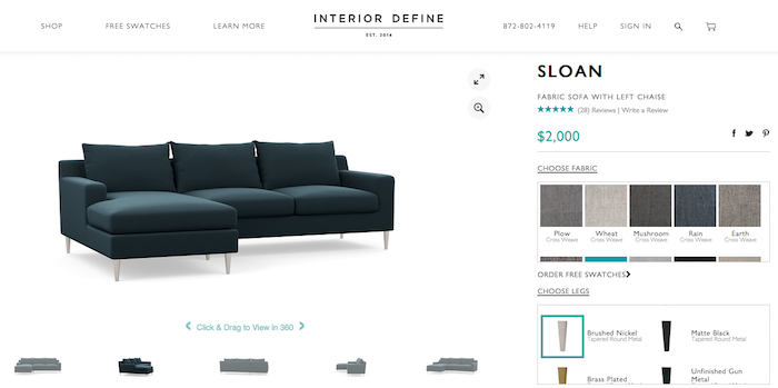
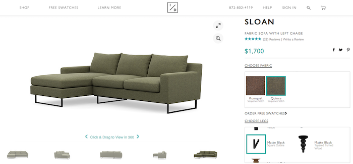
Interior Define is a furniture retailer that invites customers to design their own furniture through use of a product configurator. They use one of our favorite tools of late, Cylindo, an HD viewer that rotates online products to view at 360 degrees.
We applaud Interior Define for using Cylindo in their variant display. In the top photo below, we worked on a Sloan sofa in a dark blue with polished nickel legs — we can click on the image and spin it around to see it from any angle. In the second photo, we tried out the Sloan in green with black box legs. It’s super cool how the configurator updates with the variations as we create, as well as how we’re able to see the sofa from any angle.
Product Descriptions
When shoppers land on a product page, it’s visually appealing to have a succinct product description, and we know we only have the users attention for a short time. Yet it’s vital that the description says everything someone needs to know to purchase here and now. The guiding principle is balance: Product descriptions need to contain enough information for a shopper to buy, without overwhelming text. Once this is established, we expand into the other rules for strong product descriptions:
6. Give shoppers all the information they need to buy your product.
7. Don’t give more information than is needed. No mega-lengthy text.
8. Clearly state “in stock/out of stock” status. Bonus: give the option to be emailed in stock notifications.
9. Show free shipping notices or shipping charges. The number #1 reason shoppers abandon an online sale is due to surprises regarding final cost. Check this out.
10. For clothing & shoes, provide a size chart, esp. if selling international sizes.
11. Reviews: If you have them, flaunt them! Potential buyers rely on reviews. But please note: Showing a space for reviews, without actually having reviews, reflects negatively. If you don’t have reviews, omit this space on the page.
12. Give customers the option to add your product to a Wishlist. (Ana of Alien Outfitters shared her favorite Shopify app for this here.)
13. Provide icons that allow shoppers to share your product via social.
Highlight: Inventory Status & Size Chart
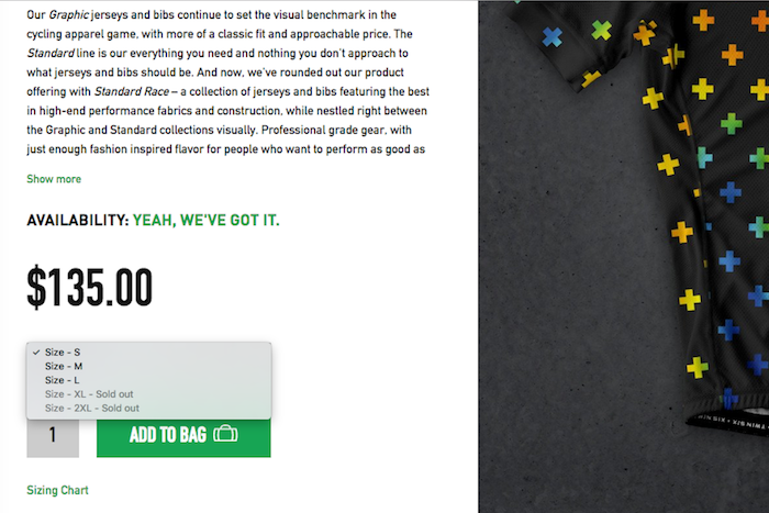
We like what Twin Six did in the description of The Furthermore, one of their bike racing jerseys. At first look of this product page, we get a short description with clear statement of availability: Yeah, We’ve Got It.
Also the product description starts off short with “Show More” after two paragraphs. When we click on Show More, we get a lot more. The drop down description shares all the info that racing enthusiasts need to buy.
Then when we click on the drop down menu for our size, we get an immediate inventory update. We can buy The Furthermore in S, M, L, but not in any larger sizes. Thankfully they have their sizing chart handy, and we’re able to see how they measure their sizes.
Price/Add to Cart
If we could shout one rule for product pages from the mountain peak, this is it: Make it easy for shoppers to find the Price and Add to Cart button. It’s so simple that it’s tempting to overlook it, but it’s crucial. Please don’t make anyone hunt. (They won’t.) When planning your Price/Add to Cart features, remember:
14. The price should always be clearly displayed next to the product–don’t make it a smaller font size. Transparency is key.
15. Make it super easy for customers to select the product attributes they want: color, size, etc.
16. Clearly communicate the updated product once shopper selects attributes.
17. Highlight discounts with strikeouts and show the percentage of savings.
18. Make it super easy for buyers to Add to Cart.
19. Clearly express that the product has been added to the cart.
20. Offer Checkout and Continue Shopping as easy next step options.
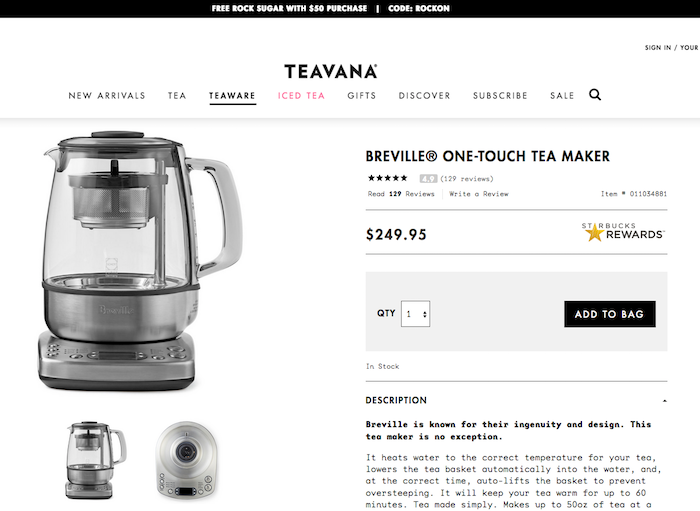
As an example of a clearly visible price, take a look at the Tevana shop and their product page for the Breville One-Touch Tea Maker. It’s available for $249.95 and so easy to “Add to Bag” here.
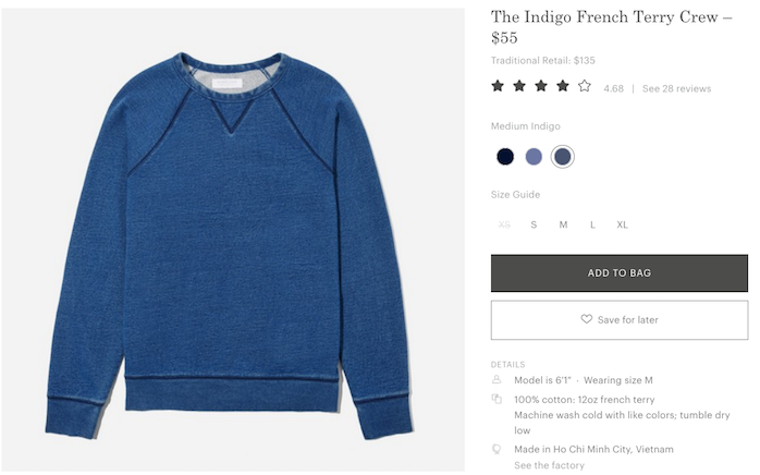
We could write a whole post about Everlane (The Waitlist! The “See the Factory” Feature!) but for now, let’s simply admire their easy-to-use, friction-less size and color selector. Yes, please.
Use Product Pages to Upsell and Cross-sell
In our final rules for optimizing product pages, we encourage merchants to make use of two nimble tools: the upsell and the cross-sell. You already have a customer in the store; this is the chance to increase the order.
21. Seize the opportunity to upsell. Think about the options for your products. Can a customer upgrade the material, for instance?
22. Plan ways to cross-sell, too. Offer product ideas based on current interest, e.g. “Customers also bought” or “You might like.”
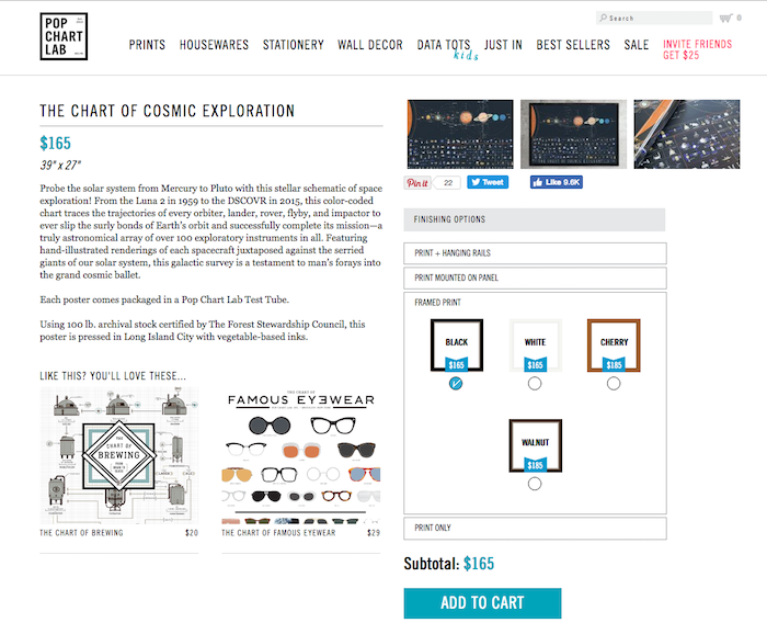
One of our most favorite projects to date was creating the online store for Pop Chart Lab, purveyors of “all human experience in chart form.” Their charts are funny, quirky, inspiring, and informative. Once customers get inside their world, they want more.
This became an excellent opportunity for both upselling and cross-selling. We developed an upsell feature for people who wanted framed prints; there are a variety of frames available at different prices. For cross-selling, Pop Chart Lab’s products are so fun, it’s engaging to share recommendations with their avid fans.
Are your product pages increasing sales for your store? We hope so. But if you see room for improvement, we would be happy to share some ideas about updating them for better conversion.