The 4 Rules of Error Messaging that Keep Customers Converting in Checkout
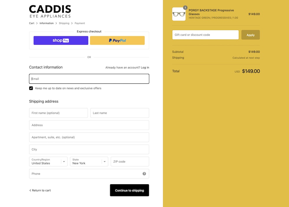
Caddis offers a smooth checkout experience on Shopify
When you think about it, errors in physical retail stores are not all that common. Occasionally, a store’s systems go down or a customer’s credit card doesn’t swipe properly.
But when someone is on a website, any number of things can go wrong. There may be technical bugs that prevent them from completing a checkout. Or maybe a form field requires MM/YY for the expiration, and they keep typing M/YY.
To address online customer mistakes, error messages are a necessity. Retailers have to notify people when they make a mistake, especially when the error isn’t easy to spot.
Visitors will leave if they can’t figure out what to do next, and ecommerce teams have to help them understand what went wrong. It’s crucial to find these potential problem fields through research into how your customers behave, and optimize them as much as possible, such as through auto-formatting spaces for a credit card number.
But there are still bound to be mistakes no matter how bulletproof you think your fields are. Therefore you need to ensure each field has appropriate error messaging.
Handling checkout field issues can feel complicated. But it really involves four key things:
- Let users know as soon as they make a mistake
- Make errors prominent
- Show error messages in context
- Ensure messages are easy to understand and helpful
In this article, we’ll review these four rules in depth. Plus we’ll discuss ways to optimize your error messaging that will lead to less confusion and easier fixes in fields with mistakes.
Rule #1: Let Customers Know As Soon As They Make a Mistake
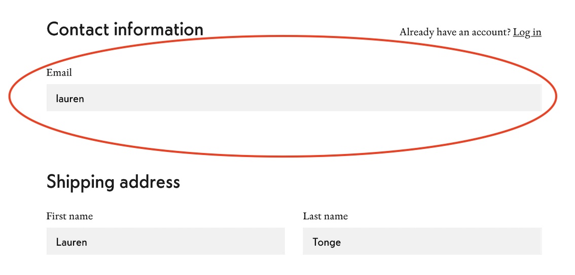
Before a user moves to the next field, let them know if they made an error in the previous field. This should be done right after the user has clicked out of the field. Showing an error messaging as soon as someone clicks into a field is not a good experience, as the user has not had time to enter anything.
In the example above, I was able to move onto the next field without receiving validation (positive or negative) that my input was correct. Ideally, I would be notified that the email is missing an @ and a domain, using copy such as “Please enter a valid email including @ and domain (example@email.com)”.
One way you can provide feedback in a field is by using Luhn validation in the credit card number field. The card number field is often the longest string of characters a user has to type aside from the address. Luhn validation won’t tell visitors whether their card is actually valid or has sufficient funds, but it does check that the number they typed is plausible. For example, typing 1234 5678 9000 0000 will result in an error message based on Luhn validation since this is not a plausible credit card number.
Providing validation as soon as a visitor clicks out of a field will help them immediately know they made an error and fix it quickly. This is as opposed to letting visitors know once they try to submit their information or move to the next page of the checkout, which causes friction since the user is ready to move on.
Rule #2: Make Errors Prominent
A subtle error is one that is easily missed – and causes friction for visitors. If a user makes a mistake, highlight the field in red and provide error messaging in red.
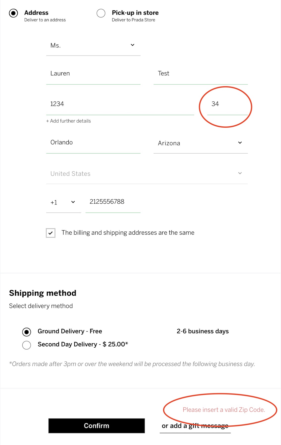
On Prada’s checkout, despite providing visual feedback that fields were seemingly filled out properly (green lines under the fields), I still received an error.
Prada could improve this error messaging by placing the copy near the affected field and highlighting that field in red. I missed the messaging near the “Confirm” button at first. Looking at this page quickly, it’s hard to tell there’s an issue. We want visitors to immediately realize what the issue is and see where they need to go to fix it.
Rule #3: Show Error Messages in Context
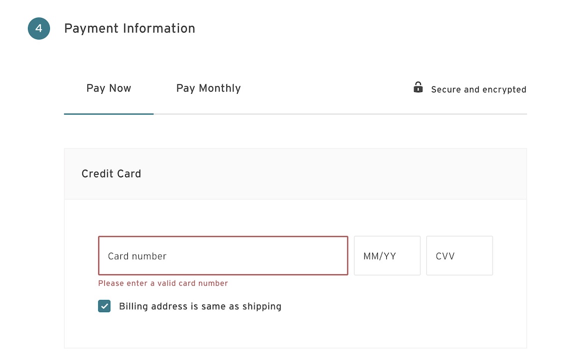
The best place to put an error message is next to the affected field. This results in less need for visitors to reference the error, then scroll around to find the field to correct it. Platforms like Shopify already do this in the checkout, but your custom checkout design may not.
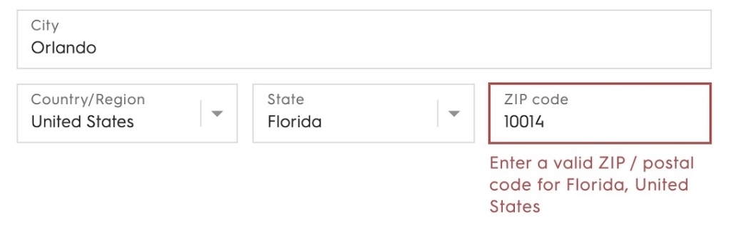
In the example above from a Shopify checkout, the error message is right under the affected field. This is as opposed to placing all of the error messages at the top or bottom of the checkout, as this can make it difficult to find the field that needs correcting.
If error messages display upon submission and the affected field is not in the viewport, the screen should automatically scroll the user up to that field. Otherwise, visitors may not find out they have an issue and may not know to scroll up and look. If they don’t notice they have an error and keep trying to submit their checkout they could end up getting frustrated and leave.
Rule #4: Make Sure Error Messages Are Easy to Understand and Helpful
A field can often be easy to fix and update. But there are instances where a visitor is not aware of what exactly is wrong with their input.
Ensure that all of your error messages are easy to understand and are also helpful.
Copy such as “Invalid email” or “Enter a valid zip code” are not helpful to visitors who think they entered a valid email or zip code.
Messaging such as “Please enter an email including @” for the example above is more relevant and useful to visitors than “invalid email,” as it directly tells the user what exactly they need to fix.
This can be very important for sensitive areas of the checkout like the payment fields. Visitors may input their credit card number incorrectly or type their CVV or expiration date in a way that doesn’t match the correct format. They will need guidance on how exactly they are expected to fill in the field (ideally the fields should auto-format or mention the correct format in the first place).
Address issues can be more easily remedied by using address validators such as Google’s address autocomplete tool. This allows visitors to start typing and then see suggestions of possible addresses. Once they select an address, the state, city, and zip code will automatically fill in. Address auto-suggestion tools can help visitors more easily fill out the checkout, as well as avoid errors.
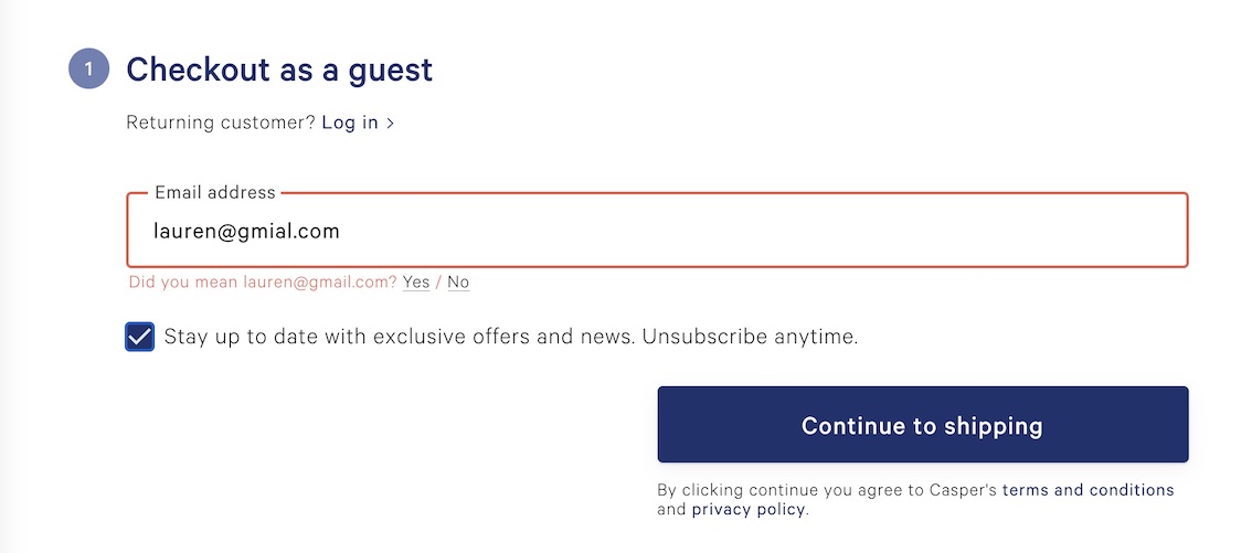
Casper does a great job in their checkout of actually helping the user when they make a typo. They provide a suggested email in the error. We can easily click “yes” to have our email updated to the correct spelling. This makes correcting the field a relatively frictionless process.
Additional Considerations to Keep People in the Checkout Flow
If a user sees error messaging, yet they haven’t actually interacted with that field, they might feel slight panic that something has gone wrong.
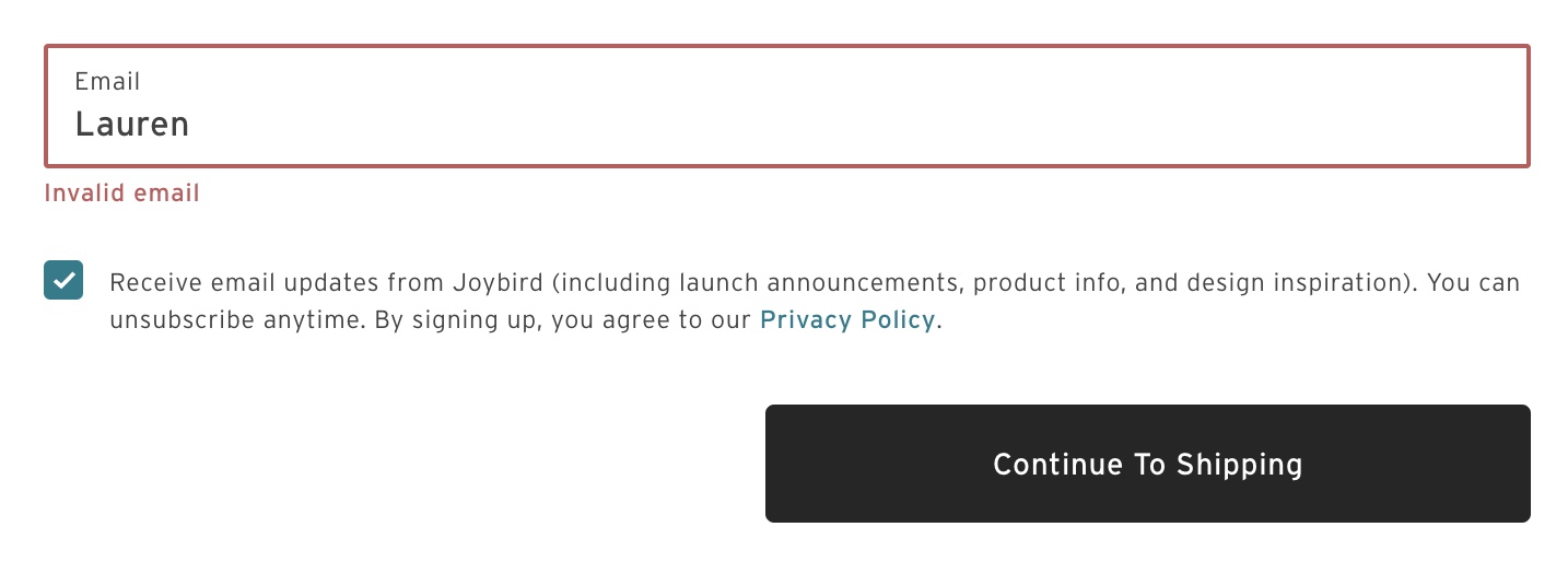
On Joybird, when I landed on the payment step, the credit card field was already warning me to enter a valid card number although I hadn’t interacted with the field. In this case, the messaging is appearing too early. Luckily it’s an easy fix.
For instances where checkout is not possible for certain regions, this should be made clear elsewhere on the site and also as soon as a user selects that place in the checkout.
In testing another site’s checkout process, we listed Hawaii as our shipping location. Only then did we learn that the retailer does not ship to Hawaii. In this case, we recommend informing customers about shipping limitations a lot earlier in the process. Otherwise people will be frustrated that they spent time shopping and checking out when they were never able to buy.
Consider this Customer Scenario and Try to “Break” Your Checkout
Imagine: A visitor has seen your marketing, press, branding and felt compelled to check out your store. They browse (maybe a few times) and find something they want to buy. They answer all their questions about your product and vanquish any doubts about returns and shipping time. Now they’re in the checkout with credit card ready.
But, what’s this? They click the “Complete Your Order” button and nothing happens. Now they’re worried the order didn’t go through, but they can’t tell why. All they see is the button staring at them on their phone. They tap again, but nothing. No loading icon, just a button.
They decide to come back later. But then they forget to return. Turns out, they typed their credit card number wrong by one digit – but they were never properly informed of the error.
Go through your checkout and try to “break” it. See what happens when you type fields incorrectly, don’t use the proper format, use symbols, enter the wrong zip code for your state. Note how visitors to your checkout will be notified of an error and how easy it is for them to fix it. No matter how flawless your checkout process is, a superb checkout experience means handling the mistakes humans will inevitably make.