How to Structure Product Filters and Sorting for Highest Conversions
We’ve all been in a situation where we had too many choices and felt overwhelmed to make a decision. Sometimes we think we want more options – more is better, right? But studies have shown that too many options can lead to no decision at all.
With this in mind, ecommerce stores need a better way to help visitors find the right product. Collection pages are the closest thing to an in-store product shelf, but when your store offers 300 items, it can be difficult to show everything on a collection page.
Instead, your store likely uses filters and sorting to help customers narrow down options to that match their particular criteria. But, are your company’s filters are the most relevant and valuable to your customers? Are they displayed in the most optimal way?
Your team has to ask these questions, among others we will discuss here. In this article, you’re going to learn what to consider when setting up product filters, A/B tests to run on your filters, and examples of stores utilizing filtering options.
Filters Need to Be Relevant and Useful
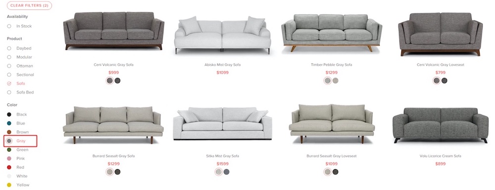
Depending on what you sell, there can be a multitude of filters to offer. You really want to know which are the most relevant and useful to your customers. This is especially true if your products have many different characteristics, for instance, like RAM, storage, and video card options for computers.
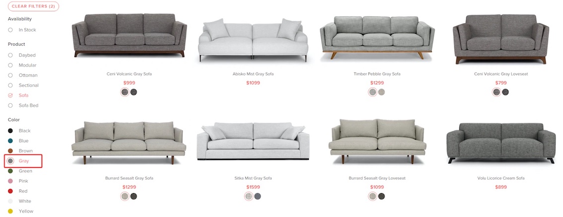
A filter like “camera strap color” is not as useful as whether or not a camera includes a body or a body and lens. The same goes for relevant filters. The body color of a DSLR camera is not very relevant to customers, but color is very relevant to someone shopping for a couch.
If you don’t already have custom filters, you want to determine a couple of filters that will be most used by your customers. We suggest focusing on a couple because over time you can continue to add more and refine them. You’ll also want to evaluate how to get that product data and ensure it’s as accurate as possible.
Along with custom filters, you’ll want to include some standard ones for things like pricing, customer rating, color, and size.
Lastly, ensure you include filters for the product information displayed on the collection pages. If products show a feature like “Includes Free Shipping,” then visitors should be able to filter on that option.
Optimize Filter Display – Especially for Mobile Searches
Showing filters can seem very standard. Most desktop sites show them on the left-hand side of collection pages. On mobile, you’ll often see a button at the top of the page.
But, that doesn’t mean there’s only one way to show filters. Or that these standard ways are the best for your customers. Although many desktop sites show filters on the left column, Baymard Institute has found in eye-tracking studies that desktop visitors often focus on the center of the collection page. Thereby they often miss left-hand filters, and focus on horizontal filters instead.
Determine Where to Display Filters and How to Show Them
When displaying filters on desktop, you can show them on the sidebar or at the top of the page to see which suits your customers. If opting to show them horizontally at the top of the page, it’s best if you only have a few filters, otherwise the products can get pushed down.
You can also test whether you want them to be sticky as a user scrolls or not. Sticky filters can sometimes reduce the friction involved of needing to scroll to get back to the filters, but they also run the risk of causing distraction because they’re always present even if a visitor doesn’t want to use them.
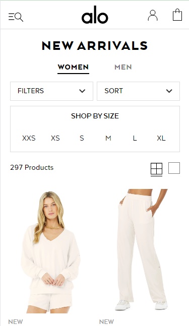
On mobile, you can show a filter button or display the filters at the top of the page (if there aren’t too many). You could display 1-2 filters if these are the most relevant to your customers, such as sizing for apparel stores. Alo Yoga does this on their mobile site, likely to reduce the friction involved in clicking the filter button to reach the sizes.
After you’ve decided on where to display filters, next you’ll want to determine how they should be shown. It’s best not to display all filter options fully, but rather limit them to 5-10 and hide the rest behind a “view more” link so as not to make the filters feel overwhelming.
A useful test to run is to order your filters from most used to least used. Often you can find this information in Google Analytics if there is a parameter appended to the URLs that indicates a filter has been used. You can also utilize click maps to learn which filters are clicked most.
Use Tool Tips and Visuals to Explain Filters When Needed
Are your filters easy to understand for customers of all levels? Someone who builds their own computer knows the jargon, but a first-time buyer will need some help. If you plan to offer filters that aren’t clear to all visitors, include a tooltip to explain that filter.
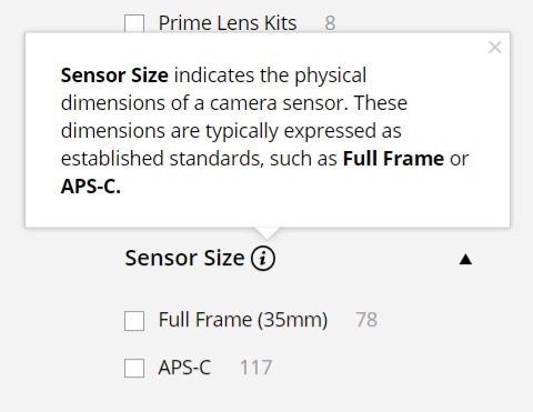
Baymard Institute recommends avoiding industry jargon and vague filters altogether, but if that’s not possible then there needs to be some sort of explanation. Aside from adding a tooltip, you can also utilize visuals to better explain a filter and its options.
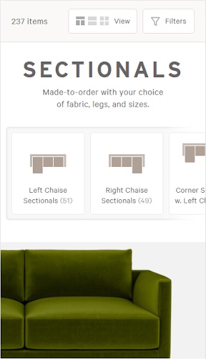
For example, Interior Define does a great job of promoting a popular filter at the top of their page (couch layout) and uses illustrations to better explain those options. They likely know that interior designers will understand these terms, but someone getting their first apartment might not know what a “left bumper sectional” looks like.
Follow the 4 Foundational Rules of Filters So Customers Don’t Get Lost
Filters are meant to guide people towards the right product, and they shouldn’t get in the way of the journey. It’s important that filters follow a few rules so visitors don’t end up with 0 results or results that aren’t useful to them.
- All options should show how many products are available and that number should update as they select other options.
- Once a user selects an option, the product results should update automatically. They should not have to click a button to update.
- Users should be allowed to select multiple options per filter. For example, selecting black and red from a color filter.
- If a user selects an option, say Modern Style, but there are no leather options, grey or cross out that option so visitors cannot select it.
User testing shows that visitors get confused when the thumbnail on the product listing doesn’t match the options they’ve selected. It is best to dynamically show the proper thumbnail when a user selects a particular option.
If a visitor wants to see green pants, but they are shown pants where the default thumbnail is black, they may assume it is not relevant to them even though that product may have a green variant. As you see below, Article displays the appropriately-colored thumbnail when visitors swap between different color options.
Additional Considerations: Applied Filters and Filters By Theme
Once visitors have selected filters, you need to offer a way to remove them and to view which ones are selected. An “Applied Filters” area typically displays at the top of the page on desktop. On mobile, it’s often either at the top of the page or within the filter modal.
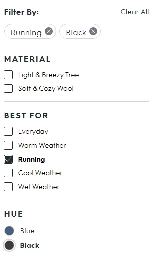
Allbirds helps make it obvious which filter options are selected by placing them at the top of the filters. Visitors can “clear all” using the text link or remove individual filters by clicking the “x” next to it.
Also, if you sell items like apparel or decor, consider offering thematic filters. For women’s dresses, this could mean offering a filter like “Occasion” and having options such as wedding, cocktail, party, work, formal. For decor, this could mean a filter like “style” such as modern, colorful, tropical, countryside. These types of filters can help visitors who don’t know exactly what they want, but have a sense of how they’ll use the product.
Test (and Then Test Again) Your Filters to Determine the Best Approach
Finally, you’ll want to test! No filters, options, design, or placement should be set in stone. If you already have filters on your site, test out different layouts, different placements. Add new collection-specific filters such as “fit” for jeans.
And if you’re not totally sure what filters your customers might value, ask them. You can reach out with post-purchase surveys or in your newsletter to ask visitors what criteria is most important when looking for certain products. You might find that most visitors looking for lamps are more interested in lampshade color than in height of the lamp.
By paying close attention to current filter engagement and testing out different approaches, you’ll help your customers find their new favorite item in your store.