How Product Photo Zoom Can Make or Break Ecommerce Conversions
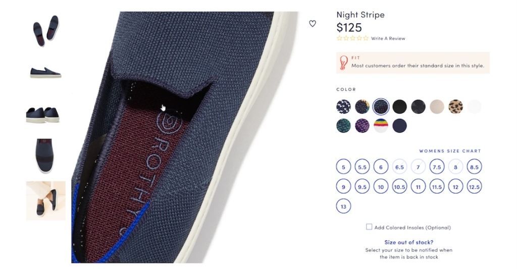
Rothy’s provides zoom upon hover on desktop. On mobile, they provide “pinch to zoom,” but the company doesn't communicate that feature as we recommend.
As an online retailer, you probably have a love-hate relationship with your product pages. On the one hand, these pages are how your company presents its products to the world. Your team spends time crafting them to display the best photos and most persuasive copy. On the other hand, they can become monsters to manage. Especially when you need to add custom copy, images, and other features to different products.
But no matter what, high-quality photos – and a lot of them – are vital for product pages. According to the Baymard Institute, “56% of users’ first actions were to immediately begin exploring product images after arriving on the product page.”
When customers can’t see or touch a product, the next best thing is to see all of its different angles. People want to view the product in context, as well as zoom in and see detail. Yet, even though product photo zoom is so important, it often falls to the wayside when considering all of the elements you need to optimize on your ecommerce store.
It’s critical to allow customers to explore products using a photo zoom feature. Additionally, there are special zoom considerations to address for mobile shoppers. To make sure your customers can access the product information they need, we’ve shared a few questions for you to determine if your photo zoom tool does what it needs to do.
Why Product Photo Zoom Is So Important
A study by Baymard found that when product photos were low-quality and couldn’t be zoomed sufficiently, customers often abandoned those products.
Ouch.
This is not something you want, especially if you’re spending a lot of money on ads to get them to your site in the first place.
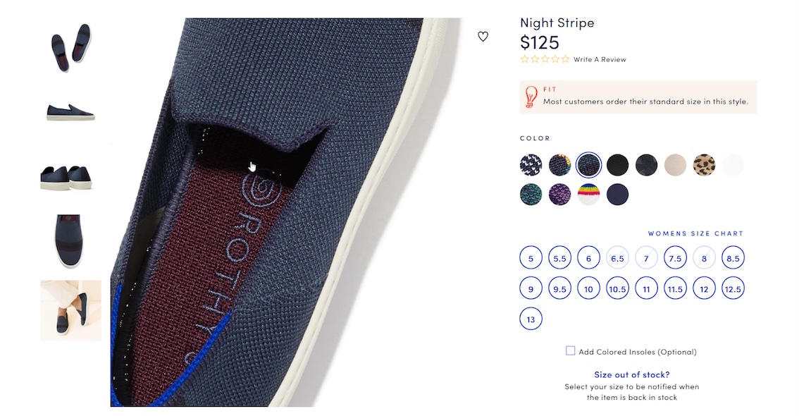
The zoom feature allows customers to see closer details of the product photos they’re viewing. But it also signals to customers that the site is polished. This gives them more confidence in their purchase, especially when the zoom feature is smooth and provides high-resolution images.
A user tester in a Baymard study was especially frustrated by the lack of resolution in photos on Sears.com:
“This is completely pixelated and grainy, so I can’t get a good [look]…I mean, this picture…I don’t even know what that is! Or well I know what it was supposed to be, but this is still kinda disappointing.” (Baymard study)
Does this sound like a customer who is going to purchase now? On the contrary, it’s highly unlikely someone this disappointed will buy – and they could end up leaving the site altogether.
A product page needs to ease any lingering anxieties about purchasing and answer relevant questions in-context. Product photo zoom can help answer some of those questions. If a customer can’t properly inspect texture, material, product quality, see the different aspects of the product, or special product details (such as labels on containers), they will have unanswered questions. As a result, they’ll leave and buy with a store that gives them all the information they’re seeking.
Customers not only expect to see high-quality images, they want to see a lot of them. If you have a large catalog, it might not be feasible to produce dozens of photos for each variant. But, at the very least, you want to share a lot of top-quality photos for your best sellers.
Special Considerations for Product Photo Zoom on Mobile
Even if your product photos allow zoom, are they showing high-resolution photos on both desktop and mobile? Oftentimes retailers create lower-resolution images for mobile shopping to reduce loading times. But even for mobile users, your image gallery should offer high-resolution versions of the product imagery when users begin zooming in. Otherwise people might get frustrated at the lack of quality and leave your site. (Note: instead implement lazy-loading images.)
In addition to displaying high-resolution zoomed images, you need to consider how to communicate the zoom tool to product page visitors.
On desktop, visitors can typically hover over a photo and zoom in, or their cursor might change to a magnifying glass upon hover. On mobile, customers typically try to “pinch to zoom” or “double tap to zoom.” But 40% of ecommerce stores don’t support either feature.
This adds friction to the shopping journey, as a customer will often attempt one gesture, and then another, and then realize they can’t zoom in at all on mobile. This can lead to customers turning their phone to landscape mode, something 50% of users in a study did when they were unsatisfied with small product photos.
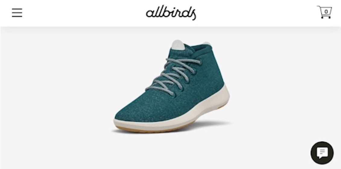
Further, it’s estimated that 52% of online stores don’t scale landscape images proportionally. By not scaling proportionally, visitors have a hard time viewing the image properly. In order to scale images in landscape mode, Baymard mentions it can be as easy as “defining the image size as a relative width of the viewport.”
Even if you have close up images of your product, visitors will often still attempt to zoom in.
It is recommended to allow for both pinch and double-tap zoom features in your image gallery (We do not recommend interstitials or modals.) And if you already do so, make sure to mention this feature near the gallery. A staggering half of ecommerce sites don’t do this! A small reminder like this will help nudge users to utilize this feature to better inspect product photos.
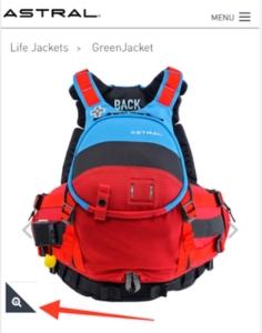
Baymard Institute actually recommends using “Double-Tap to Zoom.” The word “Pinch” is often unknown to users who aren’t native English speakers. If you prefer to use “Pinch,” also include a gesture icon to indicate the motion.
How to Ensure Your Site’s Product Photo Zoom Is Optimized
Taking a look at popular Direct-to-Consumer sites like Snowe, JoyBird, Bespoke Post, and Public Goods, none of them offer a proper zoom function. Snowe and JoyBird show tools that make you think they offer zoom, but clicking the photos only brings you to a full-screen gallery of images, not an actual zoom feature.
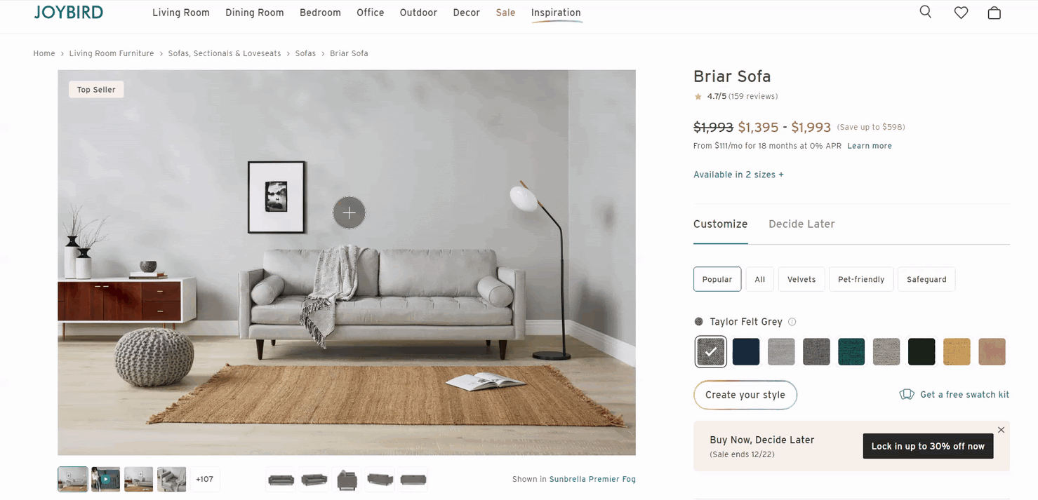
Take a moment to look at your 5 best sellers on desktop and mobile, and ask yourself the following questions:
- Can you zoom in on desktop and mobile?
- Is the tool fluid and easy to use? Or is it laggy and jumpy?
- Can you see enough details and are the images high-resolution?
- Are you effectively communicating your zoom feature on mobile?
- Do you support Double-Tap and Pinch zooming on mobile?
If you answered no to any of these, there’s some opportunity to improve.
If you don’t have this feature at all, the first thing you should do is test a zoom option on your product pages. There are different ways to zoom and it’s best to A/B test to see which works best for your products and audience.
For example, Feather offers a click to zoom option that opens the zoomed image in full screen.
ArtLifting allows you to hover over and zoom in on the artwork.
MHMGear has combined their zoom feature with their 360 degree view. (We shared about MHMGear’s Hootview in our article on outdoor ecommerce stores)
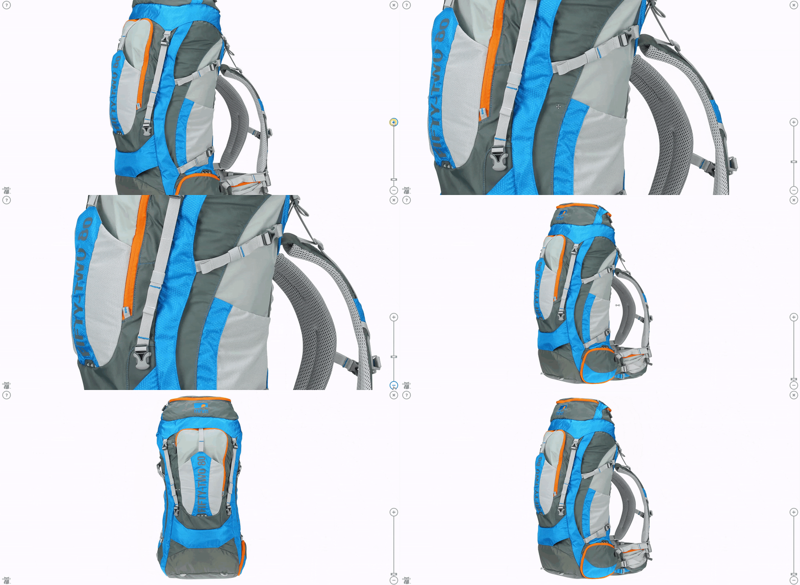
If you’re lacking high-resolution images that provide for a quality zoom experience, A/B test that as well. This can give you data to back up any efforts to source high-resolution images for your products.
Go on and start improving your zoom. Customers might not thank you for it, but rest assured they’ll be satisfied when they go to zoom and see crisp, high-resolution photos showing all the details they need to be confident about their purchase.
Looking for more info about photo zoom? Watch our video on eCommerce photo zoom tips.
And our other video about product image galleries.
