11 Must-Have Features for Outdoor Ecommerce Sites
“Wilderness is not a luxury but a necessity of the human spirit.” — Edward Abbey
We agree, Mr. Abbey. Thankfully so do many outdoor retailers who sell products for our time in the wild. In these high days of summer, we got curious to review outdoor brands selling their merchandise online. Broadly speaking, the mission behind these companies is to help people relax offline. Yet, as you’ll soon see, the companies with the most innovative outdoor products also tend to have excellent online experiences. Whether your company sells outdoor gear or another category through its branded website, we believe these ecommerce feature examples offer strong guidance.
Increasingly, merchants understand that the online buying process isn’t just a means to an end; it’s an extension of the product and the business. We’ve been promoting this idea for years, and we’re delighted to see these brands embrace it. Every example here highlights an ecommerce feature that is top of its class.
Here are our Top 11 Outdoor Gear Sites for your ecommerce inspiration.
1) Ecommerce Outdoor Product Page
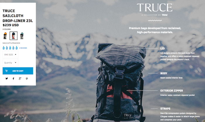
Winner: Trew Gear
When we landed on the Trew Gear site, we were greeted with the announcement that their Truce Sailcloth bag was “Back in Stock!”. This is welcome news for their longtime customers. For us newbies, it quickly led to the question, why is this bag so popular? So we ended up exploring the Truce bag’s product page. (Note: a restock notification wins over both returning and new shoppers.)
And what a product page it is. The photos are compelling and clear. The page navigation is intuitive and easy. As we scroll down, we see the bag in various settings. Most importantly for sales conversion, the shopping cart is always handy. We can maneuver up and down the page, learn more about the bag, etc. and Trew Gear is ready for us to buy any and every minute.
2) Product Comparison Tool
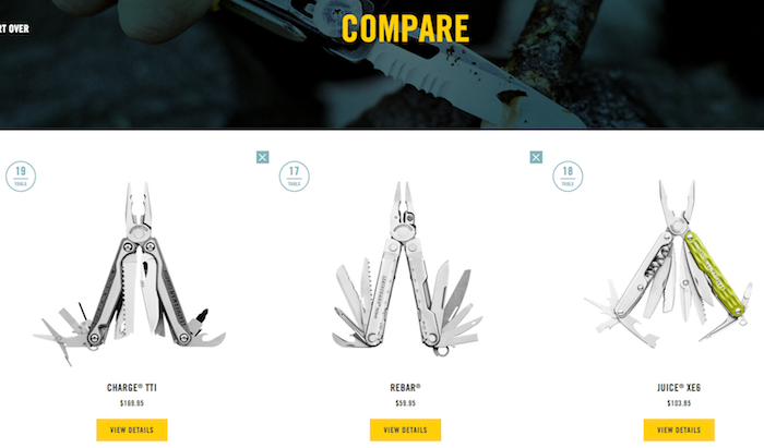
Winner: Leatherman
We love seeing an old favorite get in the front of the times. Founded in 1983, the Leatherman online store conveys the energy of a much younger start-up through its features. One of the best is their “Compare” module that lets shoppers select various Leatherman tools and line them up for pros vs. cons.
For example, do you need a cutting hook on your Leatherman? In the battle of the Charge TTI vs. the Rebar vs. the Juice XE6, the Compare features shows us that the Charge is the way to go.
3) Ecommerce Product Cross-Sell
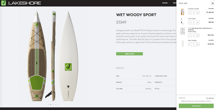
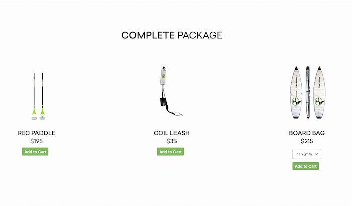
Winner: Lakeshore Paddleboard Company
For starters, the product imagery in this store is a solid 10. It can’t be easy to photograph paddleboards, and Lakeshore nailed it. Also, when we add one of their boards to the cart, in this case the Wet Woody Sport, it creates a split screen. We stay on the product page, yet we know that the board is in our cart.
As we scroll down, the cart remains visible, and soon we get to “Complete the Package.” This shows us everything we need to get on the water with this single order. This a perfect cross sell. Since the cart has stayed with us as we shopped, we can easily add the new items. Well done.
4) Product Variant Selector
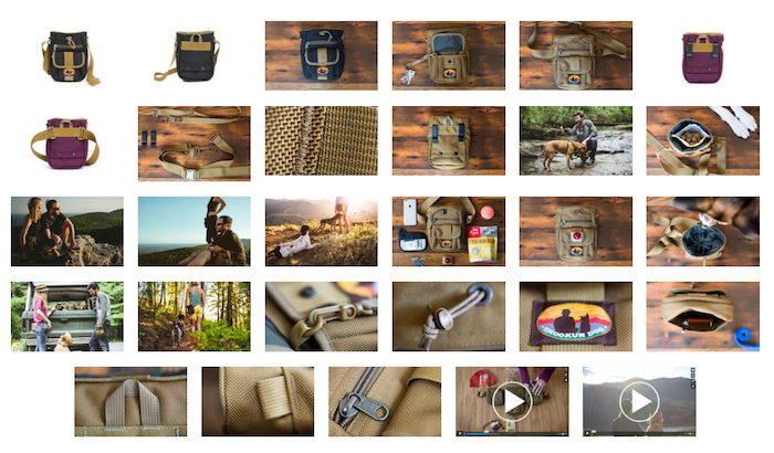
Winner: Tom Bihn
Based in Seattle, the Tom Bihn company has built a fan club around the world. (They do a beautiful job of sharing this through their “Bags in the Wild!” feed of customer photos on their store homepage.) One of the many reasons for customers’ devotion is that Tom Bihn creates the bags people need for all sorts of adventures — and the bags are packed with options.
Take a look at their Citizen Canine bag for hiking with dogs. Shoppers are given five variant selectors to customize their purchase. And, as shown above, the company shares 27 photos and two videos of the bag on its product page! We really get the chance to see this bag inside and out, as well as in action.
5) Ecommerce Product Configurator
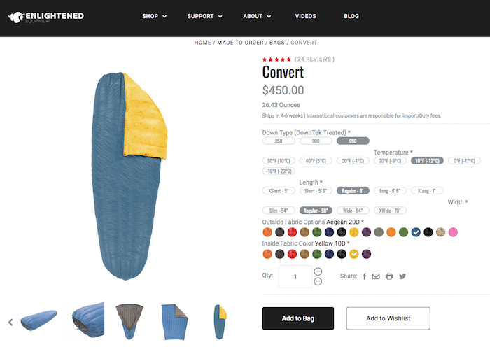
Winner: Enlightened Equipment
Regular readers our Insights know that we love a good product configurator. As shoppers embrace customization, we like seeing retailers serve their wishes by inviting them to design their own products. Enlightened Equipment extends this invitation from the home page with these navigation options: From the Shelf and Made to Order.
In customizing a sleeping bag, the options not only address visual preferences, i.e. fabric colors, but also to one’s level of camping expertise. (Shoppers can also tailor the bag size to their frame.) As for expertise, the type of down liner, as well as the bag’s temperature grade are up for selection. Hobby campers can sleep warmly in a 50F degree bag, while a hardcore hiker can take her temp down to -10F.
6) Invitation to Go Omnichannel
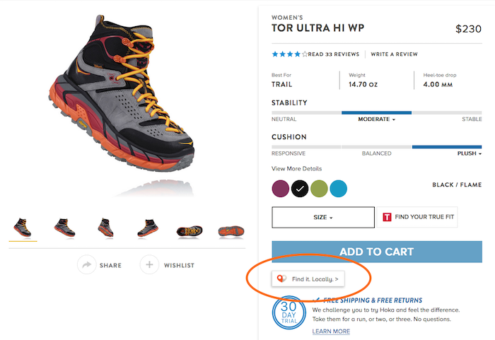
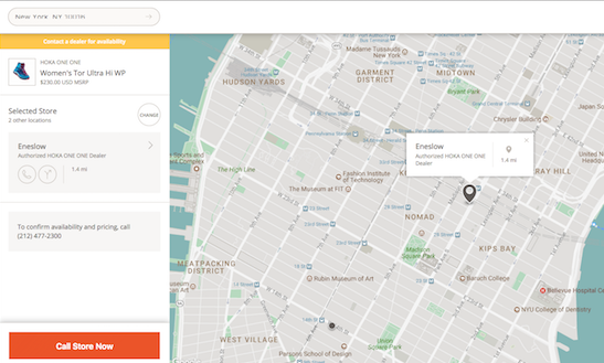
Winner: Hoka One One
In the name of omnichannel, Hoka One One products are available both online and in physical stores. As we toured the product page for their Womens Tor Ultra Hiking Boot, we noticed a button right under Add to Cart. It reads “Find it Locally” and quickly leads to an area map with the option to input our zip code. After we do, a map appears with local Hoka One One distributors AND the stores’ phone numbers. This company makes the transition from online to in-person easy and inviting. Their 30-Day Trial offer is pretty rocking, too.
7) Engaging Ecommerce Product Videos
Winner: Astral Designs
Based in Asheville, NC, Astral makes a wide range outdoor products including shoes, apparel, bags, and life jackets. Their items tend to be available for men, women, children – and pets! This site has crisp imagery and friction-less navigation. The variant selection is especially well-communicated.
But where they really hooked us was in the product testimonial for the Astral Otter 2.0 Youth Life Jacket. They took the opportunity to have a customer, in this case a girl charmingly missing her two front teeth, walk us through the benefits of the jacket for kids like her. Beyond the major cutie pie factor, the video conveys that Astral knows their customers and wants to talk directly to them.
8) Ecommerce Checkout
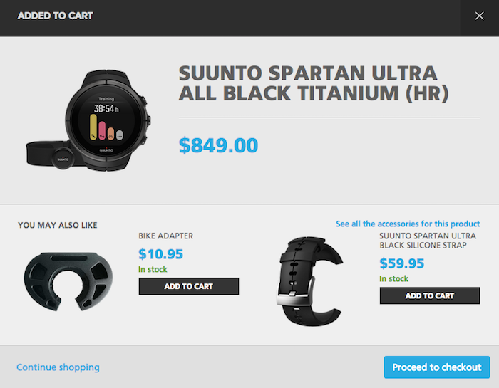
Winner: Suunto
Developed by diving experts in Finland, Suunto (pronounced “soon-toh”) sells watches for athletes in training. The watches are highly technical, and their product pages bring this expertise to life through videos, detailed specs, and more. This store also assists shoppers in choosing their model through a compare feature, as well as offers personalization through a great product configurator. (Chant it with us: Customization. Is. King.)
Yet our top ecommerce feature example here is the Suunto checkout. When we add a watch to the cart, a box immediately pops-up with the heading, “Added to Cart.” It also shows us products to add to our order; in the example above, the cross sell is a bike adapter and the upsell is a different kind of wrist band. AND we are given the options to Continue Shopping or Proceed to Checkout. Suunto has done a really nice job of communicating our product status – and options – here.
9) Product Navigation
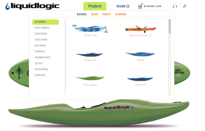
Winner: Liquid Logic
Along the white waters of North Carolina, Liquid Logic makes kayaks and other “river running” boats. They offer a wide range of products, and to convey their various lines, they built a matrix from product silhouettes right into their navigation. The result is a visual path to shop for a specific type of kayak or other boat. Then once we land on a product page, as we hover over a kayak, the zoom feature very smoothly pops up. The zoom has nice control, and we’re able to really see the boat that could soon send us down river.
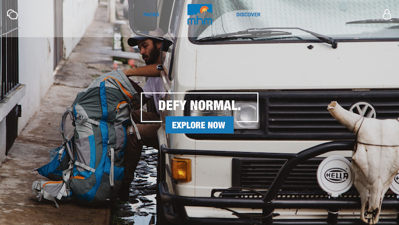
11) Ecommerce Product Visualization
Winner: MHM Gear
The MHM Gear store has super navigation, starting from the homepage when the first drop down menu lets us shop by backpack shape. Then, once we click on a product, in this case the Fifty-Two 80 pack, we’re led to a page full of information. One of the highlights here is a diagram of the 80 liters of things we can put in this backpack for an extensive camping trip. Another highlight is the 360-degree product review shown above. Made possible by Hootview, we can spin the pack all the way around. When we want to examine any specific part of it, just click on the zoom to bring the bag super close.
12) Ecommerce Inventory Status
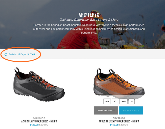
Winner: The Clymb
The Clymb’s landing page is a grid of countdown sales featuring the various brands they carry. Click on a brand – Arc’teryx shoes are shown above – and the countdown clock stays ticking. Also, as we shop on the brand page, we like how we can see the sizes available before we even click through to the full product page. Take a look at the mens shoe on the right — there are all the sizes available in highlighted boxes. And you’ll want to find your size ASAP to get ready for The Clymb’s amazing line-up of Adventure Travel trips.
Do these ecommerce feature examples give you ideas for your site? Do you see an opportunity here that you’d like to work into your own online store? We hope so. We love sharing new design ideas to help retailers increase sales. Now what can we do for you?