Best in Class: Beauty Ecommerce Stores
Selling makeup online is a blessing and a curse. Anyone in ecommerce knows that the beauty industry is huge and continues to grow. More stores appear online every year, focusing on different markets and creating new product lines.
But, in this industry, it can be difficult to compete with retail stores for multiple reasons:
- Hard to communicate shades, colors, palettes
- Inability to try the item
- People are wary of trying something new
- Product discovery is tricky
The makeup ecommerce industry isn’t all doom and gloom. The online space is teeming with beautiful stores with high quality photos, unique product discovery tools, and innovative ways to help customers shop for new makeup.
Our Best in Class series looks at different ecommerce industries to find the top sites in a variety of industries including menswear and the luxury space.
Now we will take you through some of our picks for Best in Class when it comes to makeup and beauty, so you can see some of the most inspiring sites we’ve come across.
Best in Class Home Page: Credo
The home page is often the most popular landing page for visitors. It’s a chance to showcase your brand to new visitors and remind return visitors of all the items they’re missing out on.
The home page can be a tricky page, because of all the possibilities. We narrowed down the Best in Class home pages in makeup to a few truly well-designed sites:
3rd Place – bluemercury
2nd Place – Space NK
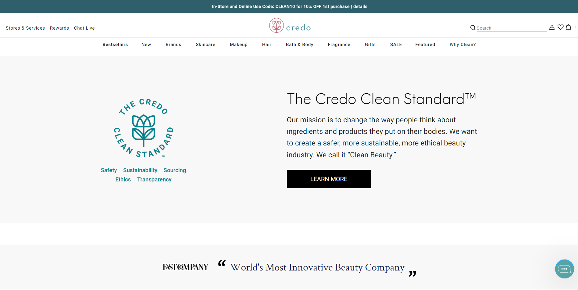
1st Place – Credo
All three sites have wonderful home pages (check them out), but Credo won the top spot for a few reasons.
First, the home page is broken down very well to encourage scanning. Many visitors are looking to get a general idea of a site by scrolling through the page quickly and then identifying what they want to look at further.
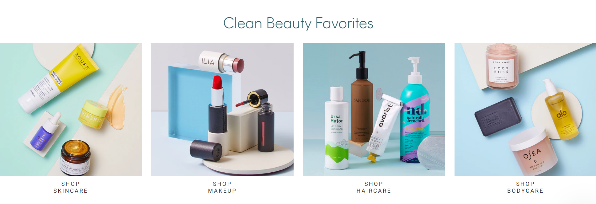
Next, the page includes many different types of content. A good home page should include a mix of shoppable sections and branding. You want to give visitors an idea of what you sell, but also why they should be buying from your site in particular.
Credo’s home page is also very cohesive in terms of the branding, imagery, and copy. Everything feels like it should be there. It’s visually appealing and is likely to catch someone’s attention. This is very important for making a good first impression on a new visitor.
The diversity of sections on Credo’s home page, but the cohesive feeling are what make this our Best in Class pick.
Best in Class Product Discovery: ILIA Beauty
Product discovery is a new category in our Best in Class series. When it comes to beauty products, especially makeup, customers run into challenges in finding new items.
Many makeup sites have really innovated when it comes to discovering new products. These two sites stood out to us:
2nd Place – Dose of Colors
1st Place – ILIA Beauty
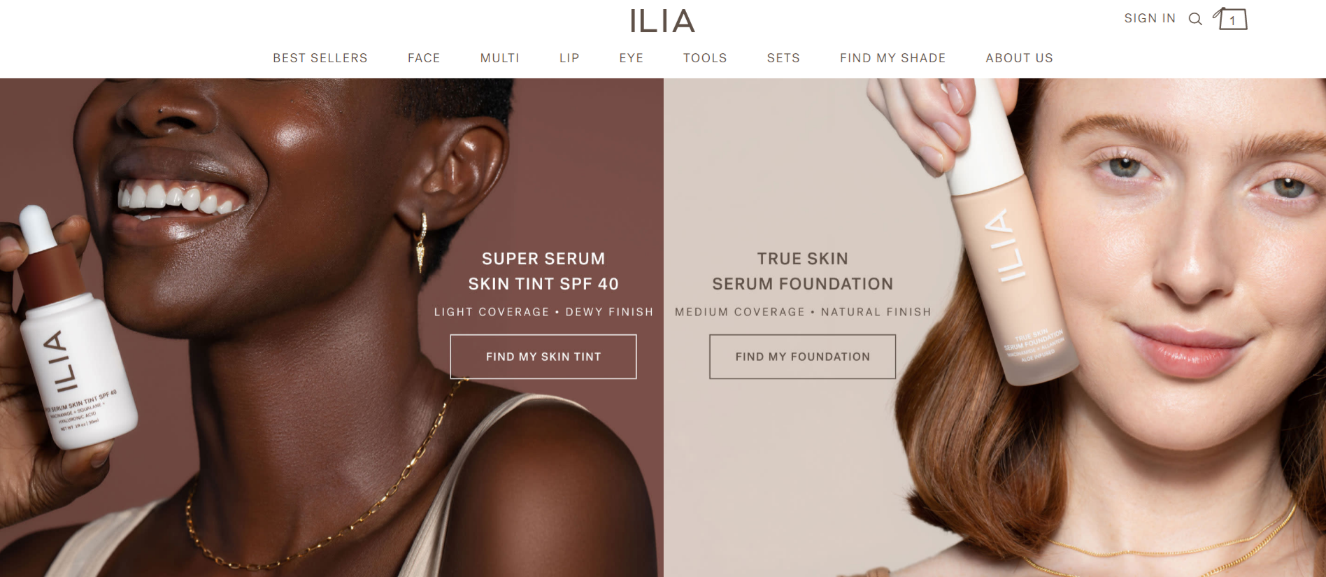
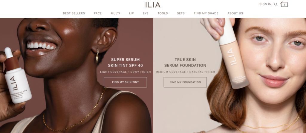
We selected ILIA Beauty’s Skin Tint and Foundation quizzes as our Best in Class for product discovery.
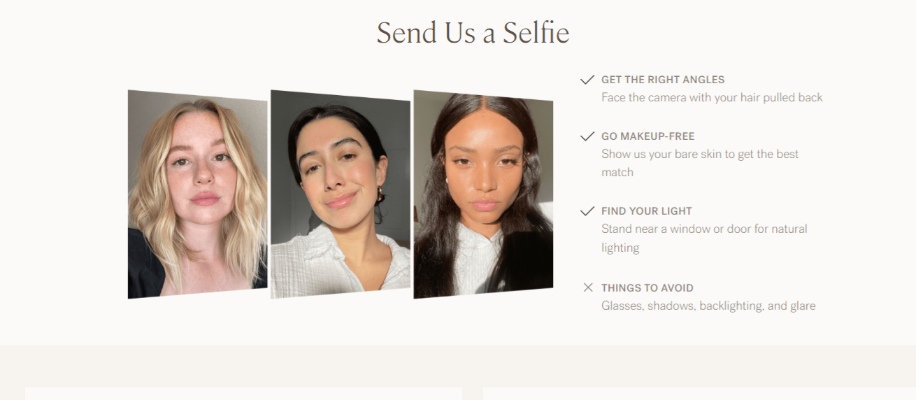
Foundation is something many makeup users are looking to purchase, but online it’s hard to tell if a particular tone will be right for your skin. On the surface, you would expect a typical quiz, but the unique part of their product discovery is that ILIA offers a quiz and also the ability to be professionally color-matched.
Visitors might not be as confident in their quiz results, but getting a real person to help find the right tone for a customer’s skin can help give them the confidence they need to purchase. The quiz can provide immediate results, while those that aren’t needing to purchase right away can get the color-matching within 72 hours.
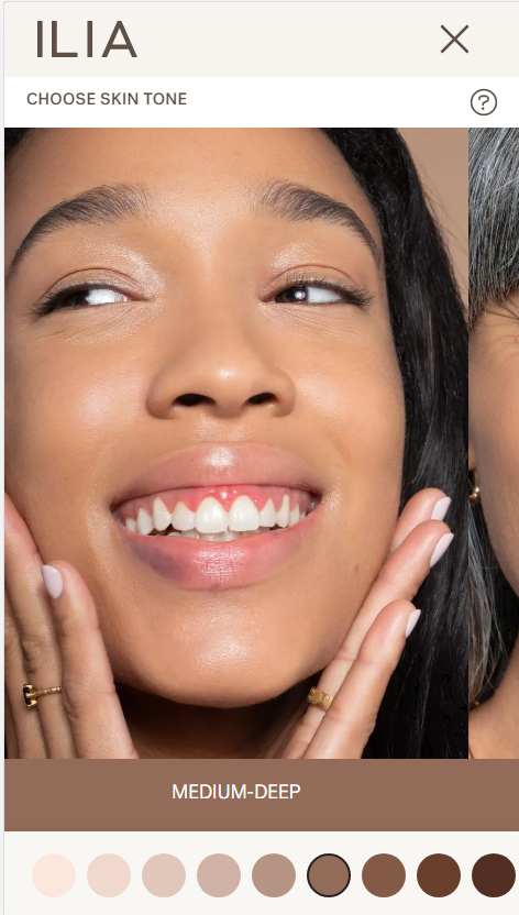
When it comes to the quiz, ILIA offers both colors and multiple images of models with those skin types to help customers better find the right match for them. On other sites, we often found just pictures of colors, which can make it hard for customers to relate the shades to their own skin, lending to doubt.
Both ILIA and Dose of Colors allow users to get their quiz results without needing to enter their email. This is recommended, as visitors may not want to give their email at this stage of shopping.
If you’re looking for inspiration for product discovery, whether or not your site deals in beauty, check out ILIA and Dose of Colors for ideas.
Best in Class Category Page: bluemercury
Category pages are often quite standard across different industries. Customers come to expect rows of products, a few details, and sometimes filters to narrow down their selection.
For makeup, there are certain nuances that sites need to consider:
- What should the product photos display? (Product packaging, container, shade)
- How large do the photos need to be to convey enough detail?
- How much information does each product need?
- What types of filters are necessary?
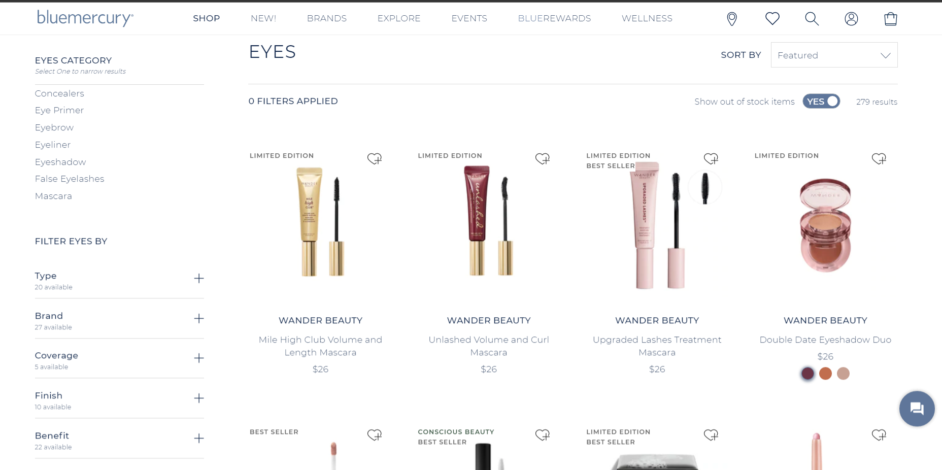
Despite coming in 3rd place for our homepage selection, bluemercury is our Best in Class pick for their category pages.
Our biggest piece of praise is around the amount of information displayed on the pages without being overwhelming. Here are all the bits of information you can find on these pages:
- Whether or not an item is in stock
- Type of product (Best seller, limited edition, conscious beauty)
- Rating and number of reviews
- Color variants of the product
- Number of filters applied
- Plethora of useful filters (11 for eye category)
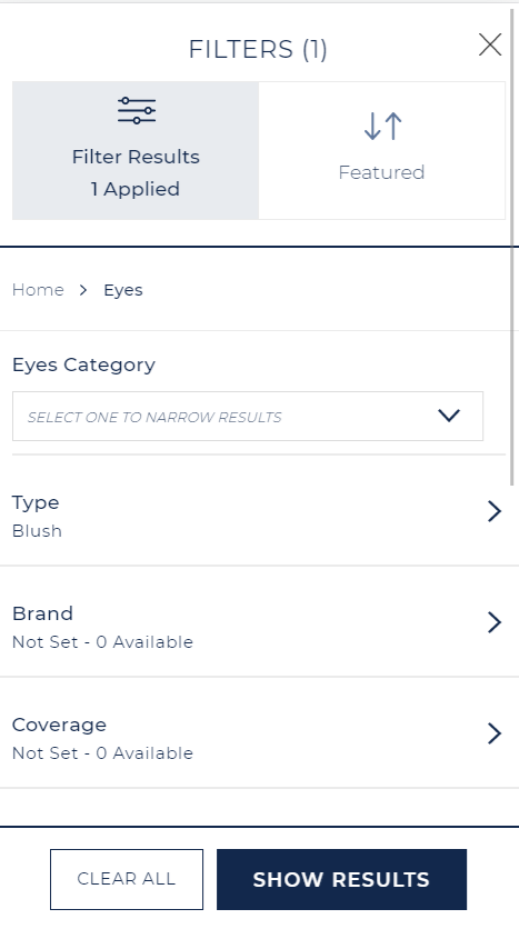
Even with all of that information, the pages do not feel overwhelming or cluttered.
Another nice feature is that visitors can easily add items to their wishlist and worry about creating an account later. Many sites try to get users to create a wishlist right after adding their first item, and visitors can often abandon that creation because it takes them out of their browsing journey.
All of these touches combine to make bluemercury our Best in Class pick for category pages.
Best in Class Product Page: ILIA Beauty
Product pages need to do a lot of things for a lot of different audiences. Some visitors are just browsing, trying to get an idea of whether they want to consider the product. Others are in the final stages of deciding if they want this item or not. These audiences all need something different from the product page to give them the confidence to purchase.
When it comes to makeup products pages, our top pick is….
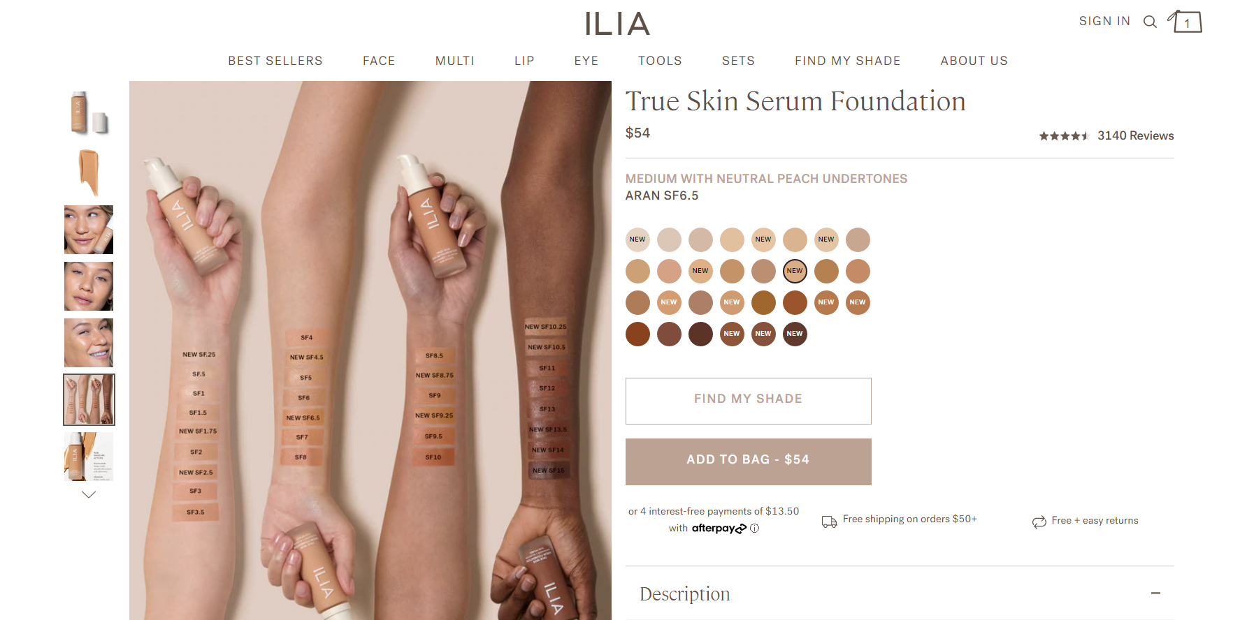
Their product page features basic information on the surface, but as you dig deeper you see more details that will help customers really feel comfortable in their purchase.
For example, their foundation product page showcases an image in the gallery that has the different foundation tones on different skin types. This can help customers better visualize the colors.
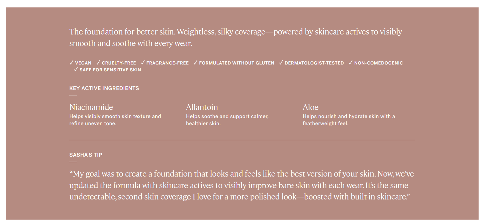
Each product page also features this helpful section that contains information on the active ingredients, the type of product (vegan, dermatologist tested, etc.) and a tip about the product.
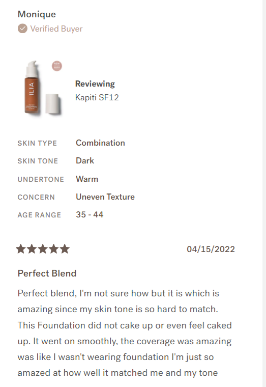
Lastly, the reviews section prominently features photos from customers. The individual reviews have details about the product purchased and about the reviewer. This helps put the review into context that makes it more relevant for the customer reading it.
ILIA Beauty provides a level of detail in such a deceptively simple-looking product page.
Best in Class Cart: BEAUTY BAY
The cart page can often act as a storage spot. Customers come to the site and browse, saving items to their cart that they want to review later. A useful cart overview can be important, especially for beauty stores, where visitors can tend to purchase more than one item.
When it comes to the cart, visitors’ chief interest is knowing what is in their order and how much they’re going to be paying.
After scouring dozens of sites, our pick for Best in Class cart is BEAUTY BAY.
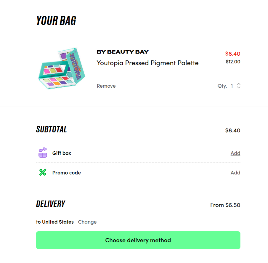
Their cart page is as simple as it gets. Visitors get a clear indication of what’s in their cart, including an image, the price, and whether or not it’s on sale.
The subtotal also features a delivery estimate and the ability to add a gift box or promo code. Visitors can easily get an estimated delivery charge to other countries straight in the cart.
The call to action is also quite clever, as it doesn’t mention checking out, but instead asks visitors to choose their delivery method next. This is a smooth transition from the cart right into the checkout, and doesn’t feel like a large decision.
Best in Class Checkout: Beautylish
Our last category is the checkout. This is where all the effort of the other pages culminates in a, hopefully, friction-free checkout experience.
Beauty stores are no different than most other ecommerce verticals in the need for a quick checkout process. Customers should only be asked what is necessary, and shouldn’t feel the need to leave the checkout due to doubts or uncertainties.
With that said, our Best in Class pick for best checkout is: Beautylish.
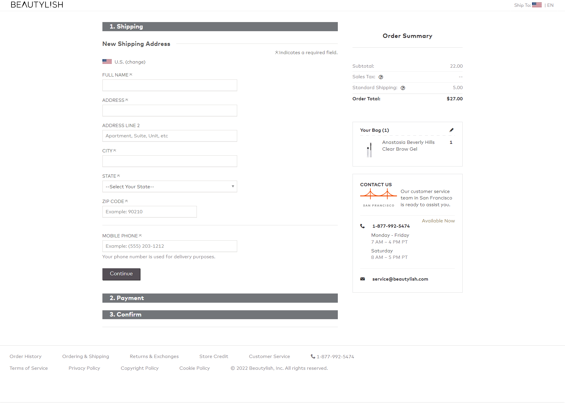
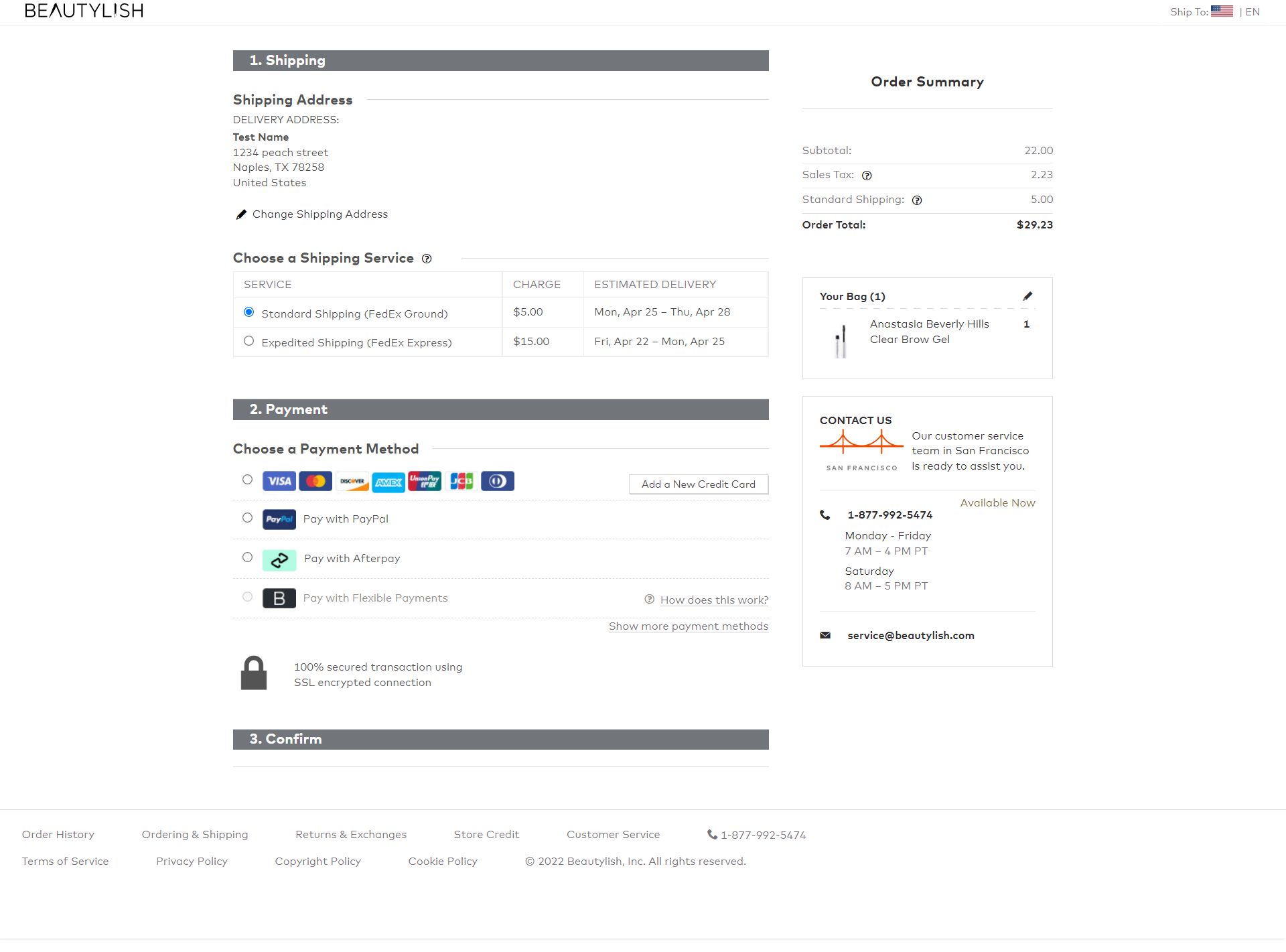
Beautylish has a unique accordion-style checkout that makes the process feel easy and quick.
When you first see the checkout, you can immediately get a feel for the steps you’ll need to fill out. The page does not feel overwhelming, despite showing the order summary and contact information.
Once the customer information is entered, the next steps display: shipping and payment. The shipping step reminds visitors what they entered on the prior step and selects the cheapest option by default.
The payment methods are very clear. Even the Flexible Payments option has a tooltip to provide extra details, but only for visitors that are considering that option so as not to distract others.
The contact info on the side adds a sense of trust, even if visitors aren’t needing to call. The checkout is very efficient and provides just enough detail to make a customer feel comfortable.
That wraps up our Best in Class: Beauty ecommerce selections! Many hours went into researching different stores across the industry, but that still doesn’t mean we could view them all. Be sure to sign up for our newsletter, as we’ll likely revisit this industry in the future and will have upcoming Best in Class features too.

