8 Tech Innovations To Transform Your Ecommerce Apparel Site
Calling all apparel retailers: you know that feeling when things are going well with your ecommerce site, but you know they could be going better? Perhaps you’ve solved your biggest issues. You no longer get customer complaints about site issues. People can find what they are looking for and check out. Yet, now that you’re sailing calm ecommerce seas, how can you grow your business? What site improvements can you make next?
You’re working in an industry that is transforming all the time. Customer expectations continually change. Plus, the tools to serve those expectations keep getting better. To help you navigate the options for fashion site improvements – and to stay ahead of your competitors – we’re going to share 8 apparel sites that are leading retail technology. We hope these examples inspire you to see what you could do next to keep improving your onsite customer experience.
1) Product Description Innovation: The Feel Guide from Lou & Grey
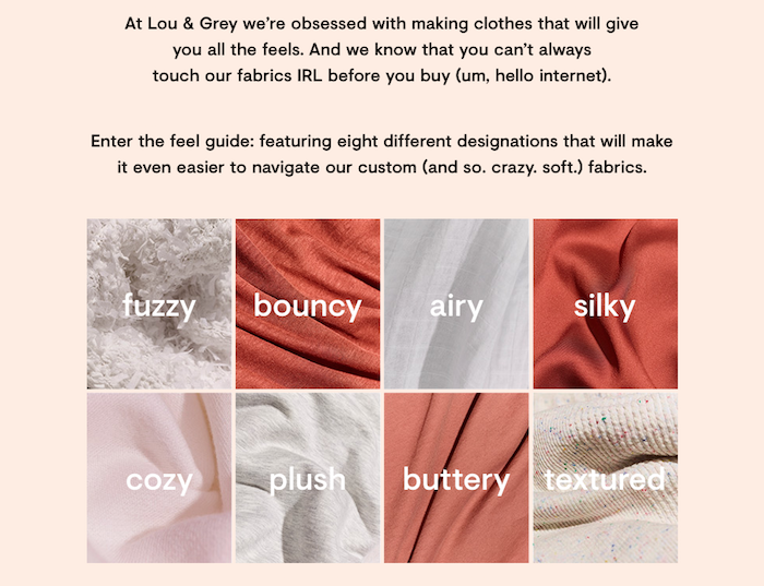
As we’ve discussed, more people are buying clothes online than ever before. There are a few reasons for this, and an important one is that ecommerce retailers are communicating better about their apparel. Lou & Grey gives us a super creative example of this with The Feel Guide on their site. Not only can a shopper navigate by product category, e.g. shorts, shirts, or pants, but they can also shop by descriptions of how the fabrics feel.
When I click on the Lou & Grey Striped Softserve Linen Shirttail Tank, the product description includes a Feel description. In this case, it’s Airy. The tank is 100% linen, and product explanation helps assure me that it will be a soft, flowy linen, rather than stiff and scratchy. Airy is in contrast to other descriptions like Bouncy which is “stretchy and made to move.” This is a company that loves their fabrics.
One last thing: I’d love to be able to shop by fabric. For example, if I’m looking for a pair of fitted pants, I’d like to see all the pants made from Bouncy fabric. They’ve done such a nice job of defining all the fabrics that now I want to navigate and shop by each fabric, too.
2) Custom Fit Finder: Helly Hansen
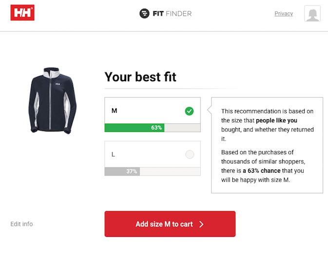
Apparel sites are also converting more buyers because they’re helping online shoppers find the best fit. As I shop for the W Coastal Fleece 2.0 on Helly Hansen, the site offers me a Fit Finder right below the listing of standard sizes. After I open the Fit Finder, it asks me a few simple questions, including height, weight, body shape (narrow, average, or curvy), and preference for fitting (tighter or looser). After I easily enter all my answers, the Fit Finder offers its suggestion: there’s a 63% chance that the medium is my best fit. I can also edit my answers if I want to refine this suggestion.
I like this because I don’t have to sign into an account; the site simply offers this feature. Ecommerce sizing is becoming more precise and easier for shoppers to use. This is an area of strong tech innovation now. Case in point: Nike just announced their new approach to shoe sizing due to come out soon.
3) Accessibility in Fashion Ecommerce: FUBU
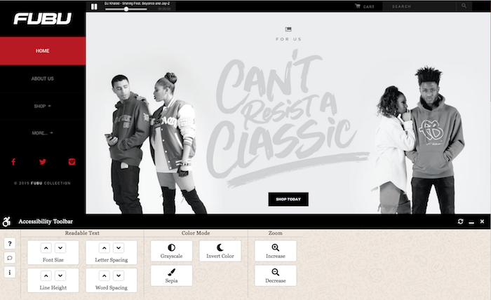
Right from the homepage, FUBU offers shoppers an Accessibility Toolbar to help shoppers browse the site. I can minimize or expand it. When I expand the toolbar, I’m given several options to improve my experience of the site. I can zoom in, make the font bigger, or create more spacing between lines of text. If I don’t like a change, I can reset any webpage to its original settings. How cool is that?
FUBU shows that they value ecommerce accessibility right from the start of my shopping experience. Not only are they helping people, but it’s a good business practice, too. At any given time, approximately 12-19% of the population is living with a disability. Online shopping is one of the great conveniences of modern times, and it should be available to all.
Disclaimer: The Accessibility Toolbar used here is a plug-in. Before adding any kind of third-party feature, it’s crucial to know how it will function with the rest of your site. I’m not suggesting that retailers should upload a plug-in and call it a day. Rather I’m cheering on FUBU for their attention to accessibility. From there, I suggest an ecommerce accessibility audit to arrive at the best solution for your business.
4) Shopping Meets Service: Rockets of Awesome

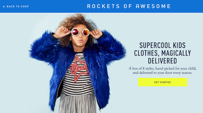
Have you ever witnessed a kid having a meltdown at a clothing store? Yeah, me too. It’s not easy to shop with – or for – little ones. Nevertheless, growing bodies continually need new clothes, plus it’s fun when they find stylish outfits to express their emerging personalities. Rockets of Awesome answers this need with a fantastic collection of children’s clothing – and the site is super easy to navigate.
But that’s not all. Rockets of Awesome saves parents from that all-too-common store meltdown. The company offers a subscription service that delivers eight new outfits for your child at the start of every season. To sign up, parents answer a few questions about sizing and favorite styles. The retailer then assembles a box of clothing to be delivered. Parents can review and approve every outfit before the shipment goes out. If something still doesn’t work out after a child tries it on, parents can return the garment for free.
Subscription services are excellent tools for ecommerce personalization. In the case of Rockets of Awesome, not only are they going to be able to build long-standing customer relationships through their subscriptions. They are also helping parents easily buy clothes and avoid in-store meltdowns.
5) Close Up Shots Without Zoom: Buck Mason
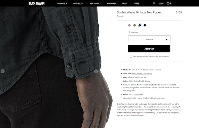
A while back, fashion ecommerce picked up a bad habit: the photo zoom tool. Every now and then it works fine, but too often, it’s jumpy and clunky. Buck Mason allows customers to see product detail in their photos in a much better way. For instance, see how it’s done with their Atlantic Double Weave Vintage Two-Pocket Shirt. I’m easily able to flip through the photos, starting with overall photos that show product fit and overall styling. As I advance through the photos, the angles become closer. The close-up photos perfectly show product details like stitching, cuffs, etc.
This photo technique is simple and effective. It’s especially easy on a mobile phone, as I can tap and expand photos to see the details even larger. It’s the same functionality I use to look at my own photos on a phone. Here it’s translated to ecommerce, creating an elegant, easy shopping experience.
6) Check Store Inventory via Text: Modern Citizen
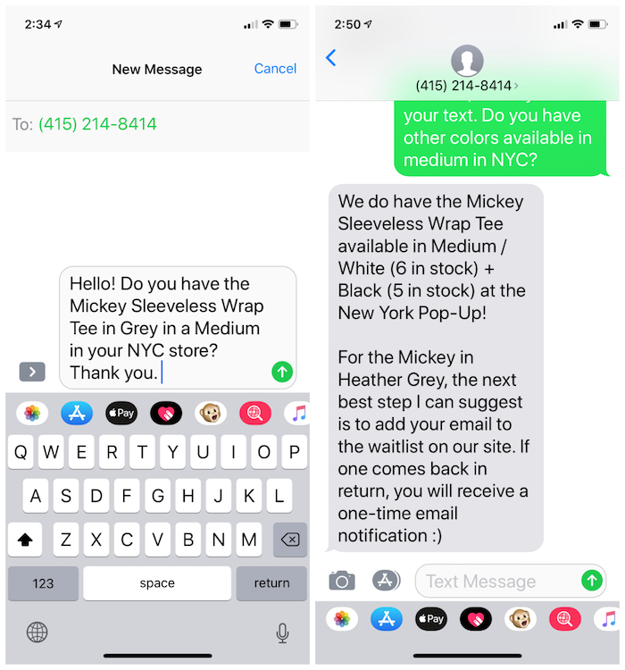
Speaking of mobile shopping, every product on the Modern Citizen site includes a phone number to text “to confirm the item and size you’d like to try are in stock at our San Francisco + New York locations.” I live in New York, and I had my eye on the Reese Short-Sleeve Wrap Tee in grey. I texted the number listed and asked if the t-shirt was available in a medium at the NYC store.
Within a couple of minutes, I received an autoreply saying my text inquiry had been received and to stay tuned. Next, just a few minutes after that, I got a text from a woman named Carol who informed me that they were out of my particular request in NYC. I wrote back asking about other colors, and sure enough, Carol texted me the inventory update. There are several shirts available in my size, in white or black, near me. I learned all this from the comfort of my favorite chair at home.
7) Select Your Model: Good American
One of the most refreshing trends in fashion is the BOPO (body positive) movement. Finally, designers are acknowledging that the human body comes in all shapes and sizes. This is something to celebrate, not hide. Amen. And much like recognizing that people have different levels of ability and offering accessibility, serving different sizes is a smart business decision.
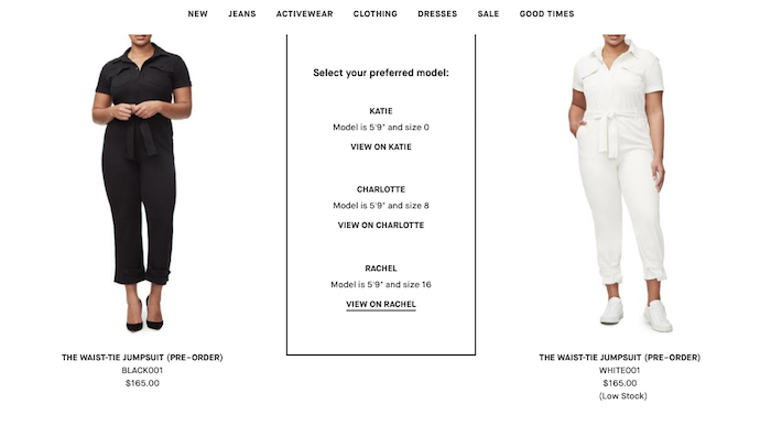
Three cheers to Good American for a really nice, easy way of addressing the range of body sizes on their site. Once I land on a product category page, I’m asked to “Select A Model” based on the model’s size. The sizes start with Katie, who is 5’9″ and a size 0. This is the traditional model size, and frankly, it’s not relevant to many shoppers. So, Good American offers two more options: Charlotte who is a size 8, and Rachel who is a size 16. Both Charlotte and Rachel are 5’9″ tall like Katie.
What I find most impressive about this technology is that it remembers my model selection as I browse different product categories. I get the opportunity to select a new model size every time I go from shirts to pants, for example, but the navigation defaults to the model I’ve already chosen. So smart.
8) Everything Custom: Fame and Partners
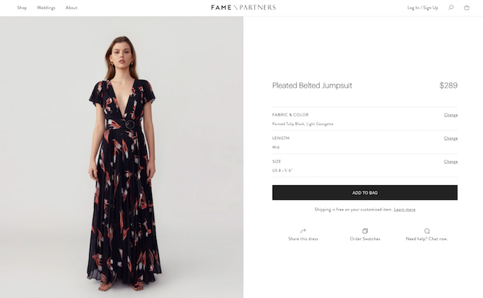
Fame and Partners does the seemingly impossible: they offer a full collection of made-to-order clothing. The garments include everything from casual cotton tops to formal dresses.
Nearly every product offers a wide variety of fabric options, as well as other customizations such as sleeve or pant length. Would you like this top as a V-neck? No problem, just add $10 to the final order. The product customization navigation is super easy to use, and it makes me want to create my whole wardrobe.
What’s also interesting about Fame and Partners is how they handle returns. For starters, they offer reimbursement for alterations up to $50. Secondly, if you decide to return your custom purchase, they will give you a refund. However, they’ll deduct a $35 Zero Waste Fee from the full refund. In their own words, “We charge this fee because we don’t build inventory into our upfront pricing, therefore offering you the lowest pricing possible for made-to-order clothing. Your Zero Waste Fee will help us reduce the impact of excess stock on the environment.”
When I think of how much clothing goes to waste, the Fame and Partners model is intriguing. It’s environmentally sustainable, and given the ease of their site, it can scale to serve a lot of people.
As you can see, apparel ecommerce is an exciting area of innovation. It keeps getting better. Now, what technology can you bring to your site to improve your customers’ experience?
