Mobile Commerce Conversion Optimization: 6 Tips for More Sales on Mobile
The first sales numbers of the 2017 holiday season are rolling in, and they confirm the shape-shifting in retail: online sales keep growing. According to The Wall Street Journal, 11/27/2017, “The number of people visiting U.S. stores on Thanksgiving and Black Friday fell 4% from last year….Meanwhile, online sales increased 18% over that period.” And yet, there’s an even bigger story: the rise of mobile shopping a.k.a. mcommerce. This post is a quick start guide to mobile commerce conversion optimization.
On 11/24/2017, TechCrunch reported, “Purchases made on mobile devices have so far totalled a record 36.9 percent of all sales, and 54.3 percent of all site visits.” With so many shoppers using their smart phones in the buying process, what do retailers need to do to convert mobile sales?
Related: Convert Vs. Divert on Desktop
Today I’m going to walk through 6 bullet points to convert more sales on mobile devices. As you read them, please keep this context in mind: People are shopping with their tablets and smartphones because they already have them in hand. This may seem like an obvious point, but there’s more to it. By using our phones all day, everyday, for numerous things like texting, sharing photos, etc., we assume behaviors in site navigation. By and large, the way we use our phones in our daily lives is how we want to use them in shopping, too.
Desktop online shopping is now in its third decade; however, consumers’ move to mobile shopping is relatively new. As a result, mcommerce still has a “Wild West” feeling to it–some retailers are fully established on mobile, while others have the learning curve ahead of them. Let’s take a look.
1. Set the Right Expectation from the Landing Page
Baymard Institute is an excellent resource for all things mcommerce. For example, check out this article: 42% of Mobile Homepages Risk Setting Wrong Expectations for Their Users.
The researchers at Baymard spent two years studying people shopping on their smartphones. In the process, they learned that 70% of shoppers scroll an entire mobile homepage before advancing to another page. In Baymard’s words, “Most described this as “getting an overview of my options.”
To get a sense of what this means, think about how people log into Facebook or Twitter. We land on the feed and then start scrolling to find out what’s going on. In doing this, we get an overview of the news, family and friend events, etc. Shoppers initiate this same behavior when they land on your mobile retail site. You want the first impression of your site to show the breadth of your inventory.
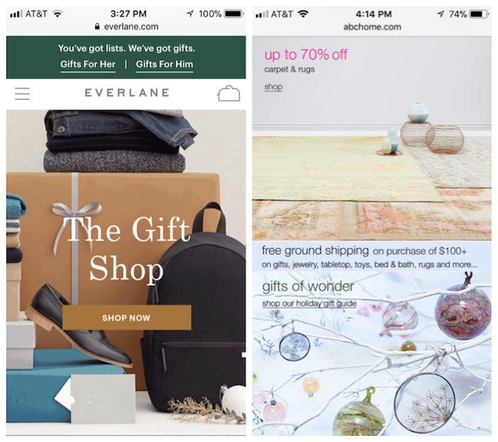
In the case of Everlane, left example above, their homepage visually gives shoppers a sense of their inventory. It’s interesting to note that this isn’t a scrolling homepage. It’s a single screen with the Shop Now button front and center. We quickly grasp that they sell Mens, Womens, shoes, and bags. We can also explore their gift guides easily. Really nice.
In the example on the right, ABC Carpet and Home also gives their shoppers an overview of their inventory. They’ve chosen to go with a scroll, but as the Baymard research shows, most people will start their journey by scrolling. It works. They list a wide range of categories, helping customers to understand their offerings.
In both of these examples, shoppers will be able to quickly gather whether or not these stores sell what they are looking for. The homepages set solid expectations.
2. Mobile Is Not the Time for Pop-Ups
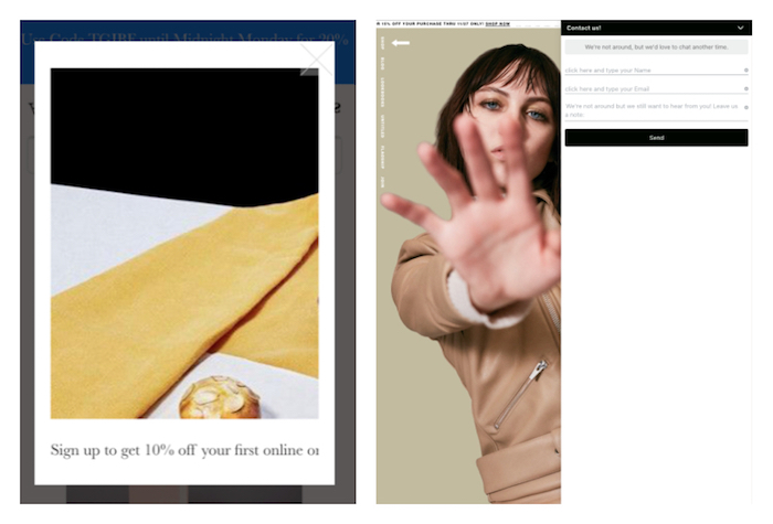
I LOVE beautiful retail sites, but I have to show these two examples to illustrate when pop-ups crash the shopping party. As you see, I’ve cropped and deleted any distinguishing words from these images. In both cases, these are fantastic stores with strong desktop sites. Unfortunately, the product experience does not translate into the sites on mobile. The main culprit? Pop-ups.
In the left example, there’s a pop-up encouraging email sign-ups for a discount. But it interrupts the shopping experience altogether. What does this store sell? At first glance, no one knows.
The example on the right shows another fabulous merchant with a clunky mobile site. Here I clicked on a tiny envelope, and it brought up a Contact Us pop-up. It’s tough to close. I really want to see this store sells, but there’s a pop-up getting in the way. (Also, the navigational categories on the upper left hand corner are too tiny to read. Help.)
The key take-away here is that mobile-responsive sites have limited real estate. Please do not clutter the space with pop-ups. Also, mobile shoppers are often on the go. This isn’t the shopper who has poured himself a cup of tea and is now going to browse sites for the afternoon. Pop-ups on mobile create glitches–and shopper frustration.
3. Product Pages: Let Shoppers Pinch and Grab Photos
As I mentioned at the start, mcommerce is gaining in popularity because it’s so convenient–we’re already using our phones. We do dozens of things by habit with our phones. One of which is looking through photos.
In planning the product photos in your mobile store, think about how you show a photo on your phone to a friend over dinner. Often the friend will take the phone, hold it close up, and pinch or expand the image. People do this all the time when looking at photos on mobile devices. Shoppers want do this with product photos, too.
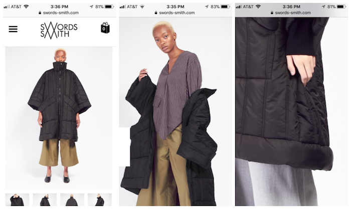
Swords-Smith has a great selection of photos on every product page, and their pinch and grab feature works just like I’m used to with phone photos. The photo on the left shows the product landing page for the Henrik Vibskov Swing Coat. I’m then able to flip through several views of the coat, including the middle image. Lastly, I can zoom in on one of the photos, by expanding the photo, and get a close up on the hemline.
Please note that I’m not advocating for an actual zoom feature that creates a pop-up on mobile. I’m talking about the pinch and grab movement that we all do with our phone photos already–just translated to the mobile store.
4. Product Page to Checkout: Clear Communication Wins More Than Ever
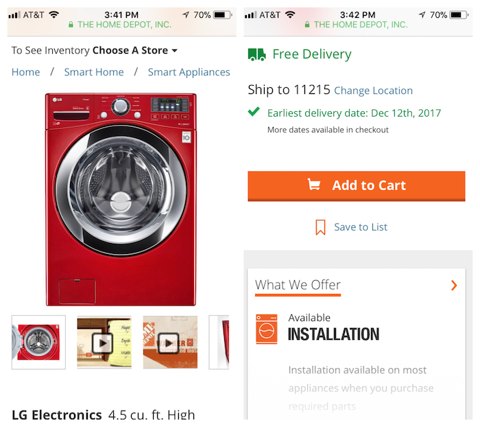
To showcase good communication via mobile store, let’s talk about Home Depot. They do a good job of helping me buy a complicated product. In this case, it’s an LG washing machine in red. (I live in New York City. Let me live this dream.)
For starters, when I land on the product page, I’m able to flip through numerous photos and videos about the machine. I can pinch and grab any image.
Further down the product page scroll, I can enter my zip code to find out about delivery. Then Home Depot clearly states the earliest date for free delivery – nice! And this is followed by a big, wide, orange ADD TO CART button. Please note that the buy button is the width of the screen. I can’t miss it. Nor is it a stretch for my thumb or fingers. I can easily click this.
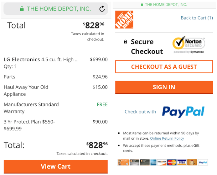
When I add the LG washing beauty to the cart, I’m also given a menu of installation options. Again the communication here is clear and well-paced. After I’ve selected the options I want for the installation, the next page shows me the full tally of my cart. Everything is itemized, including the free warranty that makes me feel like I’m getting a good deal.
After I click on View Cart, the next page takes me to check out. Home Depot does everything right here:
- I can check out as a guest. This is crucial!
- I see the security lock in the URL bar, as well as on the checkout page. There’s a Norton security badge, too. This site is secure.
- PayPal is listed as a payment option, along with gift cards and 7 different credit cards. Retailers want to give customers a range of payment options.
5. One Click Pay & AutoFill Are Mcommerce Friends
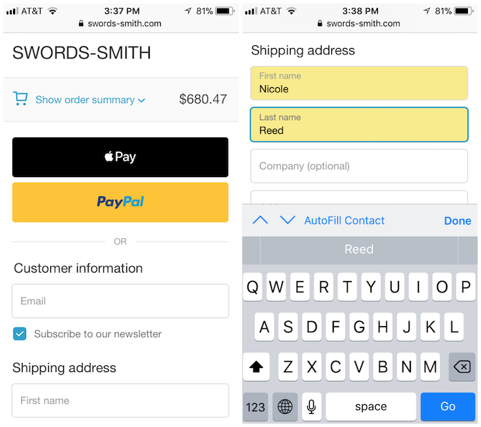
To review the mobile check out, let’s return to the Swords-Smith store. As you see above, I’ve placed my order in the cart. I can click open the summary to see my swing coat. Then – and here comes the exciting part – I have the option for one-click payment! This makes mobile buying so easy. Here I have the Apple Pay and PayPal options. Keep in mind that if you’re on Shopify, your customers are also able to one click pay through Shopify Pay. These services expedite mobile payments. As mobile shopping grows, so will the use of these one click options. I’m all for it.
Also, if I’m going to pay long form (not via one click), I really appreciate AutoFill. My phone will suggest the entries, but it’s up to retailers to allow for AutoFill. This isn’t complicated on the back-end; please make sure your customers can use this super easy function in your store.
6. Show Shopper Progress at Checkout (Think Accordions)
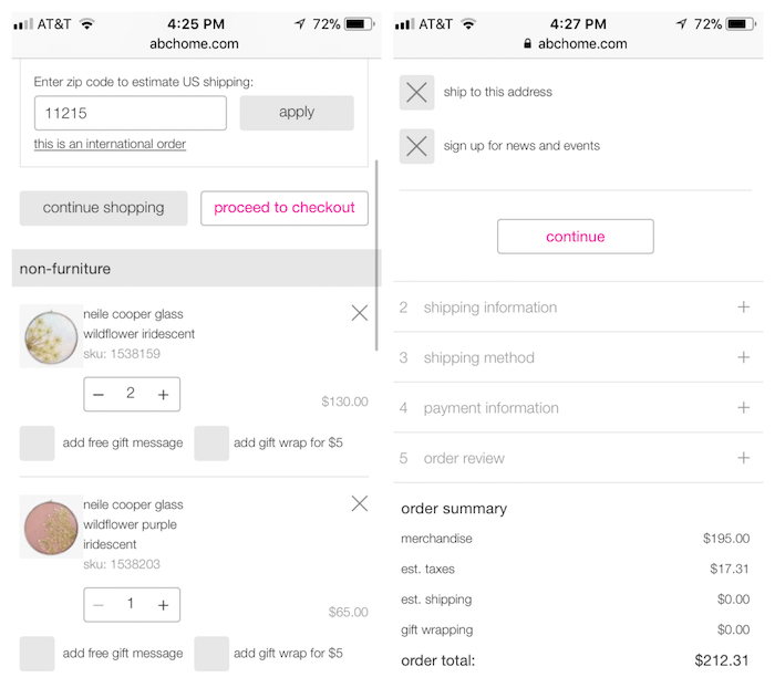
On the final note about optimizing the mobile store, I want to share another aspect of the ABC Carpet and Home site. I like the way they show a lot of steps and information in a small amount of space.
First, on the left, they offer a shipping calculator. I’m not going to get surprised by the shipping costs at checkout. (This is one of the leading reasons customers abandon online shopping carts, so it’s important to communicate shipping costs early on.) Also, the page nicely itemizes my order. I can add or subtract products, as well as gift options.
Then, as I proceed to checkout, they show me the steps ahead from beginning to end. Progress indicators are just as important on mobile as they are on desktop. Here I’m going to be able to auto-fill my shipping information, select the method, and enter my payment. I know where I’m at every step of the way.
On behalf of Command C, if you want more mobile conversions for your store, we want to help. As eMarketer reported just today, Holiday Shopping Data Shows the Mobile Shift is Accelerating. Let’s get your business in front of the curve.