5 Best in Class Furniture Ecommerce Sites
Shoppable Instagram
To buy furniture, we used to be forced to spend a weekend going from showroom to showroom sitting on couches, opening drawers on dressers. Gone are the days of needing to deal with slick salesmen and driving all over town.
The furniture space has moved online and consumers are getting more and more comfortable ordering everything from mattresses to rugs online.
With the shift to ecommerce, furniture sites continue to innovate. Whether it’s using augmented reality to make consumers feel more confident about whether a piece will fit in their home or 2D renderings to see how one of hundreds of fabrics will look on a couch, stores are adding more features to help customers buy online.
In this latest iteration of our Best in Class series, we took a look at the furniture space to find top ecommerce stores you should be paying attention to. Even if you’re not in the furniture industry, you can still likely learn a thing or two, or get inspiration for your own store.
Homepage
The homepage is often the most visited individual page on a store. It needs to cater to all types of visitors, whether they know about you or not, have shopped with you once or ten times. It can be tricky to get the content just right on the homepage. You aim to editorialize, to make the content unique, but you also want the staples to be featured (about us, value proposition, etc.).
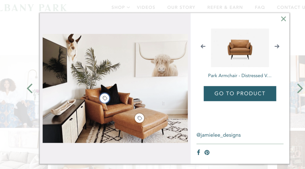
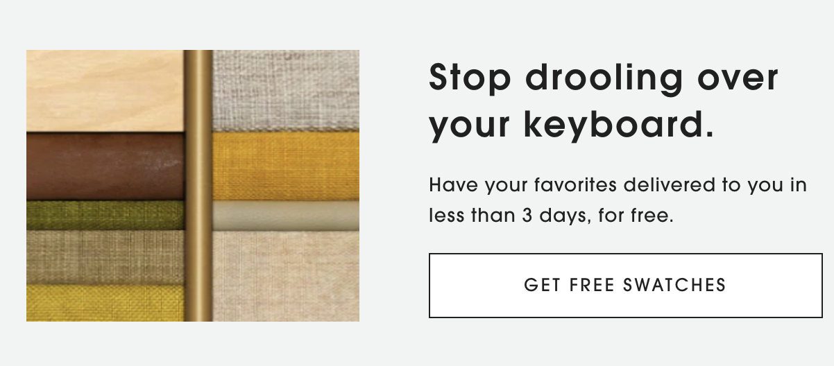
In our search for the Best in Class homepage, we chose Albany Park.
Albany Park is known for its easy-to-assemble, comfortable furniture. They make that very clear on their homepage in a few different sections. This helps new visitors understand how Albany Park is unique from the dozens of other furniture stores they might be browsing.
Aside from these differentiators, the homepage also features additional information on why they’re better than the competition, as well as social proof including testimonials, press logos, and photos from past customers.
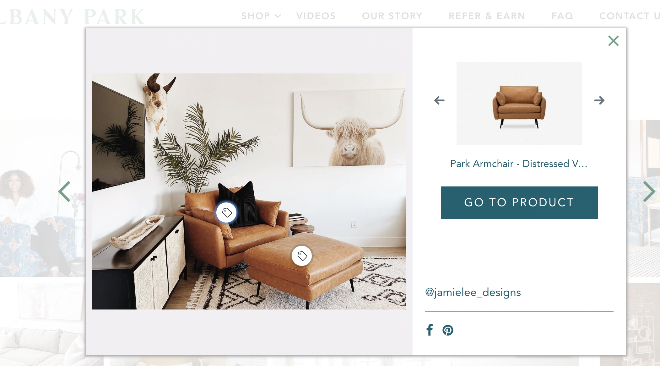
The Instagram section offers the ability to see products in context, as well as shop those items by clicking on the photo. This makes it very easy for customers to jump right to that product page, rather than having to hunt for it.
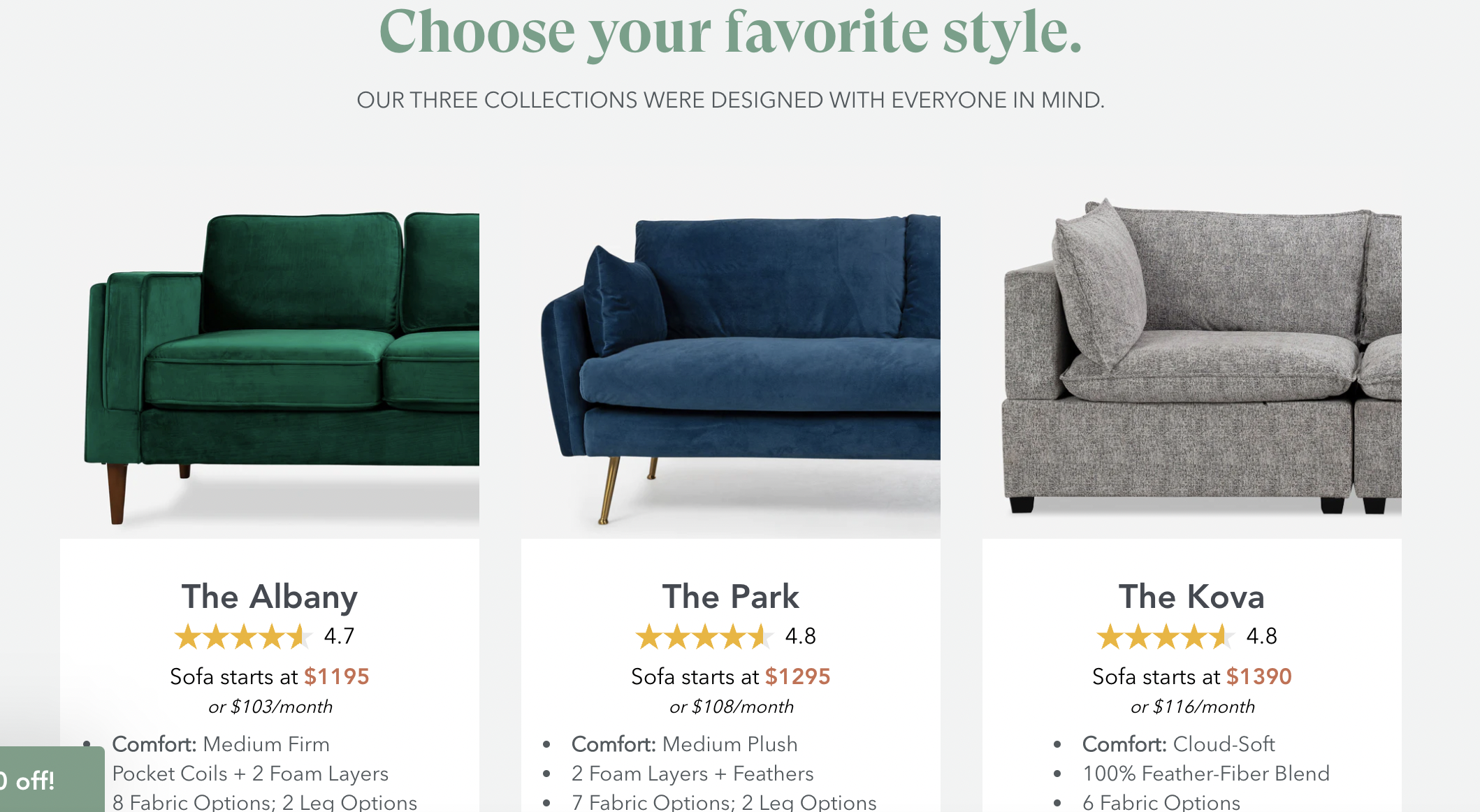
Aside from shoppable Instagram posts, the first section below the hero image features 3 styles to shop from. This can help customers jump right into shopping, since they only need to decide between 3 options rather than dozens.
Category Page & Search
Category pages don’t often see as much innovation compared to other page types. But that doesn’t mean there aren’t any unique category pages in the furniture space.
During our search, we kept coming back to The Inside, our pick for Best in Class category page.

Their site focuses heavily on customizing furniture with over one hundred fabric styles. Rather than just communicate those options on the product page, they do so also on the category page. As you scroll through, whether on mobile or desktop, you’re able to easily access the fabric patterns and see each product offering update with the one you selected.
This makes it much easier for customers to compare products.
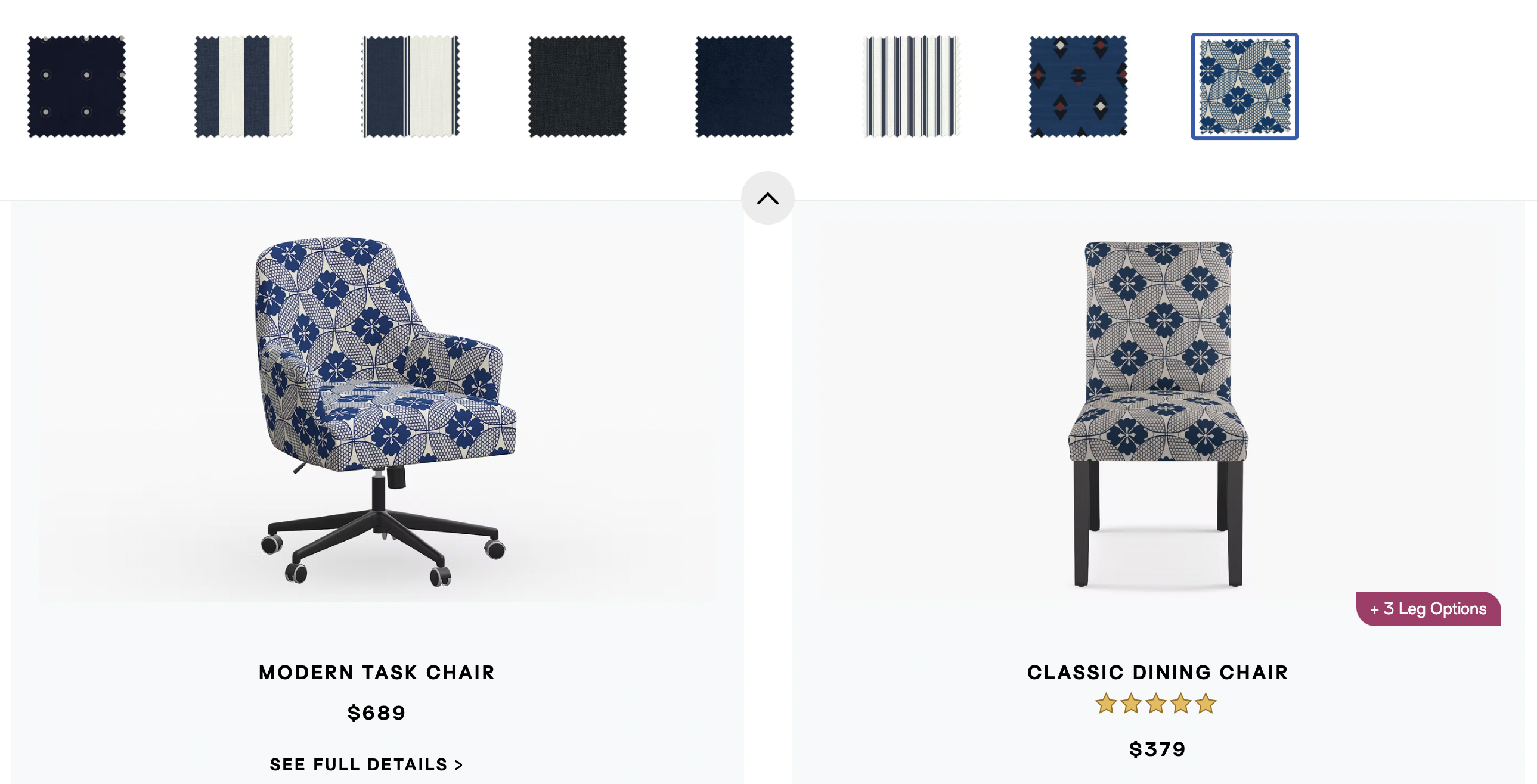
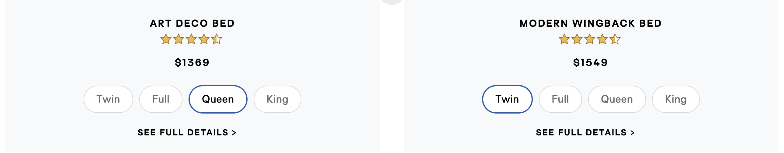
The products also communicate whether they come in different sizes or have other options. For products that come in certain sizes, like beds, you can toggle between the sizes to see the prices.
This category page does a great job of communicating the important details visitors are looking for, while making it very easy to compare pieces against each other without needing to “pogo stick” between product pages.
Product Page
The product pages of different stores vary widely. It’s amazing to see the creativity that goes into these pages and how designers and marketers choose to present similar information in such different ways.
After browsing dozens and dozens of furniture store product pages, we chose Inside Weather as our Best in Class Product Page.
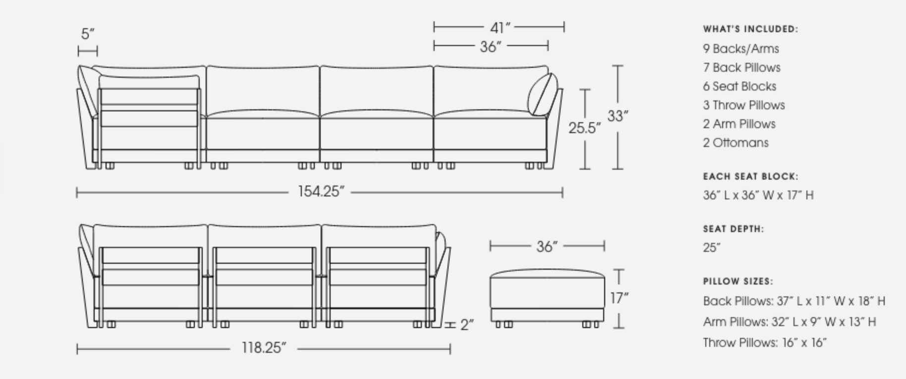
Their page features the staples that customers expect: large product photos, information about shipping and returns, reviews, and dimensions. But they also provide more detail than many other product pages we viewed.
Their dimensions are listed but also illustrated, making it easier to understand the measurements. Visitors can also request swatches of the fabrics, which likely helps them feel more confident to purchase such an expensive piece.
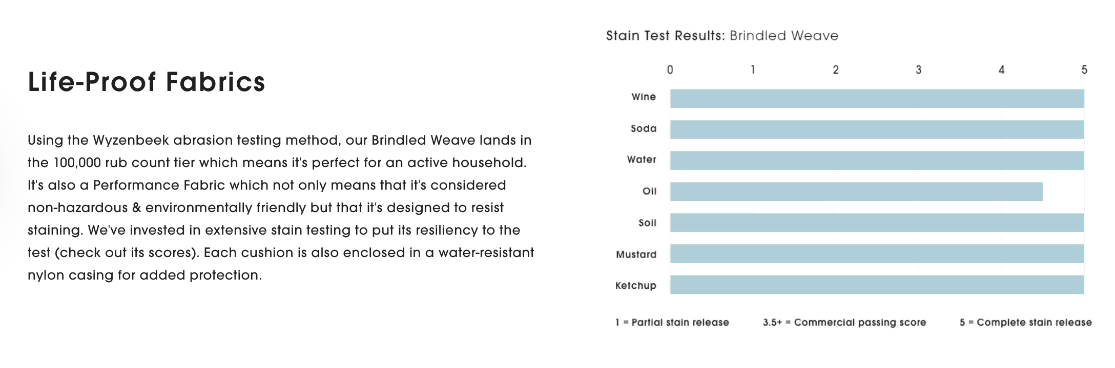
There are also details on such things as how stains affect the fabric. This was not something we saw on other stores.

Even for customers that might be caught up on selecting color options, they feature “Designer’s Picks” to help with that decision.
This product page anticipates many customer questions and holdups, and helps to address those, while still providing all the information someone needs to decide to purchase.
Cart
When it comes to the cart, we’re seeing a trend in stores moving to side carts, rather than full cart pages.
We chose to highlight one of the side carts that provided the right balance of information needed in order to checkout, as well as additional information that is useful but secondary to checkout.
Joybird is our pick for Best in Class Cart.
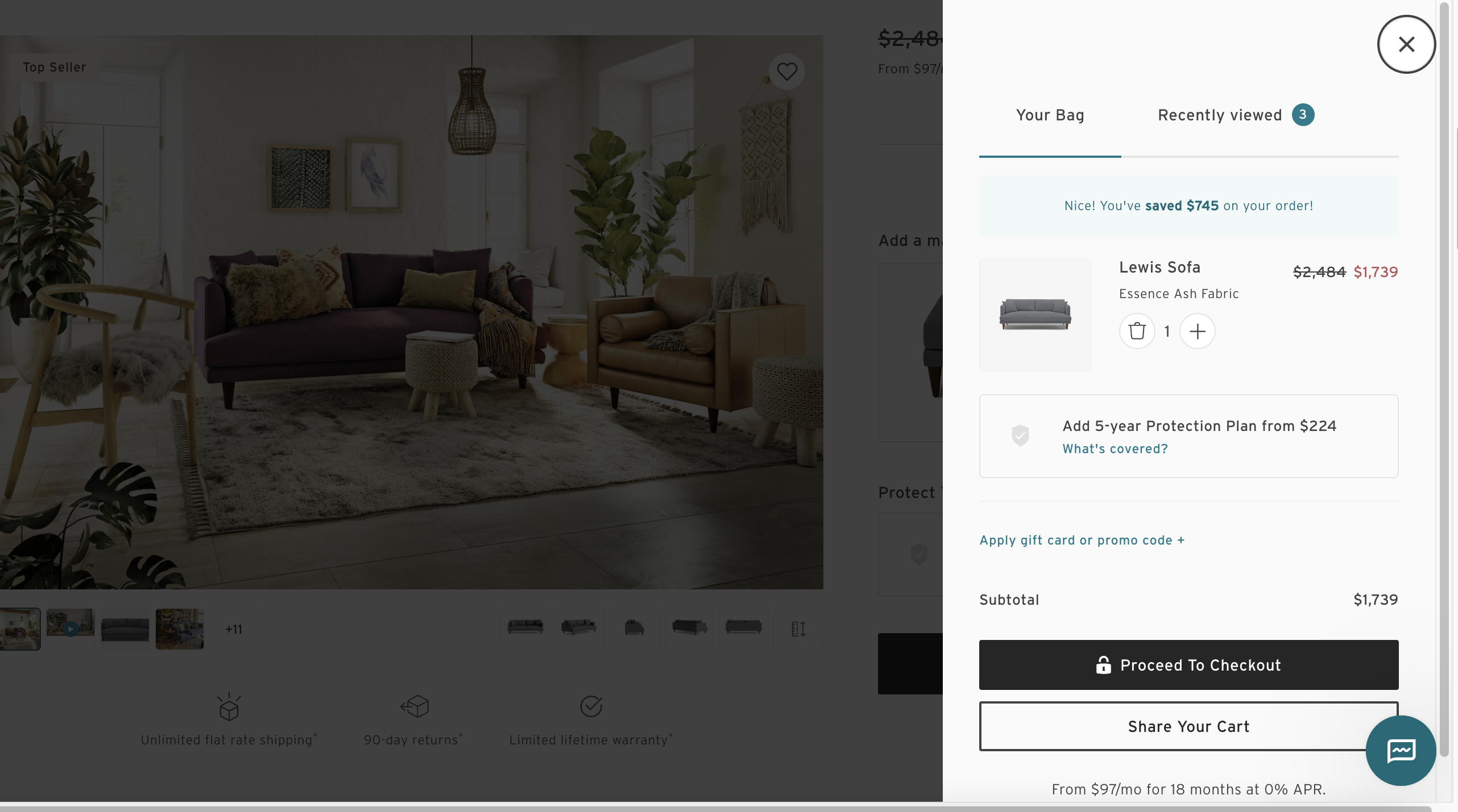
Their side cart features two tabs at the top: Your Bar and Recently Viewed. This allows visitors to firstly focus on their current order, but also to browse other items they looked at. This is a useful feature to test on your own side cart to try increasing AOV.
The cart focuses the customer on their item, reminding them of the price and options they selected. There is additional information like financing, adding a promo code, getting a protection plan.
There’s also a small callout if the item was on sale, to remind the visitor they’re saving on their order. This could likely help motivate them to continue with their purchase.
Another helpful feature is the “Share Your Cart” button. Clicking this lets you add a friend or family member’s email address so you can share the item with them. This is useful since a piece of furniture is a large purchase usually discussed with a partner or roommate.
Joybird’s cart is serving up the right amount of information to get a visitor ready to checkout, without forcing them straight into a separate cart page. Consider testing a side cart for your store, if you haven’t tried one already.
Checkout
The checkout is where a store can make or break a sale. If the checkout has a bug, is slow, or confusing, a customer will stop their purchase. An ideal checkout is streamlined, with only the fields and steps necessary to validate a purchase.
We went through multiple checkouts and landed on Burrow as our Best in Class checkout for furniture stores.
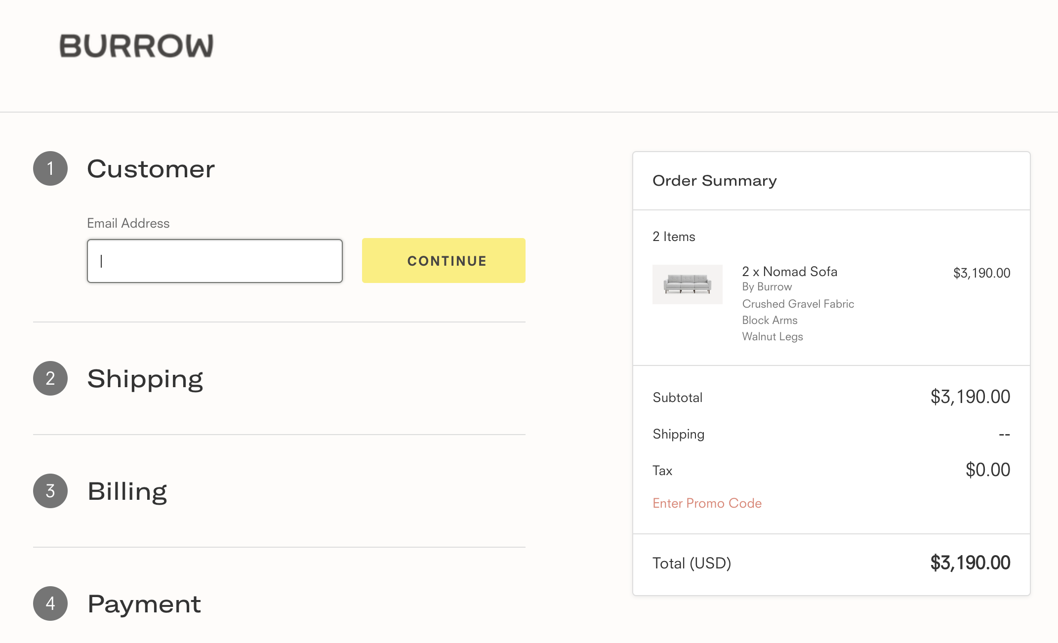
We loved the simple layout when you first land in the checkout. This makes it feel like the checkout process is going to be fast and easy. You can see the steps needed to be filled out and are not overwhelmed by too much information at once.
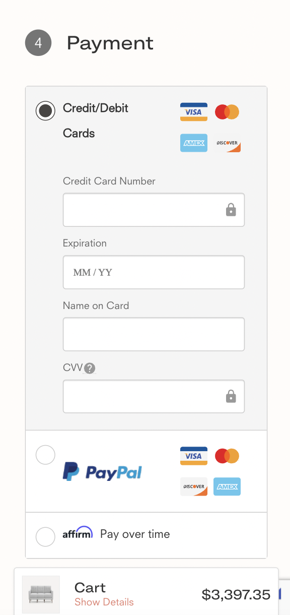
Customers don’t often like filling out mobile checkouts. The screen feels very small, it’s easy to tap the wrong thing, or make an egregious mistake. But Burrow’s mobile checkout experience feels like a breeze.
Fields that should be defaulted already are, including showing the credit card payment option by default and making the shipping address equal the billing address. The address field starts to pre-populate with suggested addresses, making it so you won’t even need to type a street, city, state, or zip code.
Although nobody enjoys spending money, going through Burrow’s checkout process at least made the process friction-free and simple which is not something that can be said of all ecommerce checkouts.
That’s it for this article! We covered trends across the furniture world like the increase in side-carts rather than separate cart pages, shoppable home pages, and highly detailed product pages. We hope you got some inspiration from these Best in Class stores.
If you have an industry you want us to cover or have an idea for an article you’d like to see, reach out to us!