Best in Class: Footwear Ecommerce Stores
Clove's desktop product page
It used to be that you could only get shoes at the mall or a department store. But with the rise of free returns and new brands, buying footwear online has become second nature to many consumers.
Selling footwear online presents unique challenges, including:
- Reducing visitor doubts about sizing
- Presenting enough information to convey quality, comfortability, and other features
- Allowing customers to see how the shoes can be styled
In this edition of “Best in Class”, we will present a few high-quality websites in categories from home page to the checkout.
Take a look at these sites, even if you’re not in the footwear industry, these examples can help provide inspiration across your store.
Best in Class Home Page: Allbirds
A home page is all about blending elements that speak to both new and returning visitors.
When it comes to footwear, a great home page needs to help customers understand why this particular brand is different from other brands. It also should be presenting a variety of shoes the company offers, especially if there is breadth to the collection.
After studying dozens of footwear home pages, our “Best in Class” pick is: Allbirds.
This is one of the first DTC footwear brands to break into the scene. Even though many consumers likely have awareness of the company, the home page still presents a good mix of shoppable products and categories, as well as content about the brand.
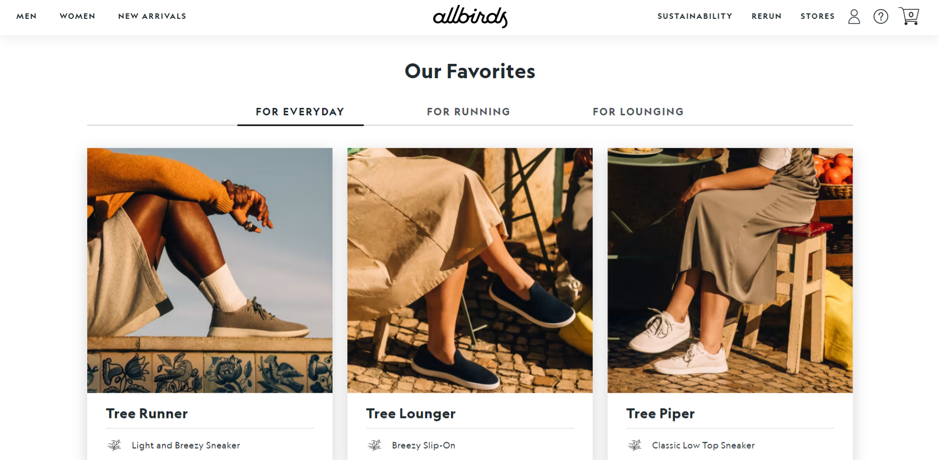
The “Our Favorites” section on the Allbirds site is unique in that there are tabs for 3 different categories. The products feature stylised photos rather than product-only images. This way customers can imagine themselves wearing the shoes.

Further down on the home page, there is content around how Allbirds is helping to reduce their environmental impact. This information can be useful for both new and returning visitors, to help them feel better about buying from the company.
Check out Allbirds’ home page to see how your store can integrate editorial content and shoppable items, without the page feeling overwhelming.
Best in Class Category Page: Tecovas
Across ecommerce stores, category pages are generally quite standard: photos of the product, ratings, price, filters, sorting options.
For footwear, there is a surprising breadth in category pages and creativity across different brands.
Our pick for “Best in Class” category page goes to….. Tecovas.
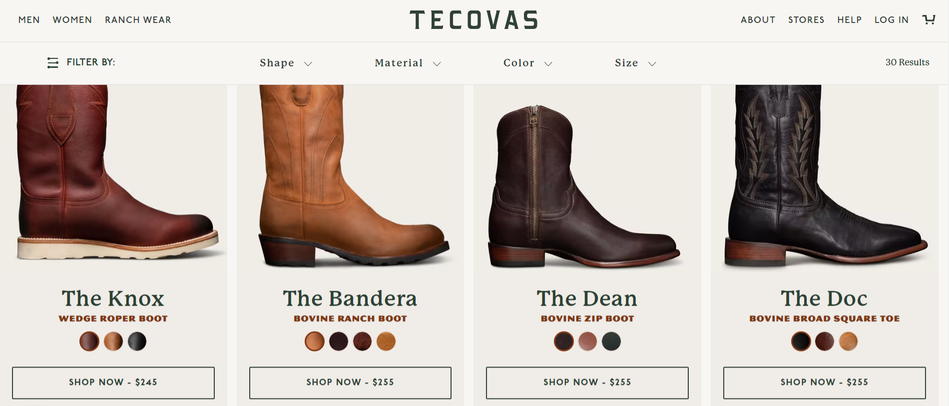
Tecovas is known for their handmade cowboy boots. Now, cowboy boots might feel like a not-so-modern footwear option, but their site is anything but stuck in the past.
The products displayed on each category page showcase the available colors, price, and large photos (with a hover option on desktop to display alternative images).
Where the Tecovas category page really shines is in their filters.
Each page features prominent filters at the top on both desktop and mobile. The filters are very relevant to the categories, including things like shape, material, color and size.
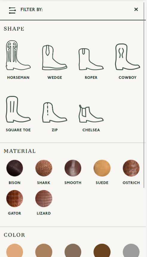
The filters are easy to navigate, displaying text alongside helpful thumbnails to illustrate each option. New visitors who are unfamiliar with the different Tecova styles will find the illustrations for the “shape” very helpful in finding the right selection.
It feels that a lot of thought went into developing the category pages. The Tecovas’ team thought through what questions visitors might ask when browsing the collections, and did a great job helping make it as easy as possible for new and returning visitors.
Best in Class Product Page: Nisolo, Clove
The product page is often where many stores exert most of their effort. A well-designed product page is a balance of just the right amount of information without overwhelming a visitor.
When searching for top-notch footwear product pages, we came across many examples that are standouts on their own.
When it came to selecting our “Best in Class” pick for footwear product page, we were between two options…… and well, we picked them both!
Our two picks are: Nisolo and Clove
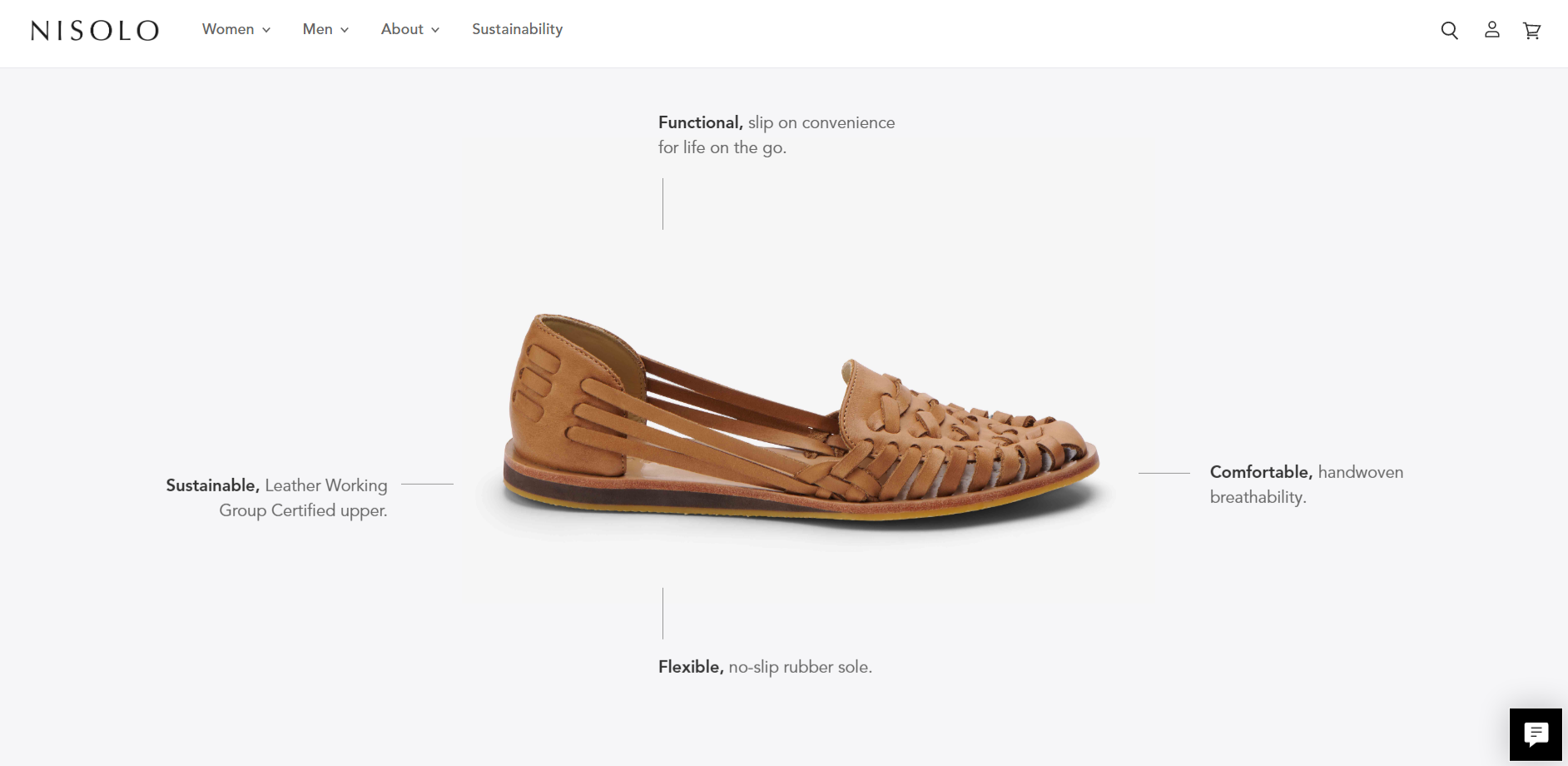
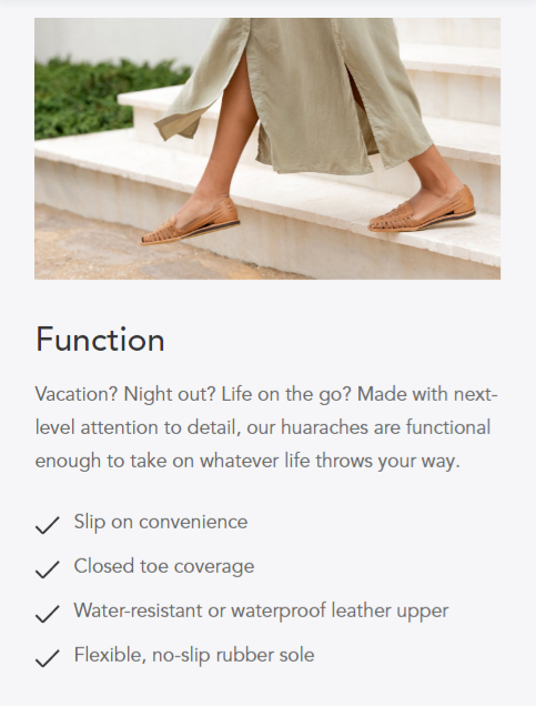
Nisolo did an excellent job of showcasing the features AND benefits of their shoes. Many product pages list out the features of a product, but not many of them translate those features into benefits that can motivate a customer to purchase.
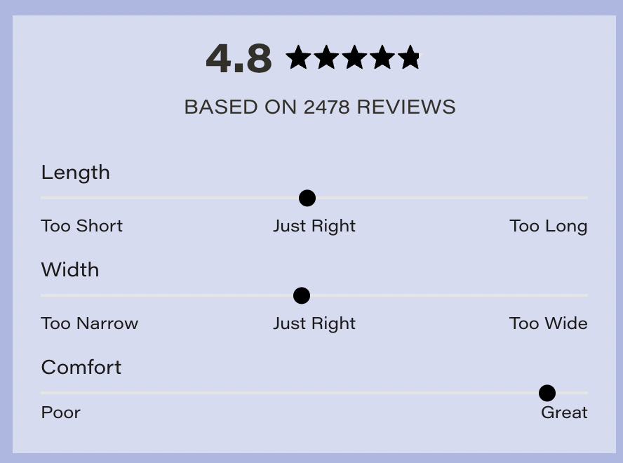
Another key element of any product page is the review section. Nisolo’s reviews offer important details that are relevant to a future customers’ decision to purchase.
Each review features the product being reviewed, size purchased, how the customer felt about the sizing and width, and what they felt stood out about the product.
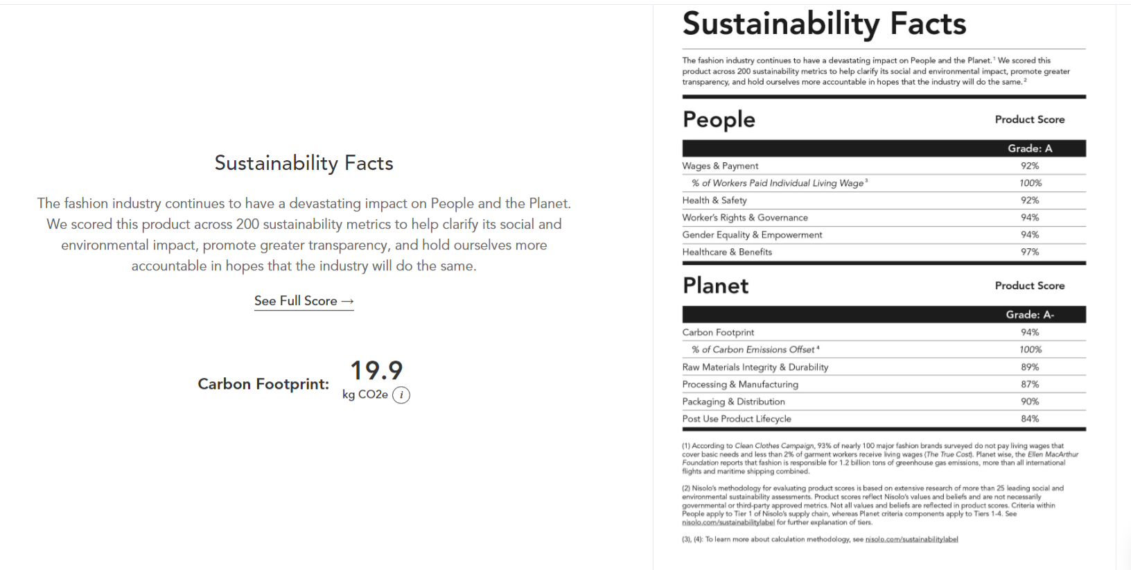
Lastly (before we start gushing about Clove), Nisolo features information about their sustainability. Visitors landing on a product page now have information not only about the product, but also about the company in general and what sets them apart from the rest of the footwear industry. This is key information to incorporate on a product page. Not all customers are going to end up finding your “sustainability” page or visit the home page that features all of these important details that could nudge them to a purchase.
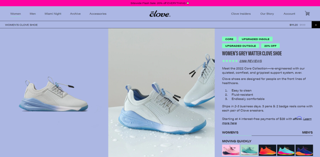
Now onto Clove, a DTC company focused on creating the most comfortable shoes for those in the healthcare industry.

Their product page is bright, loud, and unique. Their core product, shoes for healthcare workers, can feel like a boring product but their website is anything but.
Above the fold, they do an excellent job of providing concise copy that is persuasive. Each color variant has its own thumbnail, helping visitors easily see the different colorways.
But the main focuses on the product page are the photos and reviews. These are featured prominently on the right side on desktop. On mobile, the image gallery is all you can see above the fold.
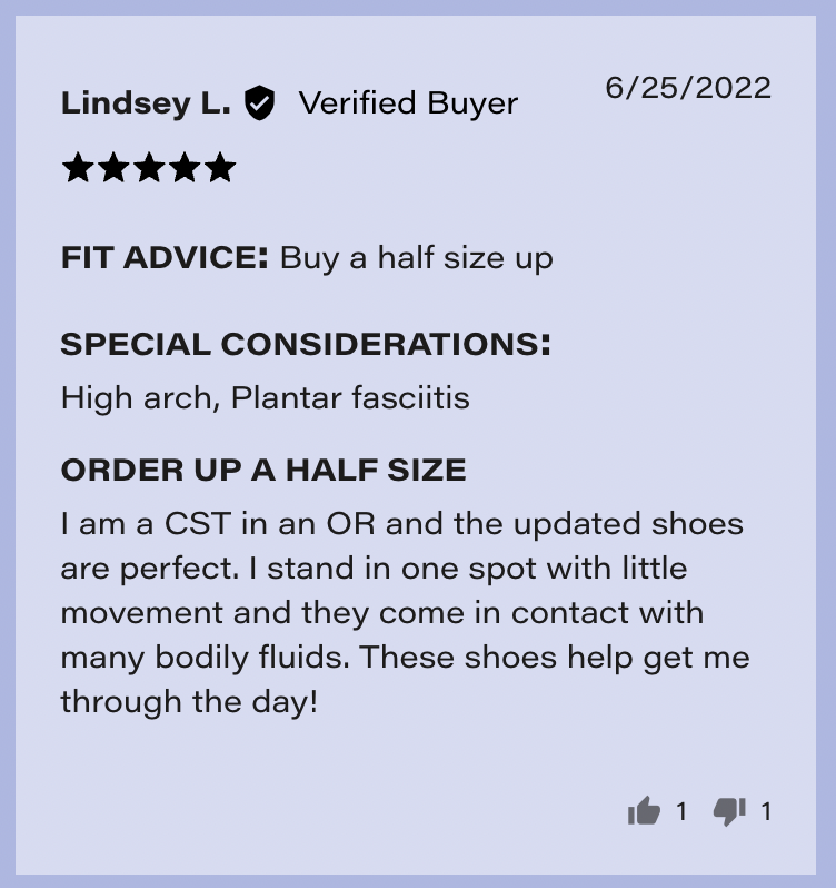
The reviews feature not just the written feedback of customers, but other important details like “fit advice” and “special considerations”. The reviews also aggregate whether customers felt the length, width, and comfort are just right, too short/long/narrow/wide, etc.
These product pages do an excellent job of giving just the right amount of information without being too shallow or too overwhelming.
Best in Class Cart: Cariuma
The cart page used to be a destination nearly every ecommerce customer visited when making a purchase. Nowadays the cart is becoming an optional part of the journey for many stores.
A cart can take the form of a full page, a modal, a side cart, a dropdown. Customers are becoming familiar with each of these experiences.
When it came to looking for carts in the footwear ecommerce industry, we tended to come across more side-carts and dropdowns than actual cart pages.
This style of cart (full cart pages) works well in this industry because visitors are often purchasing just one to two items at a time and therefore don’t need a huge cart summary.
Our pick for “Best in Class” cart goes to…. Cariuma.
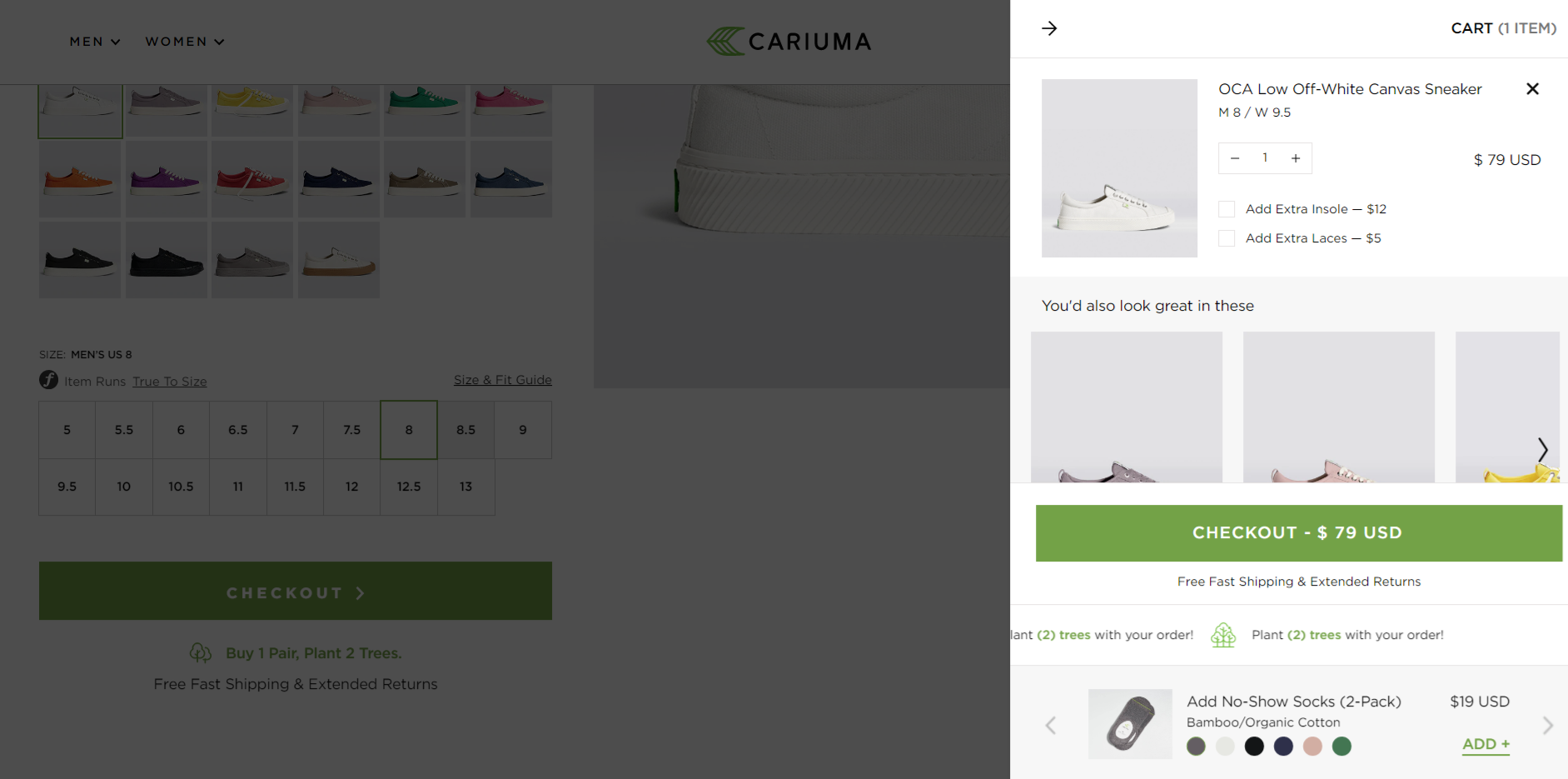
Their side-cart (drawer cart) design did an excellent job of doing everything a cart needs to do, but in a compact design.
The order summary displays a large enough photo that customers can easily verify what was added. There are also key details like the price and size. Visitors can also see other shoes they might like or add accessories like socks.
There are also unique selling propositions displayed that help provide clarity around a customer’s purchasing: free shipping and returns, planting 2 trees for each order.
Check out their side-cart to see how they fit all of this information into a small design without making it feel cluttered.
Best in Class Checkout: Tieks
The checkout page is not the most glamorous part of an ecommerce store, but it is an essential part of every customer journey. And sometimes it can make or break whether someone actually becomes a customer or not.
Our pick for best in class checkout goes to… Tieks.
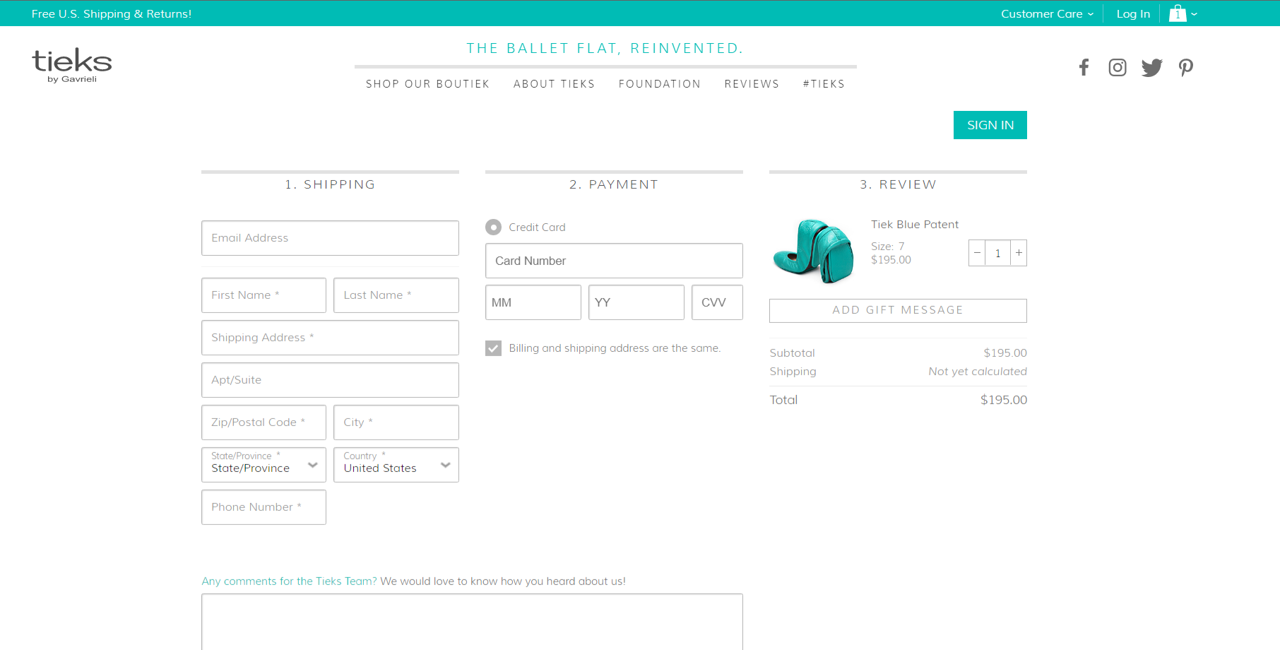
Tieks utilizes a one page checkout, as opposed to multi-page (typically having shipping and payment information separated). Now, it’s not that one page is better than multi-page (this is something to be A/B tested), but it is a feat to provide a one page checkout that does not feel overwhelming.
Tieks’ checkout on mobile and desktop is easy to fill out and does not ask for more information than is needed.
An interesting point is that Tieks only accepts credit cards, no other payment option is available in the payment step. This can reduce the amount of information shown in the checkout and also removes the need to decide between options.
The genius of this checkout is the lack of distraction and decisions that need to be made.
That wraps up our Best in Class series on footwear ecommerce stores! Hopefully you got some interesting ideas to test out on your store or inspiration to try something new.