The Trump Shop vs The Clinton Shop
They are both in the 1%. They both live in NYC. Their hair even looks the same from behind! But Donald Trump and Hillary Clinton have noticeably different ecommerce shops.
Since we specialize in ecommerce, we decided to compare The Trump Shop and The Clinton Shop. Here’s our evaluation based on four important parts of any ecommerce website.
Homepage
First impressions are critical for website success. People often make snap judgments about a website within five seconds or even 50 milliseconds.
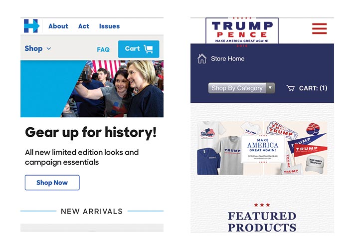
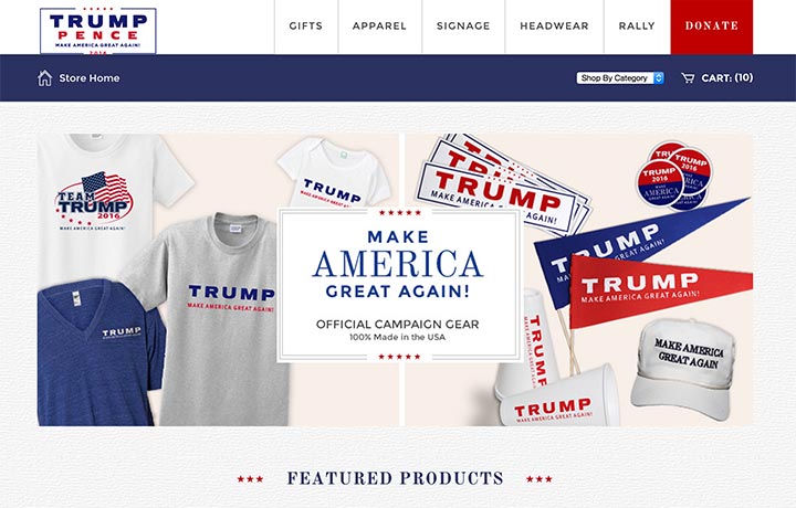 The Trump Shop homepage lacks visual hierarchy and feels cluttered. Fifteen different products are competing for attention. There’s no clear call to action on the page to guide the website visitor. The logo in the upper left corner has tiny letters. It also runs into the navigation bar, which looks unprofessional.
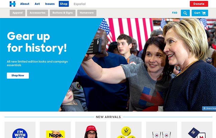
The Clinton Shop has one main image on the right. It draws attention first and also provides a sense of excitement. We know faces attract eyes on websites. The body position and gaze of the ladies then directs us toward the call to action on the left “Shop Now.” The visual hierarchy and the space around the main text help shoppers avoid overwhelm.
Winner: The Clinton Shop
Speed
Waiting annoys shoppers both in the store and online. Slow speeds often cause them to leave websites. We tested speed on both websites using various free tools online.
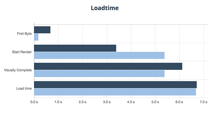
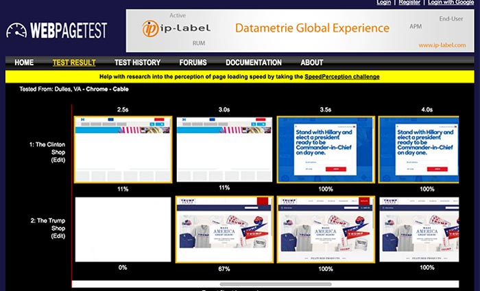 Both shops load fully by approximately the same time. Although Clinton’s time to first byte is lower, Trump shop is visually complete first. In the graph below, The Clinton Shop is represented by navy blue. The Trump Shop is light blue.
The online speed test Pingdom gave Clinton a “B” performance grade. Trump only received a “C,” although The Trump Shop website was 75% faster than all tested sites. Clinton’s site was faster than 60% of tested sites. The difference in letter grades may be due to mobile performance. Trump’s site is slower on mobile according to Google PageSpeed tests.
Winner: Tie – Not a significant enough difference here to distinguish Trump or Clinton.
Product images
Successful ecommerce retailers know that great photography helps people make buying decisions.
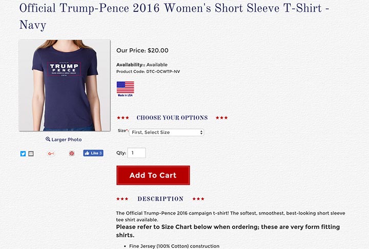
The Trump Shop offers a larger photo with details of the item, in this case a Trump Pence t-shirt. (On an unrelated note, the large areas of random blank space make the page seem disorganized.)
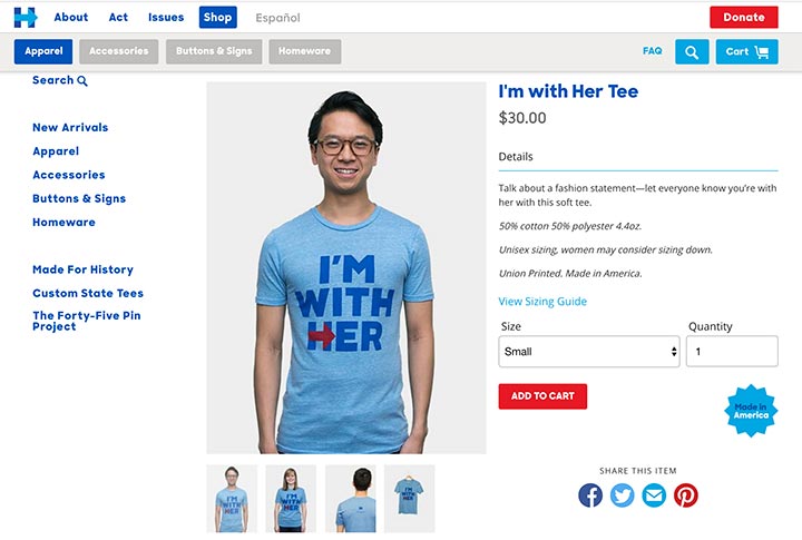
The Clinton Shop takes a different approach. It provides various photos of both the front and back of the Clinton t-shirt. You can see what it looks like on a woman, man, and hanger. Also different from Trump, The Clinton Shop shows smiling people of various ethnicities modeling its products.
The best retailers would do both: provide images with many angles and give detailed shots. Video also aids in selling products. In our comparison though, The Clinton Shop offers more information about its products through its images. It also sends an inclusive message (bonus!)
Winner: Clinton Shop
UX / Usability
We would love to conduct usability testing and interviews to get more feedback on both sites. But for the sake of time, we consider both sites in light of research already out there about best UX practices. User experience affects ecommerce conversion rates.
Both The Trump Shop and The Clinton Shop have fairly simple and clear navigation to help users. It’s easy to put an item in the shopping cart and begin the checkout process. Even on mobile devices, it seems possible to shop on both without a major problem. But we really would like to see The Trump Shop improve their mobile design. Just shrinking the large homepage image instead of adjusting for mobile makes text unreadable. The Clinton Shop does a better job for mobile visitors.
Final Result
Based on these four items, The Clinton Shop beats The Trump Shop hands down! Hillary has created a better ecommerce store than the Donald.
We looked to see what platform The Clinton Shop used and discovered our friends at Shopify are behind it. Shopify and Shopify Plus continue to increase in popularity. We often migrate stores to Shopify Plus or develop stores from scratch.
Does our ecommerce evaluation result forecast the future President as well? We will have to wait until November to find out! But we hope that you consider how your own ecommerce shop compares to these two now! Take care of any problematic areas immediately. Don’t wait until election time in Q4 to get your ecommerce store in great shape.
[UPDATE: The Donald got some website help! As of August 26, The Trump Shop has been updated to Shopify Plus as well. Our evaluation coming soon!]
