The Trump Shop Copies Clinton
In our blog post last week, we compared The Trump Shop with The Clinton Shop. Hillary clearly won. But someone on Donald’s team realized his problem and changed his website.
The strategy? Copy The Clinton Shop.
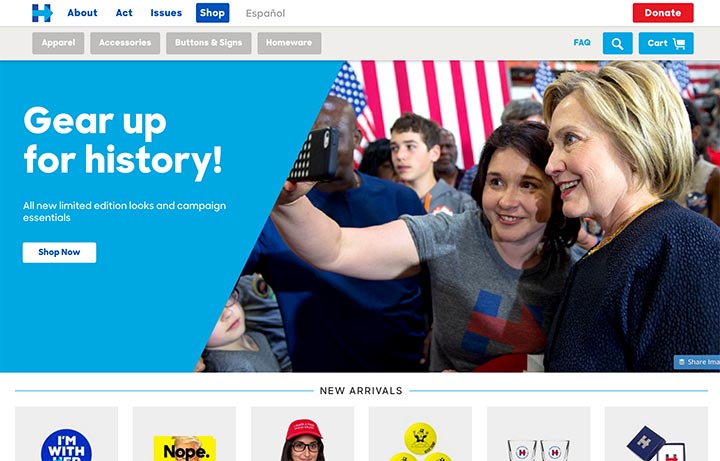
Just look at the two home pages now! Trump’s resembles Clinton’s!
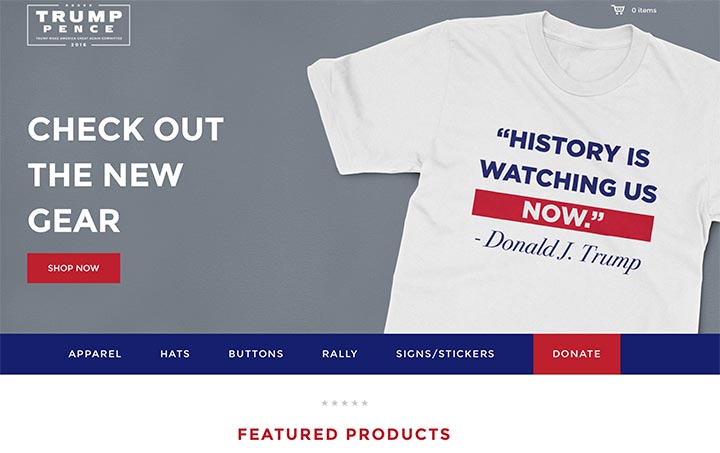
Homepage Messaging
The Trump Shop now has similar messaging on its home page about “history.”
Trump: “History is watching us now.” Clinton: “Gear up for history!”
Hey Trump Team, we’d like to see a bit more originality here to distinguish you from Clinton. We dislike copycats in web design – you should stand out from your competition not copy them!
Look and Feel
Check out the similarity of Trump’s new font choice to Clinton’s. The last iteration of his site leveraged a more classic serif font. Trump’s new site is also using bigger blocks of color to break up sections of the page, again, just like Clinton’s.
Call to Action
Trump also now has the larger text and “Shop Now” button as Clinton does. We can’t fault him too much for that, as a clear call to action like this is appropriate. On the previous website, the homepage didn’t have a call to action at all. Great change, Trump Team!
Product Pages
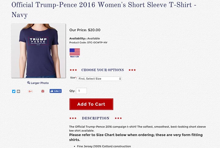
Major improvements have been made to Trump’s product pages. Here you can see the old product page:
The new product page below is streamlined and orderly:
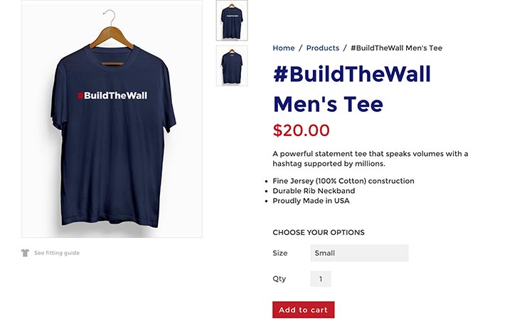
And looks more like The Clinton Shop’s product page:
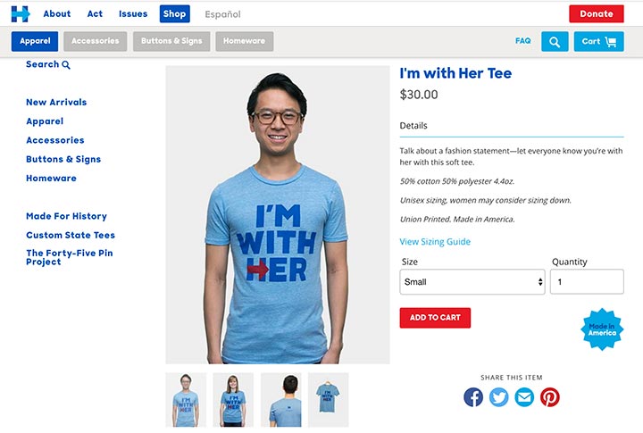
Of course, one big difference continues between the shops. The Clinton Shop has people of various ethnicities modeling its apparel. The Trump Shop relies on hangers alone. But, it might be hard to find anyone of color to actually wear the #BuildtheWall shirt anyway.
Checkout
The Trump Shop has switched to multiple page checkout like The Clinton Shop now. This was a major difference we discussed in our last blog post. The change is a smart one for Trump. We suspect it will especially improve The Trump Shop on mobile as well.
Why all the similarities between the two shops?
Trump migrated his ecommerce shop to Shopify Plus which Clinton has been using all along. Shopify has been gaining marketshare for good reason. It’s easy to use, hosted software. Although we are platform agnostic, we have helped many clients migrate to Shopify Plus.
But the similarities are NOT due to using the same platform. They are due to Trump’s design team not taking the time to make it look different. Prospective clients sometimes worry about using a hosted web platform like Shopify. They don’t want their site to look like everyone else’s or like a typical template. But Shopify allows you to have wide variety in your designs. You just need to have the right team to customize it for your desires and audiences.
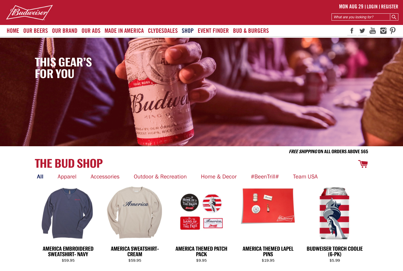
Here are two of our client sites built with Shopify Plus that have different designs. One is for The Bud Shop, selling Budweiser merchandise:
The other is for Arccos Golf, which makes sensor technology to track your golf game:
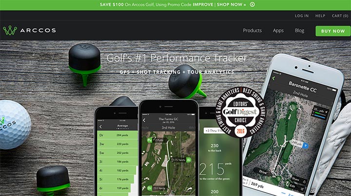
Both are Shopify Plus sites and very different from the presidential candidates’ sites!
Our Advice for Trump
You are heading in the right direction, but your website still needs work. Distinguish yourself further from The Clinton Shop. Take advantage of the flexibility that Shopify offers to make your website unique yet usable.
The Clinton Shop still wins on a number of user-experience issues that we will disclose in our next blog post. We would like to see The Trump Shop continue to better its website through the next few months. The best sites continue to iterate and grow after a launch or redesign!
