The Clinton Shop Still Beats The Trump Shop
Not only does their hair look the same from the behind, but now the Clinton and Trump ecommerce shops resemble each other too! If you’ve been keeping up, you know that Donald Trump changed his losing site and copied The Clinton Shop.
Since our focus at Command C is ecommerce, we’ve been analyzing both online stores in the last few weeks. Now that the Donald and Hil are looking quite similar, whose site wins?
Let’s take a dive into the details, because we know that details often make the design. On ecommerce sites, small details impact conversion rates and business success.
Product Descriptions
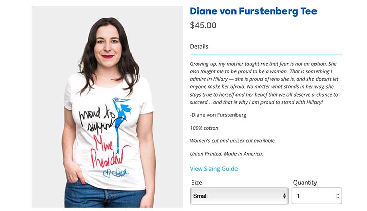
Clinton’s team has taken the time to make product descriptions interesting. Product descriptions affect conversions. Using emotional language and great adjectives help, according to successful entrepreneur Neil Patel. Don’t just talk about the product, he says. It’s important to connect products and their benefits to customers’ lives. See this example written for one of Clinton’s logo t-shirts.
“Talk about a fashion statement—let everyone know you’re with her with this soft tee.”
The Clinton Shop also collaborated with popular artists to create unique t-shirts. So for those products, there is a supportive quote from the artist in the product description. A built-in 3rd party testimonial! Using powerful testimonials increases sales on your website. Look at this statement from a fashion industry powerhouse about Clinton:
Now that’s a great use of space in the product description, thinking about the overall goal of Clinton. She wants to win the presidency, not just sell shirts!
Trump’s product descriptions tend to be more basic, more like this:
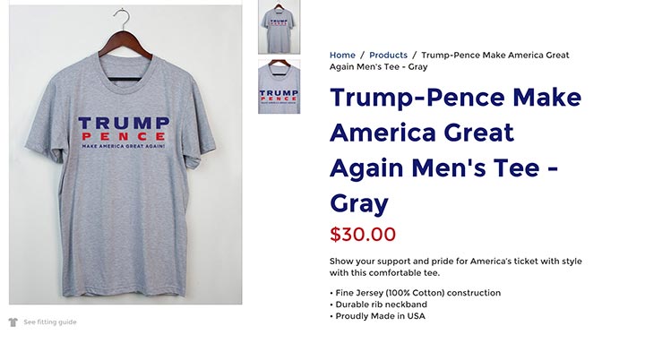
These descriptions in The Trump Shop could be more impactful with just a bit more effort. It’s not just about the product, especially in a political store! Use your product descriptions wisely.
Winner: Clinton
Search
The Trump Shop currently doesn’t offer the ability to search the site. On-site search is a terrific thing to have in the ecommerce world. It helps your potential customers who prefer to use a search box instead of the main navigation. It also gives you valuable data since you can review the words that your site visitors put in the search box. This may guide you to carry a new product that people are seeking. Or it may point out something that needs to be more obvious on your website.
The Clinton Shop does offer the ability to search. Great! Well, kinda. When we went to search for “tshirts” we got this:
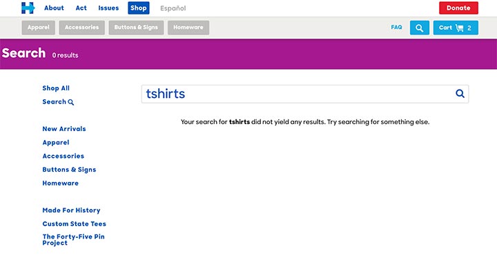
We had to put in a hyphen to get the “t-shirts” to show the shirts in the search results:
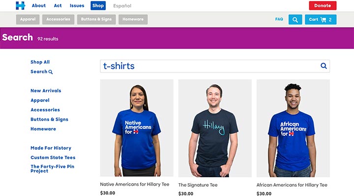
That’s just silly to demand a hyphen. The search on your website should return the intended results for correct spellings, alternative spellings, and misspellings.
However, since Trump didn’t bother with search at all, Clinton edges him out on this one.
Winner: Clinton
Forms
Do forms matter on websites? Absolutely! When a form follows basic usability guidelines, it’s more likely to be completed successfully and in less time. Don’t lose conversions at this stage of the sales funnel.
At The Trump Shop, when I start to fill out the required form fields, the form identifier stays visible. For example, “First Name” moves to the top of the field while I’m typing:
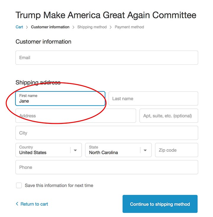
In contrast, on The Clinton Shop, when I enter my name into the field, the identifier disappears. We can all can get distracted while at our computers and look away. Helping users remember what field they are on when they come back is important.
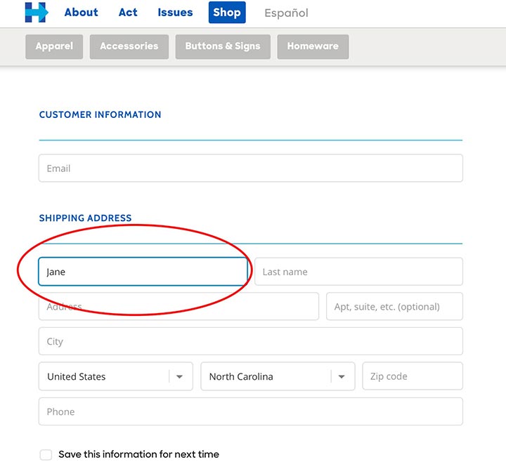
Both The Clinton Shop and The Trump Shop use placeholders within the form fields. This is when you put the label such as “First Name” within the field boxes instead of outside of them. Placeholder text in the fields hurts usability for a variety of reasons. Whenever possible, designers should avoid it. Put labels outside the fields.
Overall, we think The Trump Shop forms are slightly more user-friendly.
Winner: Trump
Logo
We are going to keep pointing this out, Mr. Trump. We can’t read the last itsy-bitsy line in the logo on your store. Even the little stars at the top look blurry on the screen! We worry that your designer is so attached to your styleguide that he or she is afraid to adjust the logo. But logos need to adjust for different contexts! You should make this change to your shop for a quick improvement and better first impression.
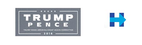
The Clinton logo, “H” with an arrow, is clear, bold, and professional.
Winner: Clinton
Final Result
There’s more we could say about each of these ecommerce shops. If we had access to their analytics and could do research with their target audiences, we could really go to town! It’s always essential to get that context to understand what’s happening and determine why it’s happening. Looking in from the outside, we can only say so much. But here’s our conclusion:
Due to The Trump Shop’s positive changes, the gap between the two online stores has narrowed significantly. But The Clinton Shop still wins out – at least for now.