8 Wearable Brands Reducing Online Friction to Increase Sales
Today we’re going to share some of the top wearable brands reducing online friction to convert more sales. In the phrase wearable brands, we mean all things able to be worn. These products have long been categorized as fashion, apparel, and accessories. And the vast majority of wearable brands fall into this category.
In the phrase wearable brands, we mean all things able to be worn.
But, in recent years, we’ve seen the concept of what people wear expand. For instance, the word wearables on its own implies fitness trackers and other tech gadgets. At Command C, wearable tech, mixed with fashion, mixed with anything people wear to look and feel better, becomes our wearable brands. As the ideas behind fashion progress, we want our words to evolve, too.
Related: Mobile Helps Convert Across Channels
One more note on wording: When we talk about online friction, we mean anything that inhibits your customers from buying. A common example of friction is when a retailer does not provide enough product info for shoppers to buy without hesitation. Or a site that makes shoppers work too hard to check-out. As a result, people get frustrated and leave.
These leading wearable brands are front runners in retail innovation. In every example, the merchant has taken extra care to reduce online friction and increase sales on their site.
Outlier: Seamless shopper UX
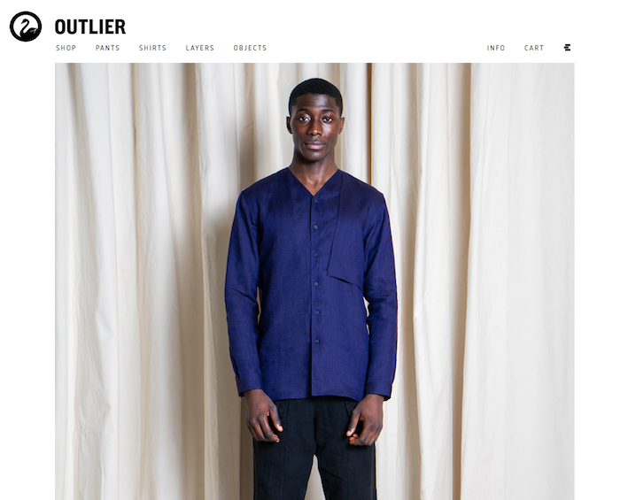
We’re starting with Outlier because they take a non-traditional approach to ecommerce and rock it.
The strength of the Outlier site is its simplicity. There are no pop-ups, flashing banners, etc. Furthermore, they have outstanding product images. The photos tell the story of their brand, and nothing competes with this narrative.
The photos are complimented by clear, uncluttered UX. Shoppers seamlessly purchase from Outlier’s product pages through every step of checkout. The cool style and casual grace of Outlier is expressed throughout the buying process.
Cos: Begin with customer location
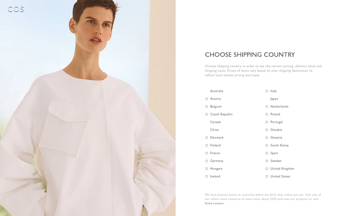
When you land on the Cos site, you’re first asked to select your shipping country. Very nicely done. This sets the appropriate experience (i.e. prices in native currency, shipping estimates, etc.) right from the start. Also, the shopper willingly shares location information. In light of data privacy concerns, esp. with this year’s GDPR in the E.U., asking the customer to select her country, rather than using location software, is smart.
Then, on Cos’ product pages, we really like how they handle product images. Take the Collarless Shirt with Pintucks, for example. As we scroll down the images, the big, featured photo is highlighted in the row to the left. Also, click on any photo and it goes full screen. Then it’s easy to click through all the photos as in a portfolio. So smooth.
Tortuga Backpacks: Make it easy to compare
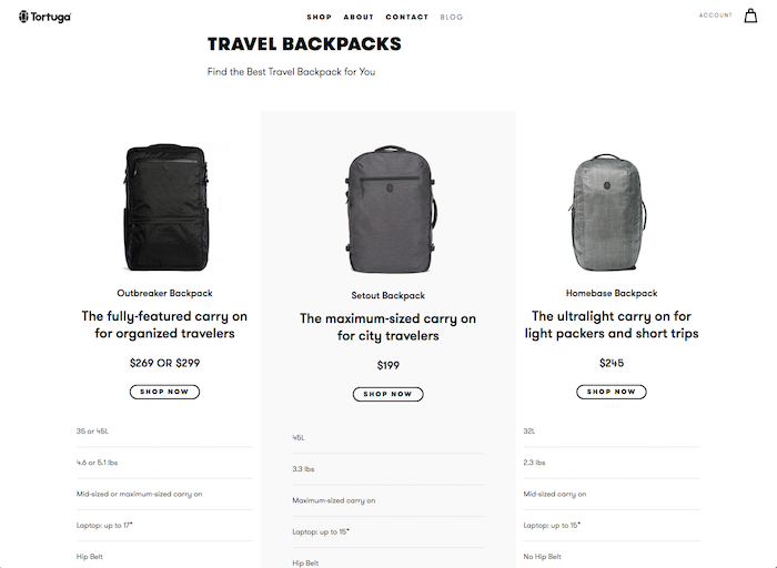
Tortuga knows why you’ve come to their site. They sell a variety of packs and accessories, but their travel backpacks cause all the clamor.
The top of the landing page shows a lifestyle photo of a young couple traveling. Right below this photo, Tortuga displays their three travel backpacks. Click on any backpack, and you’re instantly taken to a comparison chart between the three. Yes, you can easily use the navigation menu to get to other items. But they know they’ve built their reputation on the travel backpacks, and they quickly assist shoppers in selecting the best one. They are answering shopper questions before people have even asked them. Super helpful.
Bombas: Mix of mission and commerce
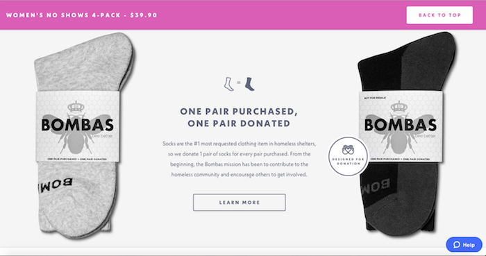
Co-Founder David Heath says they named the company Bombas, the Latin word for “bees,” because bees work together to better their community. After the founders learned that socks are the most requested item at homeless shelters, they started Bombas on the premise, “Buy a pair, donate a pair”. Whenever a shopper purchases a new pair of Bombas socks, the company gives a pair to those in need.
If Bombas sounds familiar, you may be a Shark Tank fan. They appeared on the show, got an enthusiastic response and an investment, and then…their site crashed. Bombas is direct to consumer, and they lost a lot of opportunity in the broken site.
Since then, they’ve replatformed to Shopify Plus. Now their self-described “best socks in the history of feet” are flying out of the ecommerce drawer. They’ve donated over 8 million (!) socks to date–which means they’ve sold that many, too.
The site runs beautifully. We’re never lost or wondering what’s the next step in our purchase. Yet what’s really notable is the blending of mission and commerce. For example, in the image above, as we scroll down from the product detail page for a Women’s No-Show Four Pack, we learn about Bombas’ mission. Throughout the scroll, our product remains available. We can click on the pink bar at the top of the screen anytime and buy. The purchases make the mission possible.
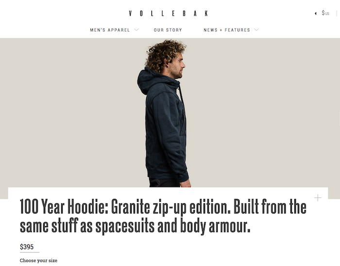
Vollebak: Everything shoppers need to know

In the intro video for Vollebak’s 100 Year Hoodie, they drag it by truck, by boat, and then fry it with a blowtorch. They make the point: this hoodie lasts.
As they tell it, “We’ve taken aramid fibres with a strength to weight ratio five times stronger than steel and spun them into a super soft knit to make the most indestructible hoodie you’ve ever worn. Milled in the US and manufactured at one of the most technologically advanced factories in the world in Portugal, each 100 Year Hoodie takes over 28 weeks to make, but is designed to last for the rest of your life.”
If we’re going to buy a piece of clothing for the rest of your life, we want to know everything about it. This is where Vollebak’s product pages deliver. They’ve written 15 paragraphs about this hoodie, in addition to the technical and sizing specs. Yet the volume of content never feels overwhelming. They’ve segmented it into readable, interesting blocks. As we scroll, it’s exciting to keep learning about this one-of-a-kind garment. The more we read, the more we want this hoodie.
Our only suggestion is to keep the Add to Cart button persistent. We want to be able to purchase the hoodie without having to scroll all the way back to the top.
Olay Labs: Personalization makes the sale
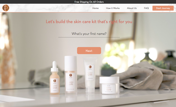
Olay Labs is one of our favorite examples of ecommerce personalization of late. On this site, customers can only shop for a customized Olay Labs skincare kit. (There are no general product categories or pages.)
To develop a personalized skin care kit, shoppers take a selfie on their computer camera and answer a series of nine questions. The questions range from skincare standards (“How would you describe your skin? Normal, oily, dry, etc?”) to more modern takes on skin care (“The air where you live can affect your skin. Can we access your location now?”).
The end result is collection of five skincare products from Olay Labs. Each product comes with a description of why it was chosen specifically for you. They use the customer’s name throughout the process. So even though we’ve never met, it feels like this is a warm and friendly recommendation.
Motiv: Get sizing right from the start
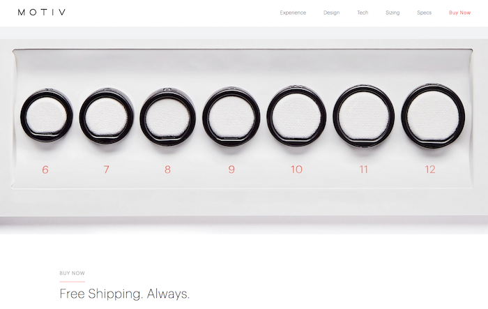
Motiv is a fitness and sleep tracker designed as a ring. To fit all the tech into a finger-sized ring, the company patented their own flexible circuit board and curved battery. It’s a beautiful, ambitious product.
To make sure customers get the full benefit of Motiv, fit is essential. The company could potentially lose time and money due to fit issues, but they’ve come up with a clever answer. When a shopper buys a Motiv ring for $199, she first receives the Motiv sizing kit (pictured above) in the mail. The kit includes 7 different ring sizes. Motiv recommends that the customer wears the sample ring for size for 24 hours, as people’s fingers slightly change size throughout the day. (FYI!) Once she decides on the right size, she orders her own ring. Motiv ships the final ring via two-day priority shipping. Very smart all around.
Paul Stuart: Shop as you wish

This year marks the 80th anniversary of Paul Stuart. They were founded as a sophisticated menswear retailer, and through the decades, they’ve added women’s clothing, as well as the Phineaus Cole line for younger men.
Throughout the company’s evolution, they’ve been known for their catalogs. Indeed, for years, this was the only way remote shoppers could buy from them. But even as retail came online, their longstanding customer base loved the catalogs. Now, as evidence that Paul Stuart understands their audience, people can shop on their site via catalog.
Click on the catalog of your choosing, and the images open like a real paper catalog. As you hover over a product, you get the opportunity to “Shop Now.” By clicking on Shop Now, the full product page and Add to Cart option appear.
Online catalogs in themselves are not new tech. But we want to highlight how Paul Stuart has blended their classic catalog with a clean, modern site. They are merging their past with the future, and in the process, customers can shop as they wish. This is exactly what we mean by reducing online friction to increase sales.
Each of these ecommerce sites shows thorough thinking on how to give customers an easy, friction-free shopping experience. Is there a point on your site that keeps tripping up shoppers? If so, let’s discuss new strategies to eliminate issues and convert more sales for your retail business.