Best In Class: 7 Top Luxury Ecommerce Examples from Landing Page to Checkout
A great ecommerce site is like the frame around a picture: you want it to enhance what’s inside without causing distraction. You want people to notice the picture, not the frame. Likewise, your online customers should experience your products, rather than get ensnared in the site itself. (Email pop-ups, we’re looking at you.)
Just what are the components of an engaging, yet seamless, online buying process? To answer this question, we turned to one of the big ecommerce trends of 2020: Luxury brands offer new online buying experiences. As we’ve discussed, the average age of a luxury buyer used to be 48-years-old; today it’s 34. These younger buyers want the style and customer service of luxury paired with the convenience of ecommerce.
But luxury brands face unique challenges in online selling. Namely, it’s tricky to convey the traits of luxury, such as exceptional product quality and gracious customer service, through a screen. Further, luxury brands are often legacy brands. Their longtime customers have deep loyalty to the products. Companies have to show, through their ecommerce sites, that their brands and products are maintaining the standards people have come to cherish.
To understand how to accomplish these goals for your luxury ecommerce site, it’s helpful to see what’s currently working – and understand why. With this in mind, we’re presenting the companies below as successful examples of the online luxury experience. Each one shows an elegant approach to ecommerce – with its own, unique twist. Let’s take a look.
Best Ecommerce Landing Page and Layout
Winner: Prada
Another phrase for this category is “Best Overall Site.” In other words, how does the site feel when you land on it? How does it feel to move through the site? If a site feels to cluttered, it will turn customers away. On the other hand, if it feels too sparse, it can fail to engage people.
When customers land on your luxury ecommerce site, they should feel both at ease and encouraged to explore your products. Indeed, Prada communicates these two feelings very well.
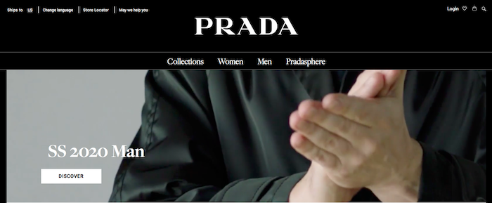
First, the landing page. Above the fold, they have a cool video that creates energy right off the bat. Along the top border of the video are four categories for site navigation: Collections, Women, Men, and Pradasphere (their accessories line). Hover over any one of the categories and different groupings of subcategories seamlessly appear. When I click on one of the subcategories (Women > Shoes), I’m quickly taken to the products listing page for women’s shoes. It sounds so simple, and it is, but sometimes companies make this complicated. Not here.
We often see retailers do one of these things well, but not both. Either companies have splashy effects to draw customers in or they have clean and clear navigation. Prada has mastered both the landing energy and smooth site layout.
Best Product Listing Page (PLP)
Winner: Rotate by Birger Christensen
The product listing page (PLP), where retailers show all their products in a single category, i.e. Dresses, is getting more creative. This is a fantastic development, as it shows that brands are breaking the ecommerce mold and making the shopping experience their own.
Yes, it’s important to adhere to customer expectations for navigating online buying. For example, if I click on Women > Dresses, I expect to be taken to a page showing all the dresses from that retailer. Merchants want to fulfill that expectation. But within those standard steps, more and more, retailers are exploring and having fun. We’re especially liking how fashion brands are reinventing the PLP.
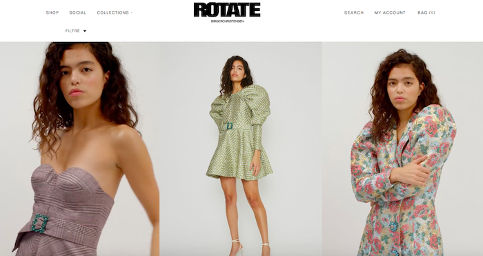
Take Rotate by Birger Christensen, for instance. (Note: Not luxury per se, but it’s too good to pass up.) When I land on the page for women’s dresses, there’s a clean and interesting grid of photos of all the dresses available. In every photo, the dress is worn by a model. Then the model starts moving – it turns out that every other photo is a video. Not only does this give me a better sense of how the dress fits, it also brings energy to the page. It’s a refreshed, updated version of a PLP. Then, when I click on one of the videos, I go straight to the product details page for that dress. This PLP meets my expectations, but in a new, different way.
Product Listing Page Honorable Mention
Winner: Stella McCartney
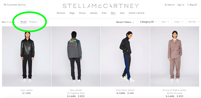
On another note of PLP creativity, Stella McCartney gives customers a cool option on her page. As you’ll see circled in the image above, when I land on the Men > New Arrivals page, the site gives me the option to view items either on a model or as standalone products. Sometimes I shop by looking at the way something fits, so I prefer to start by seeing it on a model. Other times, I want to get a sense of the item on its own. On the Stella McCartney site, I can choose how I view all the products in a category.
Best Product Details Page

Winner: Louis Vuitton
A lot of components go into a strong product details page (PDP). As a luxury retailer, you want to give enough product information that buyers can make their decision to purchase right then and there. But you don’t want to overwhelm them with too much info. You want to entice the purchase, too. Louis Vuitton pulls all this off on their PDP.
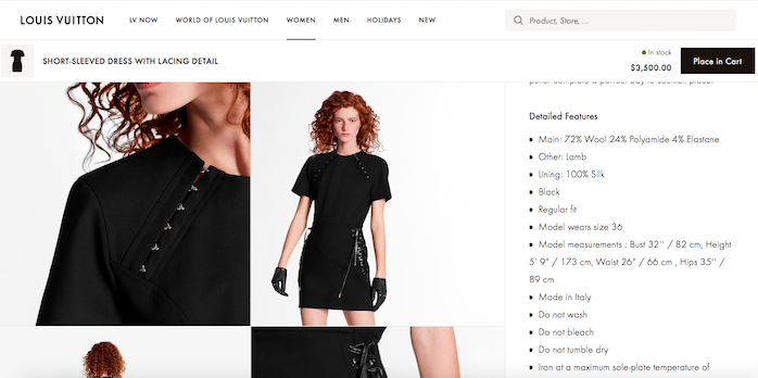
Let’s review the page for the Short-Sleeved Dress with Lacing Detail. For starters, this is an excellent example of luxury product imagery. It begins with a straightforward photo of the dress. As I scroll down, I see photos of a model wearing the dress – and one of the images becomes a video. The model slowly turns, and I get to see how the dress looks all around. Plus, as I scroll, the site gives me a persistent add-to-cart CTA (call to action). Meaning: I can click to “Place in Cart” at any time as I browse. I don’t have to go hunting for the cart. (And the phrase “place in cart” sounds elegant, don’t you think?)
Next the page displays a helpful, engaging description of the dress, as well as care instructions. They also let me know that they can deliver this dress to me for free. The company includes a phone number – listed right in the product information – to call to ask questions. Really nice. Between the dress images and description, I’m given a lot of good information here, and I feel supported with their customer service team standing by.
Best Ecommerce Sizing Feature
Winner: Bottega Venetta
Ecommerce sizing technology is one of the most interesting areas of development for online wearable brands. A lot of innovation is coming into these features, and when customers feel more confident that they’ll get the right fit, they’re more likely to finalize their purchase. Better sizing communication leads to higher onsite conversion rates.
Retailers can start as simply as listing a model’s height, weight, and size worn in photos of a particular garment. Another great option is to allow your customers to select what size model they want to view while browsing your site. And, of course, a standard fit chart for your clothing collection is a good place to start. What matters is that retailers support the buying process by offering as much helpful information around sizing as possible. This can also reduce product returns, as more customers choose the right size from the start.
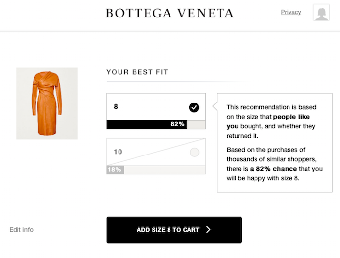
One of the best tools for online sizing is a custom fitting feature, and it’s exciting to see Bottega Venetta gracefully fold one into their PDP. When I click on the fit finder link, and I’m asked a few questions about my height, weight, age, and typical clothing size. In a few seconds, the site analyzes my answers and calculates the best size for me. It also gives me a probability score – in this case there’s an 82% chance that the size 8 is going to work. This gives me a lot of confidence in making my purchase.
Best Add to Cart and Checkout
Winner: Valentino
This is the category that every company online should win, but unfortunately, there are still common glitches in the final steps of converting a sale. For example, maybe the prices between the PDP and checkout vary. Or perhaps the site doesn’t clearly announce that the item has been successfully added to cart. For retailers who want to improve their online add to cart and checkout process, there’s inspiration in Valentino. (They also give Prada a run for Best Landing Page and Layout.)
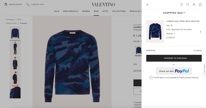
Let’s look at Valentino’s Camouflage Crew-Neck Sweater for men as an example. When I click on the sweater and add it to the bag, I immediately get a split screen showing that it’s been added. This assures me that I’ve accomplished what I’m trying to do. We’ve all seen this, but surprisingly few luxury brands take this extra step.
Then, when I go to checkout, I’m taken to a page that shows my product, as well as a lot of great information about my purchase. For instance, I get the opportunity to pick up this sweater at a Valentino boutique. I also can easily read their returns and exchanges policy, as well as all the different payment methods they accept. Plus there’s a description of their ecommerce site security policy. Lastly, the checkout page also has a customer service phone number, along with its hours, in case I need anything before I buy. I’d also consider adding a live chat feature to this page, but even before then, it does a great job.
Add to Cart and Checkout Honorable Mention
Winner: Tiffany & Co.
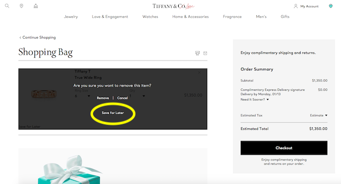
In the process of reviewing site checkouts, I also took these steps at Tiffany & Co. Since I wasn’t going to actually buy the product, I needed to remove it from the cart. Usually when customers remove an item from the cart, they get the option to either remove it or cancel the decision. Remove or cancel are the only two choices.
With Tiffany & Co., however, they also gave me the option to save it for later. This simple gesture is a smart move, especially for a luxury brand. I may realize that I can’t purchase a high-ticket item right now, but I don’t want to forget about it. Giving customers the option to save it – from the checkout – creates one more way to potentially convert the sale in the future.
Remember: Your retail website is meant to enhance your products, not distract from them. Particularly with luxury ecommerce, there’s the challenge of conveying the highest quality of goods in a streamlined, elegant way. Because luxury products can be so special and unique, it’s tempting to add more splashy online features to promote them. But as the examples here show, luxury brands can have success through clear and thoughtful development.
