10 Inspiring Ecommerce Product Sites Reinventing the Online Store
Here’s an idea with staying power: an online store–its product pages, checkout process, everything–needs to be as strong as its products. For ecommerce product sites to really inspire a customer, the shopper experience of purchasing should be as compelling as the product itself.
This makes us think of a phrase from traditional Shaker design philosophy. “Don’t make something unless it is both necessary and useful; but if it is both necessary and useful, don’t hesitate to make it beautiful.” This is equally true for a product and the process through which shoppers buy it.
Related: 22 Rules for Top Product Pages
In other words, show me, don’t tell me. Let’s not just tell people your product rocks. Let’s show them it rocks through your store’s online buying process. I’ve compiled ten of Command C’s fave ecommerce product sites leading by example.
Top 10 Inspiring Ecommerce Product Sites
Here One

As the Shakers espouse, Here One makes wireless ear buds that are both exceptionally useful and beautiful.
They sought to do the same with their site. Here are some of the ways they got there: the simplicity of the “Buy Now” button placed in the center of the streamlined home page. When a customer clicks Buy Now, she’s taken to the product page that has all the information she needs to purchase immediately. When she adds a pair of earbuds to the cart, she’s directed to a clear 3-step checkout.
For Command C’s part, we love creatively solving complex tech problems. With Here One, we got the chance to live this love on the backend. We found solutions for their multi-currency needs and other challenges.
Superpedestrian Copenhagen Wheel
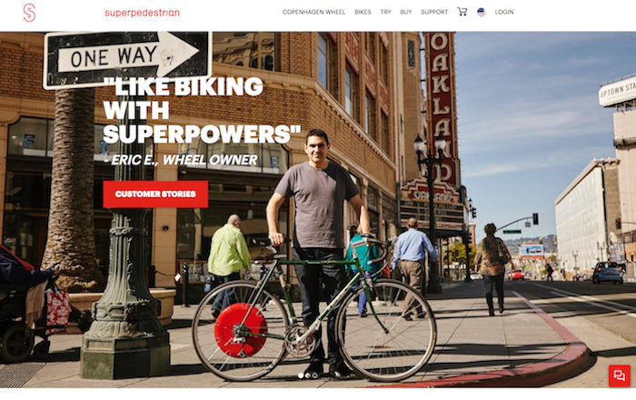
Bike riders program the Superpedestrian Copenhagen Wheel via bluetooth to transform almost any bike into a smart electric hybrid bike. The wheel gives bikers an extra boost up the big hills and recharges itself down the inclines. As described by the Boston Globe, the Copenhagen Wheel turns your bike into a “two wheeled Tesla.”
On the sales side, customers can customize their own wheels through the site’s product configurator. (You know we love these!) They also offer an option to buy a new bike with the Copenhagen wheel already installed. I like how the company has a “Try” tab on their top navigation bar. Click on Try, and it leads to a map of nearby retailers where bikers can test drive the wheel. In offering several ways to explore this product, its makers demonstrate that they understand personalization right from the buying process.
OjO Electric Commuter Scooter
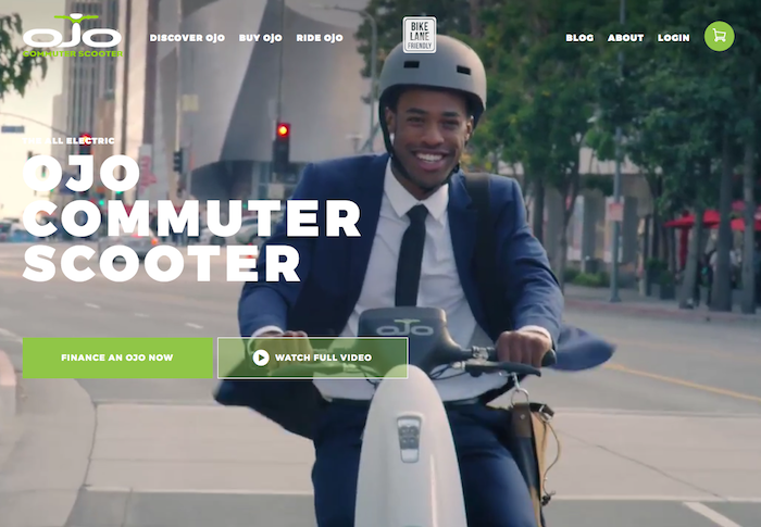
If you’re done peddling all together, check out the OjO Electric Commuter Scooter. The site, built on Magento, opens with video showing a variety of people hopping on their scooters. Right away, one gets a sense of easy, fun movement. I also like how the homepage features a “Finance an OjO Now” button. The scooter runs about $2,000 total, but they quickly spell out that payment plans are available in the ballpark of $45/month.
The scooter product page lets me view the vehicle via zoom, 360 degrees, or both. It also sells a range of scooter accessories to add to my purchase. Once I add my scooter to the cart, I’m directed to an easy-to-read page to calculate shipping (free to NYC) and enter a promo code. They make it easy for me to buzz around on an OjO in no time.
Asos
In response to anyone who says that retail is dying, I want to share this piece of news: this week the British retailer, Asos, announced a surge in full-year profits. I understand why. The company responds to customers’ wants; for example, they are testing same-day delivery in some of their metro areas.
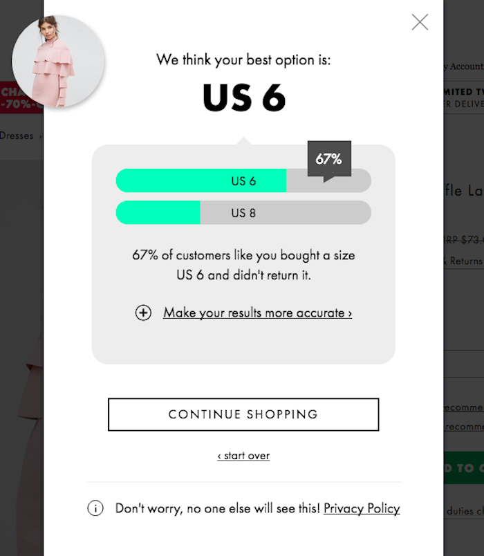
What really makes me happy is how they handle sizing in their online store. Right underneath the size selector, there’s a link that reads, “Let us help you get the right size.” Click on it, and a pop-up appears with prompts to enter my height, weight, and type of fit (loose vs. tight). The site processes my answers. It then recommends the best size option for me. AND it shares the percentage of customers of similar sizing who did not return the size they recommend!
All of this information is at my discretion: “Don’t worry, no one else will see this!,” they assure me. With this feature, Asos builds trust, gives me lots of useful information, and gets to know me–now a likely returning customer–in the process.
Spectacles by Snap
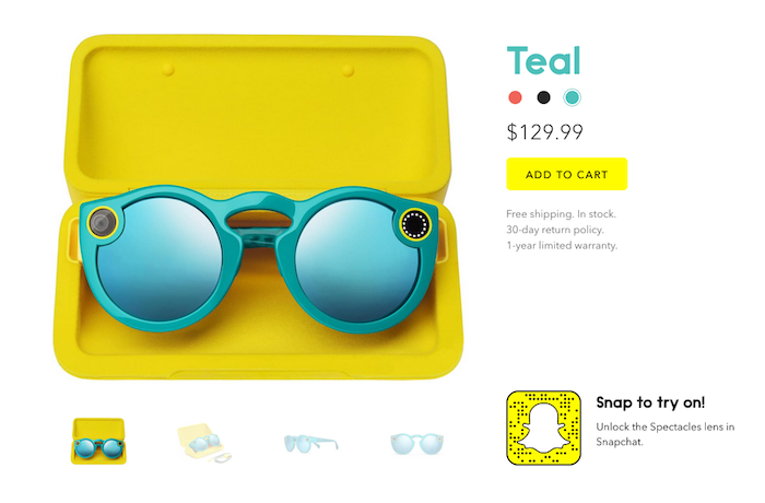
The online store for Spectacles by Snap promotes a cool new product in a simple way. The glasses are a big leap forward: put them on, hit the button on the upper corners, and they’ll record 10 seconds of video from your perspective. Click again for everytime you want an additional 10 seconds of video. Then share your worldview with friends on Snapchat.
The online store highlights features, but it’s most interesting when I can explore perspectives. They’ve done a great job of giving lots of playful content that makes me want to buy a pair. When it comes time to do so, I’ll easily select among the three colors available and get to checkout quickly. Nicely done!
Polaroid Originals
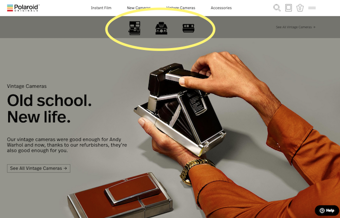
It’s been a long time coming, but I’m so pleased Polaroid has joined the ecommerce party on Shopify. The company has always had great products, but they got a little lost over the years. No longer. They recently re-launched many vintage favorites through a really nice online store.
Right off the bat, I like the ability to shop by camera silhouette. As I’m a fan of the SX-70, the model shown in the photo, I click on its icon. This leads to a product page that displays a variety of cameras from this model, plus options to buy its compatible film. It’s a vintage camera, but the site’s functionality and buying process are contemporary. Polaroid, it’s good to be with you again!
Kano Computer Kits
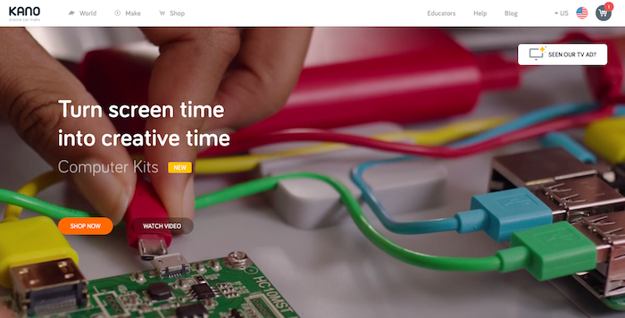
It’s possible that for everyone who experimented with a Polaroid, today there’s a young mind exploring computers with a Kano Computer Kit. The company’s premise is that we’re surrounded by billions of machines, yet “only 1% of us” can open them up and work on them. Good point.
As I shop for a Kano kit, it’s helpful how the Buy button stays present. Then, as I checkout, I’m lead to a simple 3-step process. Important note: I’m not forced to sign up for an account. Hallelujah! Kano prompts me to enter all my customer information, including my email. At the bottom of the page, there’s a box I can check to “save this information for next time.” When I click this, I will have essentially created an account. Yet I didn’t feel an ounce of account-creation pain. (That pain can be a dealbreaker, indeed.)
Allowing shoppers to buy without creating an account is one of Command C’s top online checkout rules – here’s the whole line-up.
Raden Smart Suitcases
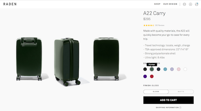
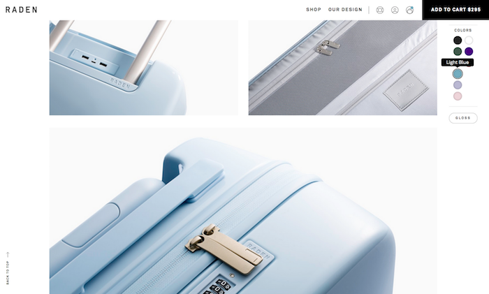
If travel gives you a headache, Raden is ready to provide a soothing balm. The ease of their online store demonstrates this. When customers shop their A22 Carry, it’s easy to select a color and finish (Matte or Gloss). Then, as shoppers scroll down the product page, all the product photos reflect the selected color.
However, if I want to change my mind, Raden keeps the options palette available throughout my shopping experience. So, for instance, at first I was thinking hunter green for my bag, but later switched it to light blue. As I played with the different colors, so did the store. Here’s the same bag in light blue, just a quick scroll down.
Everpurse
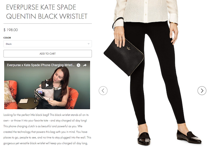
Kate Spade is the name behind Everpurse, a company that sells handbags embedded with cell phone chargers. It’s a funky concept. Everpurse sells the idea by featuring a 30-second explanation video on every product page. The video is right under the Add to Cart button; you can’t miss it.
Also, this online store excels at product imagery. I see products to scale, as in the photo above, as well as close ups that show both the appeal and function of these bags. Lastly, every product page has a set of arrows on its upper righthand corner. Clicking on an arrow lets me flip through the product pages like a catalog. I’d love to see this get widely adopted, as it makes it easy to review a store’s entire product line.
Milk Makeup

I’m in pure swoon here. This cosmetics company is doing a WHOLE new thing. They do an amazing job of embracing the “look”–whatever someone wishes this to be. Every product is shown through a variety of models and styles. Also, Milk Makeup has a video on every product showing it being applied, often by more than one person.
When I add a product to the cart, in this case Lip Metal in Slayer, a pop-up shows a free gift I can add with it. Thank you, kindly. Then the checkout is three easy steps. To start, the first screen is split: one side asks for my customer and shipping information. The other side shows an itemized list of what I’m buying, including my free gift. On the next page, I’ll give my payment info, and I’m done. As Yoda would say, “Ready to rock the Lip Metal, I am.”
In conclusion, I recently heard a retail expert poise this question: “Customers are ready for the future of commerce, but are merchants?”
It’s true. With companies like these creating new customer experiences online, they raise shopper expectations for all retailers. Thankfully, a huge toolbox exists to help merchants build or update their stores quickly and with precision. Command C works with these tools everyday, and we continually incorporate new ones into our work. Let’s discuss how we can bring your products to life through a leading-edge buying process.