Designing Homepage Carousels that Draw Customers Into Your Store

Homepages have become a place with multiple goals: merchandising, promoting sales, brand introduction, showcasing social proof and press. Sometimes the homepage can feel too long. Or it can feel as though the elements are too disparate because it’s attempting to achieve multiple goals at once. In actuality, the main goal should be displaying enough content to engage visitors and coax them further into your store.
Stores often rely on features like sliders and carousels to ease up on the “visual clutter” of showcasing too many images or promotions on a site. But there are pros and cons to the homepage carousel.
Many stores implement an auto-rotating carousel without considering the potential usability issues a visitor can encounter. In fact, Baymard Institute found that of the sites they studied with carousels, only 41% didn’t have usability issues.
In this article, we’ll go over how to make a carousel that’s easy to use and doesn’t frustrate visitors. We’ll also help you think about how to choose an auto-rotating carousel and why the order of content is extremely important. Plus, if carousels are not a good fit, we’ll share an alternative for your company to consider.
First Things First: Do You Need a Carousel?
Before implementing a carousel on your homepage – or even if you have one already – think about its goal.
The point of a carousel is to highlight products, sales, and categories, without feeling as though you’re adding too much to the page. A carousel can seem “cleaner” since it focuses on one slide at a time.
But is “visual clutter” really an issue for your customers on the homepage? Ideally, your team should test whether your site even needs a carousel before you start optimizing one. You can test a carousel versus static images from the carousel. For instance, Hubble utilizes static images to display three different promotions instead of a carousel.

If your team determines through testing that your homepage would benefit from a carousel, then the next step is to ensure it functions in a way that does not frustrate or distract visitors.
Carousel Movement: Important Desktop Vs. Mobile Notes
One of the biggest distractions on any site is movement. Think about the last time you watched a foreign film or had subtitles on TV. You likely focused more on reading the text than watching the show. Our eyes are drawn to movement, and this includes carousels.
We recommend testing auto-rotation on a carousel to see if it causes distraction. If it turns out that conversions stay solid with the rotation, then optimize the carousel for this movement.
Tech Director Erik Runyon found that auto-rotating carousels sometimes have higher click rates (8-10%) than manual carousels (1-2%). Because they rotate, there’s less friction in seeing the different slides, and a visitor is more likely to find something they’re interested in clicking.
Although there may be more clicks for an auto-rotating carousel, the biggest issue with rotation is that visitors can be focusing on a slide and then it suddenly advances to the next one. They get frustrated because they didn’t finish reading.
On desktop, you can solve this by pausing the rotation upon hover and by stopping rotation altogether when a user clicks any of the carousel controls. On mobile, unfortunately, this isn’t possible. We do not recommend auto-rotating slides on mobile for this reason.
Why pause the rotation on hover? When users are focusing on something on the page, there’s often a correlation between where their mouse is and what they’re looking at. It’s the next best thing to an actual click to the carousel controls.
To make sure people have enough time to read what’s on the slides, allow for 5-7 seconds for images with just a header and small bits of copy. If you have more text, however, give people up to 10 seconds. The Nielsen Norman Group recommends a rule of thumb of 1 second for every 3 words on a slide.
How to Design Carousel Controls to Give Visitors Useful Info
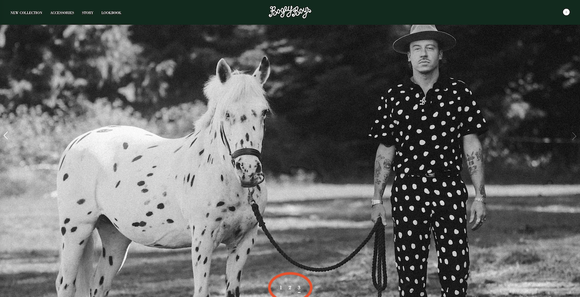
In a prior paragraph, we mentioned controls as a way to allow users to interact with the slider and stop auto-rotation. Carousel controls come in a few varieties, but we typically see the ellipsis, arrows, thumbnails or a combination of these.
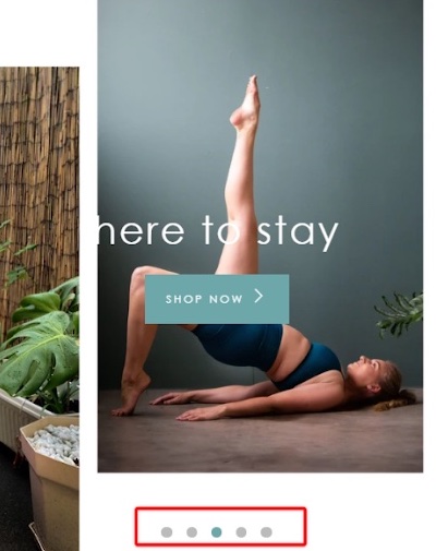
Controls allow users to see how many slides are in the carousel, so they have a better overview. Controls also let visitors move between slides without needing to rely on the auto-rotation.
Keep in mind that using ellipses often has two common issues: 1) they are too small to interact with and 2) they are difficult to see. Ensure your controls are large enough for accurate tapping and clicking. This reduces the chance of a mis-tap. As for making sure controls are always visible, contrast the dots against the image they’re on top of by detecting the brightness of the image and changing the control colors. For example, use white controls on top of dark backgrounds and black controls against lighter backgrounds.
Lastly, controls need to adhere to what users expect for particular devices. On mobile and tablet, visitors want to swipe through carousel images. They don’t want to be forced to use the controls. But we still recommend that retailers offer controls on a mobile carousel because visitors still need to see where they’re at in the slides. Mobile carousel controls also give people an additional way to navigate.
Optimize Carousel Usability – Then Define Content Through These 5 Questions
Once your ecommerce team has confirmed the carousel controls, auto-rotation, and movement, you want to define the content of your carousel.
We saved this part for last because we wanted to emphasize the usability of the carousel first. Without easy usability, visitors will not stick around to check out the content.
Before your team implements the homepage carousel, determine the answers to these questions:
- How many slides should it have?
- What order should the slides be in?
- What content is on the first slide?
- How will we optimize images for device type?
- Will this content be accessible via navigation, not just in the carousel?
Further Considerations on Carousel Content
Let’s address the number of slides, because there really isn’t a “best” number. Keep it between 3-6 slides as a rule of thumb. With two slides, there might as well not be a slider, but more than six slides can be overwhelming to click through.
Next, consider what you want to highlight in your slides. Remember: the slides won’t remain the same for all time. They will change as new sales and promotions come about, holidays arrive, and new products debut. Ensure that the slides provide clear imagery that represent the message the slide is trying to convey. If you’re promoting a decor sale, showcase multiple decor pieces rather than, say, only a pillow, as visitors quickly scanning the page might think the slide only relates to pillows.
It’s important to optimize the slide visuals for mobile. Often, carousels are designed responsively. This can lead to text that is difficult to read on mobile.
The first slide of the carousel is the most important. This slide often receives the most clicks, and has even been found to get more than 75% of all clicks. This isn’t surprising, as it’s the first thing a visitor sees on the homepage. The first slide is usually the most widely-appealing promotion, too.
Lastly, make sure that whatever is featured in the carousel is not exclusively accessible via the carousel. Meaning: if you’re showcasing a promotion for women’s sandals, the sale needs to be accessible via the navigation or other areas of the homepage. This way you are not cutting visitors off from viewing the promotion, especially since not all visitors see every slide of the carousel.
If Carousel Isn’t Converting, Try Static Image Alternative
Feeling more confident about your homepage carousel? We hope you do! But if you’re worried that your homepage carousel does not allow visitors to see all of the promotions you’re showcasing or it’s causing friction and distraction, there is an alternative to test.
Static images have become the new carousel on many ecommerce stores we’ve been browsing. Rather than hide slides behind clunky controls and auto-rotation, sites are choosing to show off multiple promotions all at once.
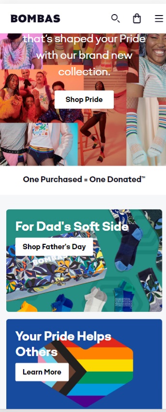
With this option, visitors have the chance to see everything you want to promote without needing to toggle through slides in a carousel. They can get information overload, however, if there are too many promotions and they can’t decide what to click.
Baymard Institute found that 70% of their mobile users initially scan the homepage by scrolling to see the type of site they landed on. Using static images rather than a carousel aligns with how visitors scan the homepage to get a sense of the site.
It can also be a money-saver to implement static images instead of a carousel. The carousel takes time to build and optimize, and this can use up development time and money.
With static images, merchandising teams also have more freedom to showcase different products and promotions, without being restricted to the carousel design. Large images can highlight the most important promotions. Smaller pictures can be used for promotions that are still important, but less so in relation to an annual or holiday sale.
Your Homepage Is More Than a Window Display
If your company is currently using a carousel on its homepage, see how it adheres to our guidelines shared in this article. If you find that your carousel isn’t up to par, consider testing it against static images. Or test the current implementation versus an optimized version. You want your homepage content to help people quickly get an idea of what you sell and guide them towards products and categories that interest them.
As much as we love our homepages and treat them like the window display of a fancy department store, the goal is to get visitors off the homepage and into a category or product page. A carousel (or static image collection) needs to serve that goal and not put up roadblocks. Use our recommendations to get your carousel into shape for your customers and get them clicking into your top content.