Ecommerce Stores That Break the Rules
You’ve looked at enough ecommerce stores, after a while the sites become predictable. Stores often use the same theme, similar fonts, similar colors, and in doing so make it hard for themselves to stand out.
In web design, there was always a push by some agencies and designers to break the rules and create sites that were outside the norm. But for ecommerce sites we tend to stick to similar layouts in order to promote consistency for visitors to prevent any friction during their shopping journey.
We’ve started to see a movement away from these cookie-cutter layouts to more unique, brand-centric site designs.
In this article, you’ll learn why we have ecommerce site rules in the first place, which ones you should and shouldn’t break, and walk through some stores that are breaking the rules (and getting away with it).
Why Do We Have Rules?
Ecommerce stores focus on getting visitors to convert, and we want to make sure we don’t put anything in their way that could prevent that. This has led to some general principles that most ecommerce stores follow.
Let’s take the navigation. We expect to see the header with a logo on the left side or middle, any icons are on the right side, and navigation links somewhere in the middle. We expect to find additional links such as about, contact, shipping & returns in the footer at the bottom of the store.
Now, think if this was reversed. You land on a store to see footer links in the header and shopping links at the bottom of the page. That’s not helpful for visitors and will likely confuse them. For someone new to your store, they don’t want to spend time having to learn to navigate your particular store.
We use these rules to help enable visitors to do what they want as fast as possible and with as little headache as possible.
Don’t Break These Rules
Before we get into rule-breaking, let’s talk about a few rules you should consider adhering to. We don’t want to break your creativity or make you feel constrained, but we also don’t want you to end up with frustrated customers either.
First, ensure the navigation is prominent and easy to find. If visitors can’t navigate, they’ll never find what they want.

Use consistent, well-known icons for elements like the cart, account, and search. You can make them branded, but keep them looking as close as possible to the actual element they’re representing.
Lastly, don’t hide elements necessary for purchase. If you want to get creative with the add to cart button, make sure it’s still the most noticeable item on the page so visitors can’t miss it.
As we go through examples, notice how many of the stores still stick to ecommerce conventions. Although their sites are out of the box and unique, their aim is for visitors to convert.
Why Break The Rules?
Breaking the rules is fun! Ok no, that’s not a good reason.
You do need to consider why you want to break the rules with your site. Are you looking to make your store feel more on-brand? Do you feel there is a better way to present something in your store that goes against the conventions? Do you feel a typical ecommerce theme won’t feel authentic to your audience? These are justifiable reasons to consider breaking ecommerce rules.
Now let’s walk through a few stores that are pushing the limits of ecommerce design.
Star Face – A Skincare Store That Makes a Statement

Starface is a brand of skincare products. We all know tons of skincare brands, but do their sites make as big of an impression on you as Starface’s site? Probably not.
Starface breaks many common conventions on their site including:
- Fast moving text
- Bright background colors
- Multiple fonts and font sizes
- Moving elements
There is a lot going on and if you’re not into that type of design, you’ll leave the site. But Starface understands their audience are digital natives who can navigate through anything. This is a big reason why they feel so comfortable breaking out of the typical website mold to try something new.
While the site is loud and fits their offbeat branding, we still see many of the typical ecommerce site features we’ve come to expect.
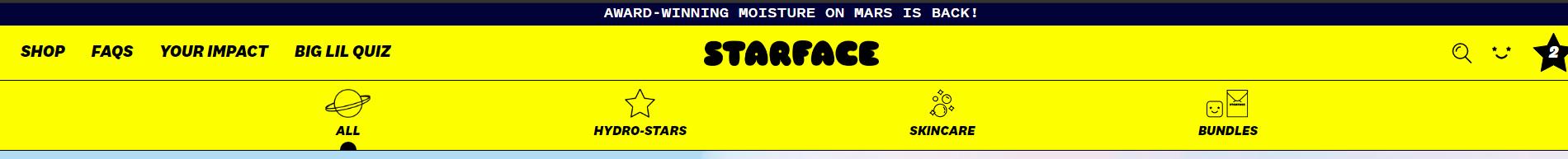
Take a look at their desktop header. They include a USP bar that announces their Moisture on Mars is back in stock. The logo is centered and icons for search, account, and cart are on the right. Navigation items are below and content links are visible but not as prominent as the navigation links.
They still take some liberties with these conventions, like making the account icon a smiley and the cart icon a star, but their younger audience will be able to easily understand what these icons mean.

On the category pages, they feature products that move up and down, and some even open to display what’s inside. Hover over the “Add to Bag” button and you’ll see additional text. These are a way to convey their brand image but they still display elements we come to expect on category pages:
- Review numbers and review stars
- Pricing
- Labels like best seller
Starface does a great job of breaking the rules while still making their site simple for their audience to navigate and purchase.
BOOST – Immune to “Boring”
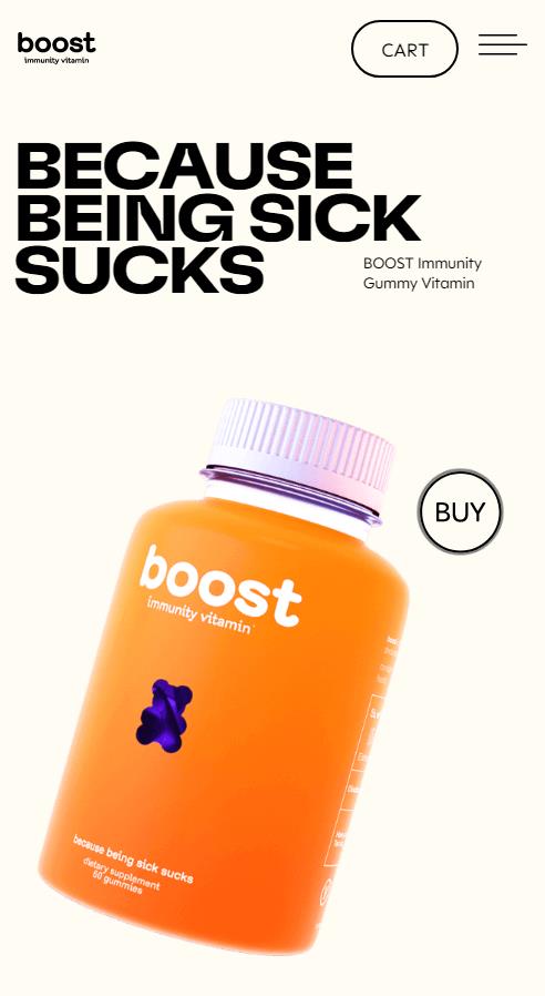
This next site makes it easy to figure out what they do and why you should care. BOOST sells immunity vitamins “because being sick sucks”.
Who doesn’t resonate with that?
Vitamins and supplements are a crowded space, so it’s important if you bring someone into your site from an ad or other marketing that you make a great impression.
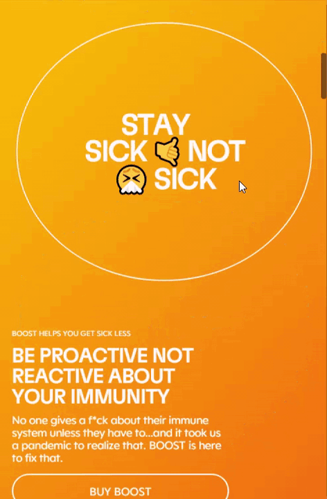
BOOST makes it simple to understand what they offer customers. They push the pain point of being sick in their design.
The site is very simple, selling just one product. They make it easy to buy, while also providing lots of info about the gummies. But just because it’s one product, doesn’t mean they made the site feel singular, instead it’s dynamic.
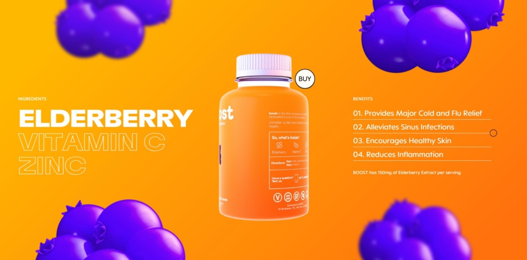
On the homepage, there is a lot of use of animation to bring users through the ingredients of the product. There are 3 main ingredients so the animation doesn’t feel long and can even force visitors to focus on these ingredients which can help them get more clarity around the benefits of the product.
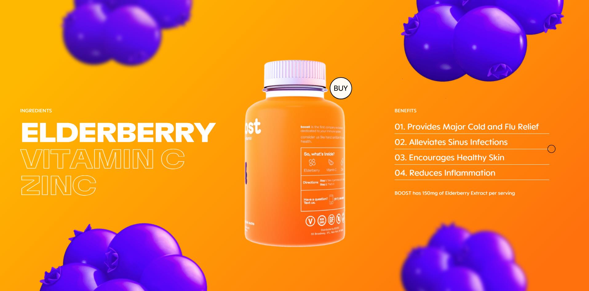
As you scroll on the homepage the supplement bottle and buy button remain sticky, a unique play on the typical “sticky” call to action button we often see on the bottom of the mobile screen.
BOOST and Starface are just two examples of the many we came across in this research. Take a look at stores like Peak, Made with MSG, and Plus for more out-of-the-box ideas.
You may be fearful of adding elements like the ones seen on Starface and BOOST for fear of causing distraction or friction. Luckily, A/B testing can help provide data-driven insights around these types of “out-of-the-box” design changes.
If you understand your audience, you can also feel more confident in trying new design elements. Younger shoppers are more adept when it comes to navigating the web, as opposed to older adults who might struggle to find the information they need and abandon the store.
How can you start implementing some unique brand elements into your store in order to make a strong impression and stand out to your visitors?