9 Product Sites on Shopify from the 2018 Consumer Electronics Show
Our topic today looks at 9 Product Sites on Shopify from the 2018 Consumer Electronics Show (CES). Every year, CES attracts buyers from around the world to view the latest products in person. As always, this year’s event showcased super cool innovation. Yet while many products looked great from the show floor, which ones continue to intrigue in ecommerce?
After the show closes and the exhibitors go home, product sites live on to attract and convert shoppers. On behalf of Command C, I walked the virtual show floor of CES 2018 to determine which products keep innovation alive through their ecommerce stores.
Related: 8 Ecommerce Trends for 2018
As you’ll see, the exhibitors at the 2018 CES showed some amazing products, and their sites reflect it. However, as I was perusing, I kept seeing opportunities to make the sites even better. I folded these ideas into this list, too. I’m not trying to be hard on anybody. Rather–and I say this from the whole Command C crew–we want to see entrepreneurs thrive. As I came across ways to improve, I wanted to share them in the spirit of encouragement.
So with that, here are 9 Product Sites on Shopify from the 2018 Consumer Electronics Show (CES). Let’s take a look.
1. Chipolo
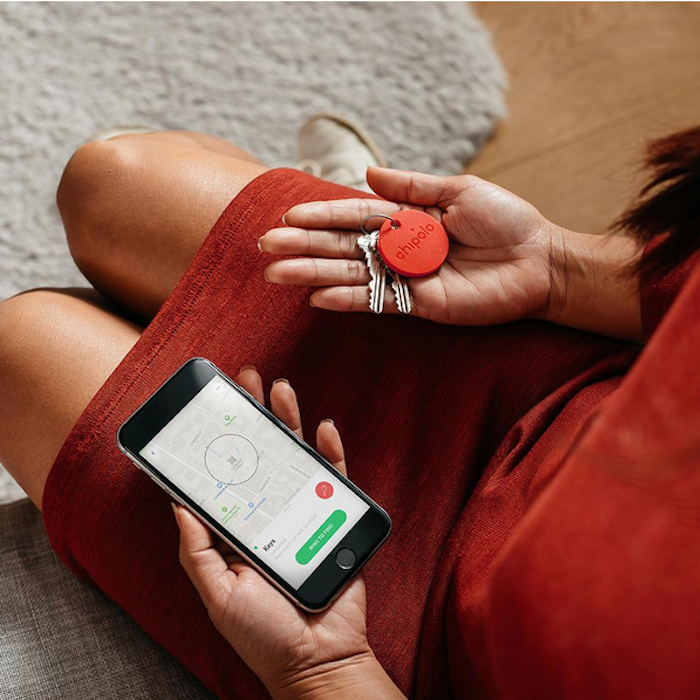
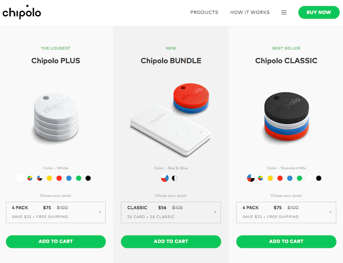
What It is: Chipolo is a small plastic gadget, available as a thin disk or card, that you attach to an item you don’t want to lose, e.g. keys and/or wallets. Sync the Chipolo to your smartphone via its app, and you’ll always be able to find the item.
What’s Great About this Site: A site is off to a good start when there are two BUY NOW buttons on the landing page. When I click one, I’m taken to Chipolo’s selection of products. The products are neatly displayed, and right off the bat, I see that they are running a sale. They don’t do this through a pop-up, but rather they’ve crossed out all their full prices to show the discount price. It’s clean and clear, and I like it.
What Would Make It Even Better: I’d like to know all the forms of payment that Chipolo accepts early in my shopping. For instance, it’s helpful when a retailer displays icons of the payments accepted (Visa/MC, Apple Pay, etc) on the homepage. Early in the checkout, I learn they accept PayPal, but I don’t know what else yet.
2. Project Nursery + Junior
What It Is: All things baby. And a lot of things for Mom. This beautiful store offers everything from clothing, bedding, accessories, furniture, and more. The company made waves at CES 2018 for its debut of the first-ever baby monitor powered by Alexa voice.
Note: Due to popular demand, this product is currently sold out. They do a good job of letting this be known right from the start of the shopping process.
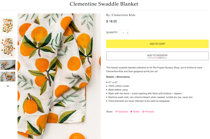
What’s Great About this Site: This company loves providing products for babies and the people who love them. And the people who love them enjoy sharing their projects – check out the Project Gallery. The store has a really nice blog, too. As I shop, I feel a part of a larger community. Also, as shown above, their zoom feature is so clear I can almost feel the softness of the Clementine Swaddle Blanket.
What Would Make It Even Better: It’s not easy for retailers to offer free shipping, but I’d encourage Project Nursery to try. (Tip: Set a threshold for free shipping.) When I get to checkout, I learn that it will cost $7.98 to ship the adorable $18 Clementine blanket to NYC. I worry that will divert some customers.
3. Reliefband
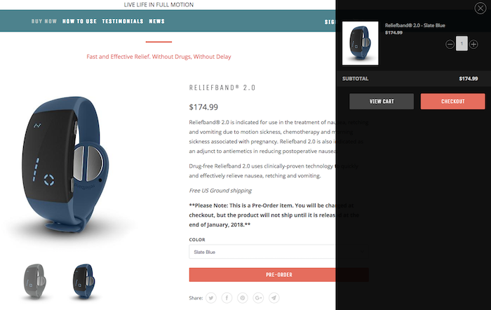
What It Is: Reliefband is a band you wear around your wrist to prevent nausea from motion sickness, chemotherapy, morning sickness, etc. As someone who got super woozy while kayaking on my honeymoon, I’m interested.
What’s Great: Reliefband does a nice job of managing my expectations. They just came out with their 2.0 version, and rather than have a “Buy” button, it reads “Pre-Order.” Right above the button, it says that this version will not ship until late January 2018. It’s written in bold with stars, so I can’t miss it. And when I click Pre-Order, the screen splits to show me that the band has been added to my cart.
Even Better: They promote the Reliefband with strong testimonials, a very good 360 degree view option, and instructions on how to apply the band. But the science nerd in me, as well as the shopper who needs to fully understand a product before I buy it, wants to know how it works. Also, they display the Charcoal Grey and Slate Blue bands as two different products on their main product page. But really, these are two variations of the same product. I suggest steamlining the main product page to showcase the one and only Reliefband 2.0.
4. Cocoon Cam
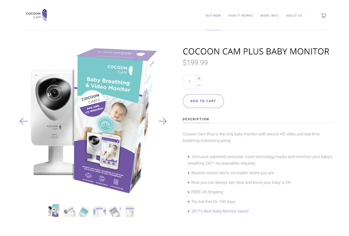
What It Is: A baby monitor with high def video, 2-way audio, cry alerts, and the ability to track baby breathing.
What’s Great: This site is clean and clear. When I start on the homepage, I easily see two BUY NOW buttons. Also, as I scroll it, there’s a list of brick and mortar stores where I can buy the Cocoon Cam. I’m all for exclusively online sales, but some shoppers may want to see this monitor in person–especially nervous new parents. Also, I like that I can buy this online using 9 different forms of payment, including Shopify Pay. I learn this from icons on the homepage.
Even Better: After I enter my address for shipping in checkout, I’m told for the first time that I can have the monitor shipped for FREE in 5-7 business days. That’s great! I encourage Cocoon Cam to let this be known earlier in the shopping process, even on the product page.
5. Populele

What It is: The company Popuband bills its Populele as the “world’s 1st smart ukelele.” The Populele connects via bluetooth to a propriety app that teaches people how to play.
What’s Great: The navigation is clear, and they suggest good related products in the cross-sell. AND I’m given 9 different payment options for my Populele! I can use one of 6 credit cards or a payment service, including Amazon Pay, Apple Pay, and PayPal. Remember: shoppers want lots of options in paying.
Even Better: It’s not until checkout that I learn my Populele qualifies for free 2-5 day shipping. That’s a rockin’ tune, indeed, but I’d like to see Populele promote the free shipping from the start of my purchase journey. Also, some of the related products such as the Canvas Case, are only described with images. No words. I want to read about these items, too. A lot of shoppers won’t buy unless they have sufficient product information.
6. Square Panda
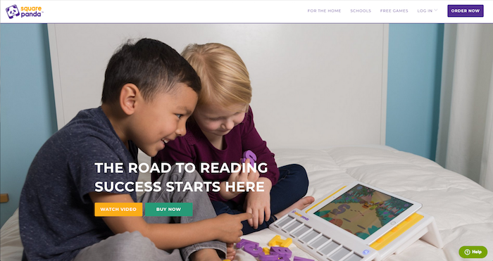
What It Is: In their own words, “Square Panda is a phonics playset for the iPad that combines early reading skills and multisensory play to unlock learning. The playset includes 45 smart letter toys that interact with learning games.”
What’s Great: I’m always a fan of seeing a large Buy Now button in the center of the landing page. The other prominent button here says Watch Video. I like these two simple options. The product video is strong, esp. when it shows how my child can learn to read through photos I’ve taken. (See it to believe it!)
Even Better: When I click Buy Now in the center of the page, it directs me to purchase Square Panda Home Edition. Yet, when I click on Order Now on the upper right hand corner, I’m able to choose between two options: Home Edition or Classroom Edition. I’d like to be able to see both options after clicking the Buy Now button as well.
Disclaimer: We fudged a little. The next 3 sites are not currently on Shopify, but we would love them to be, wink. That said, each site has a solid user experience, and I wanted to share them all here.
7. Peloton
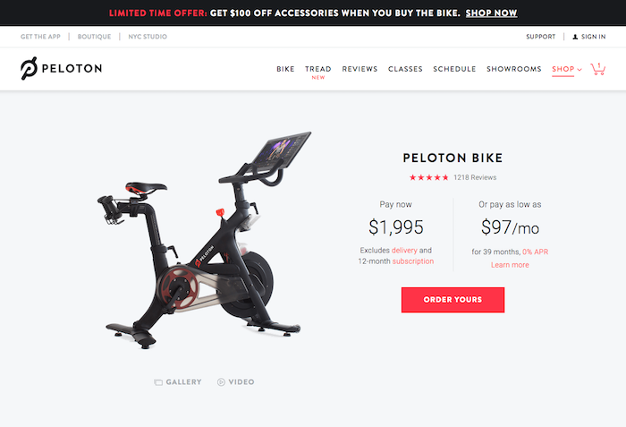
What It Is: The Peloton Bike is an indoor exercise bike equipped with a large touchscreen. With a $39 Peloton monthly membership, riders can access live and on-demand spin classes from their own home. Peloton Interactive Inc. also sells treadmills and fitness accessories.
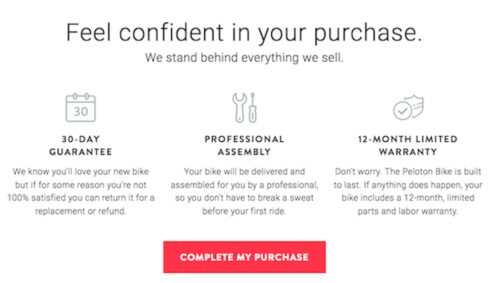
What’s Great: This product is a new concept for me, and at $1,995, it’s a significant purchase. Peloton does a great job of earning my trust. When I add the bike to my cart, a new screen pops up: “Feel confident in your purchase.” This message explains the 30-day guarantee and the 12-month warranty. Most importantly to me, it also describes the professional assembly. I can find this information elsewhere on the site, but I like how they included it at the start of checkout. Also, they offer great payment options early in checkout out, too. I can buy the bike all at once, or pay $227/month over 12 months, or $97/month over 39 months.
Even Better: Once I select my payment plan, they direct me to the final steps of checkout. I see that I’m buying the bike and monthly subscription, but there are no photos of the bike, nor any links to revisit its product page. It’s helpful to be able go back to a product page before I finish my purchase–what if I want to buy those cool biking shoes I saw as a cross-sell?
8. FormLabs Form 2
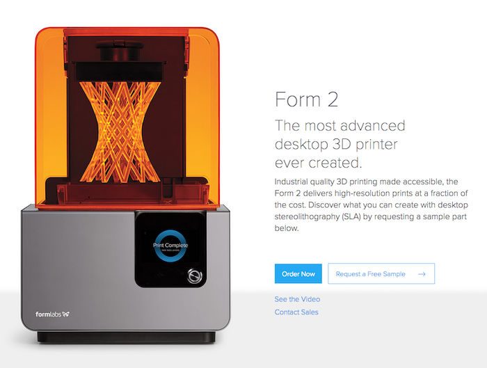
What It Is: Form 2 is a 3D printer, made for consumer desktop use, priced at around $3,500.
What’s Great: When I land on the homepage, there are two clear options in the middle of the screen: Order the Form 2 or Request a Free Sample. Since 3D printing tech is rapidly evolving, and every machine prints a little differently, I like that I can order a sample to experience the Form 2’s output. This builds trust right off the bat. Also, when I view my cart, they start with a calculator to estimate the shipping and tax. I won’t be surprised by the final tally; I get to see it before I even start checkout.
Even Better: Remember that ol’ country song, “She Needed Me to Register, so I Left”? Ok, you’re right. I made it up. The point is, at Command C, we strongly encourage retailers to fold account set-up into the checkout process or right after. Take a look at our 22 Rules for Online Checkout to see some helpful examples.
9. Immotor
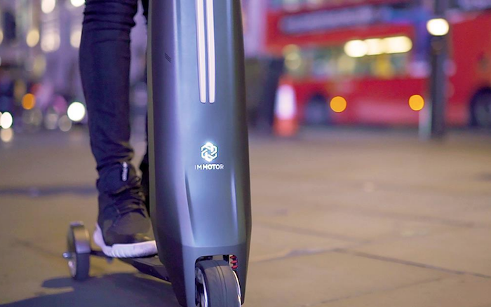
What It Is: Immotor is a personal electric vehicle that easily folds to become its own carrying case. It features the Immotor Super Battery, as well as “…Bluetooth connectivity, media and audio functionality with built-in speakers, GPS tracking, parental controls, cruise control, back-end data gathering and analysis, and more.”
What’s Great: The Immotor is in demand. I want one yesterday, but their site quickly helps me realize that it will take time. On the product page and in the shopping cart it reads, “CURRENTLY BACKORDERED UNTIL END OF FEBRUARY.” They’ve set my expectation here. Also, after I enter my shipping information, they give me the option to stay updated on the shipping progress through Facebook Messenger. With over a billion people using Messenger every month, this is a really good example of meeting customers where they are.
Even Better: After I read the FAQs about this little wonder, I was ready to walk through the purchase process. Only I could no longer get to it. I clicked on the logo on the upper left hand corner. This should take me back to the homepage, but not this time. I could be ready to buy, but I have look up the site again. Also, I couldn’t see the shipping cost ($50) until after I had entered my information. A shipping calculator would be helpful here.
After reading how to improve some already great sites, are you ready to add new features to your store? Do you have ideas to better serve your online customers? We’re experts in optimizing ecommerce sites on Shopify, Magento, BigCommerce, Miva, and WooCommerce. Let’s set a plan in motion to update your store and convert more shoppers into buyers.
