9 Recommended Ecommerce Site Features for Selling Furniture Online
The annual International Contemporary Furniture Fair (ICFF) in New York showcases some of the most talented makers of luxury furniture and home furnishings in the world. And, perhaps surprisingly, their industry is the second fastest growing industry in ecommerce. Only online sales in clothing, accessories, and footwear has it beat. In 2015, furniture and home furnishings ecommerce sales totaled $26.7 billion USD.
Statista projects online furniture and home accessory sales to grow by nearly 60% from 2015 to 2019.
This industry includes a wide range of products from napkins to sectional sofas. The smaller items may have fueled the online growth thus far, however, the big pieces are on the move now, too. Just last month, Ligne Roset debuted their online store. They’re using 3D technology from Cylindo to help customers visualize a $3,940 TOGO sofa for their living room. These are early days for the technology, but not for long.
Here are 9 furniture companies poised to cause a clamor at ICFF. As they prepare for the big show, they’re also doing something unique and inspirational with their ecommerce shop.
1. Product Imagery & Presentation: Chilewich
Platform: Not sure, but it’s too good to miss
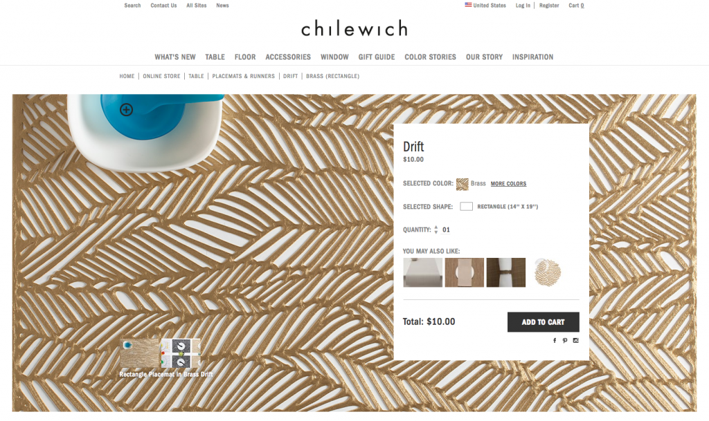
Why We Swoon: When we arrive on the product page for the Drift placemat, its photo fills the screen. This photo is big and inviting. Also, it becomes the backdrop for the product information and purchase selector. If we want to see the mat without the information on top, we click the plus sign on the blue item on the upper left hand corner, and the information disappears. If we want the information back, we click on the same icon again and it reappears. Chilewich has incorporated their product into the design of the shopping process in an elegant way.
2. Shop By Shipping Possibility: From the Source
Platform: Shopify
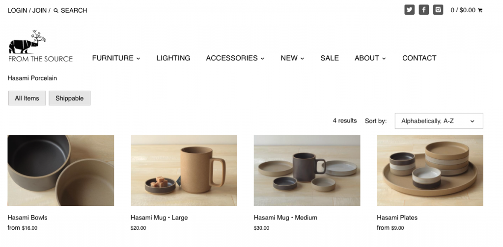
Why We Swoon: For years before their recent move to Manhattan, From the Source were our neighbors in Greenpoint, Brooklyn. We have a couple of reasons why their online store makes our list. First, there’s nothing worse than shopping for and getting attached to something online, only to later learn that it’s not shippable. From the Source handles this well. At the top of every product category page, we have the option to shop “All Items” or “Shippable.” From the Source shows us one of the most important ways to build trust with customers – by setting clear expectations from the start.
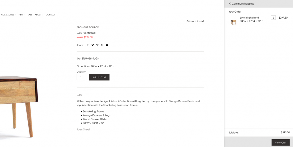
Additionally, From the Source displays a great example of a rapidly-growing trend in ecommerce. When we find a product we love and click on Add to Cart, the shopping cart appears via split screen–keeping the user within the shopping experience. This keeps our eyes on our new purchase, while giving us the option to continue shopping or transition to another page for our cart review and checkout.
3. Clear Communication of Product Options: FYRN
Platform: Shopify
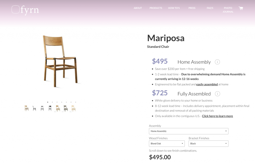
Why We Swoon: FYRN knows their customer, and she’s someone who likes to build it herself. Note the options here: the Mariposa chair is available for $495 for those who wish to assemble it at home. For customers who want to get a fully-assembled chair delivered, then the Mariposa can be yours for $725. Not only do the DIYers get to exercise some muscle, but this is also a really good way for FYRN to pass along savings to their customers. They are saving the labor costs, and most likely, some shipping costs. We like the way FYRN easily introduces these options.
They also do a nice job of setting expectations for their delivery times. The self-assembling crowd will have to wait longer: “Due to overwhelming demand Home Assembly is currently arriving in 12-16 weeks.”
4. Clean & Easy Site Navigation: Umbra Shift
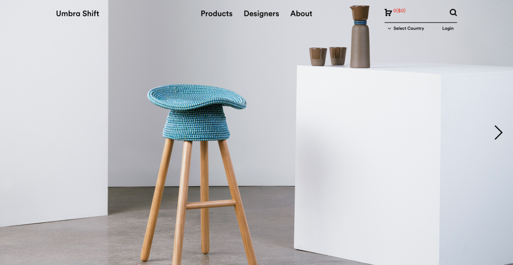
Platform: Magento
Why We Swoon: In the case of less is more, Umbra Shift is everything. It starts with the homepage, comprised of a full screen photo with three menu choices: Products, Designers, About. Click on the image, and you’re directed to a page with all products. They are shown in a clean, modern grid. Once you’re on a specific product page, there’s a large photo of it on the left. On the right, the product name is dominant, with brief copy about it underneath. Click below the copy for more information, and the product dimensions and more appear over the photo.
We often say that a website can only be as great as its product. The product should sell itself and the website should compliment the product by making the buying process as easy and efficient as possible. Umbra Shift gets this. With large and beautiful photos, the essence of their product truly comes across.
5. Great Communication of Production Time: Hugo & Hoby
Platform: Shopify
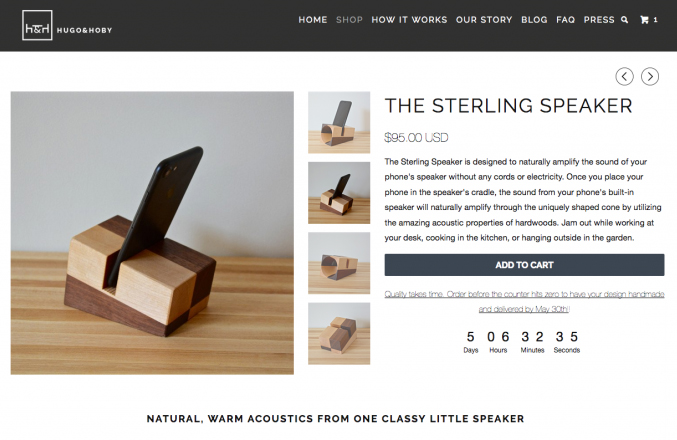
Why We Swoon: On Hugo & Hoby’s products page, several items are labeled with a small banner that reads, “Quick Ship.” Click on one of these, and it says that the item can be handmade and delivered in four days.
For products not labeled Quick Ship, each of these pages displays a timer. For example, the Sterling Speaker starts at 5 days, 6 hours, 37 minutes, and 59 seconds. And counting. It comes with a message: Quality takes time. Order before the counter hits zero to have your design handmade and delivered by May 30th! (approximately 5 weeks from this writing) Yes, online shoppers are getting used to fast shipping times. Yet all of Hugo & Hoby’s products are hand-crafted, and they’ve done a nice job of setting expectations for our order. As long as we know the timeline from the start, it’s going to be worth the wait.
6. Navigation by Product Color: Wallshoppe
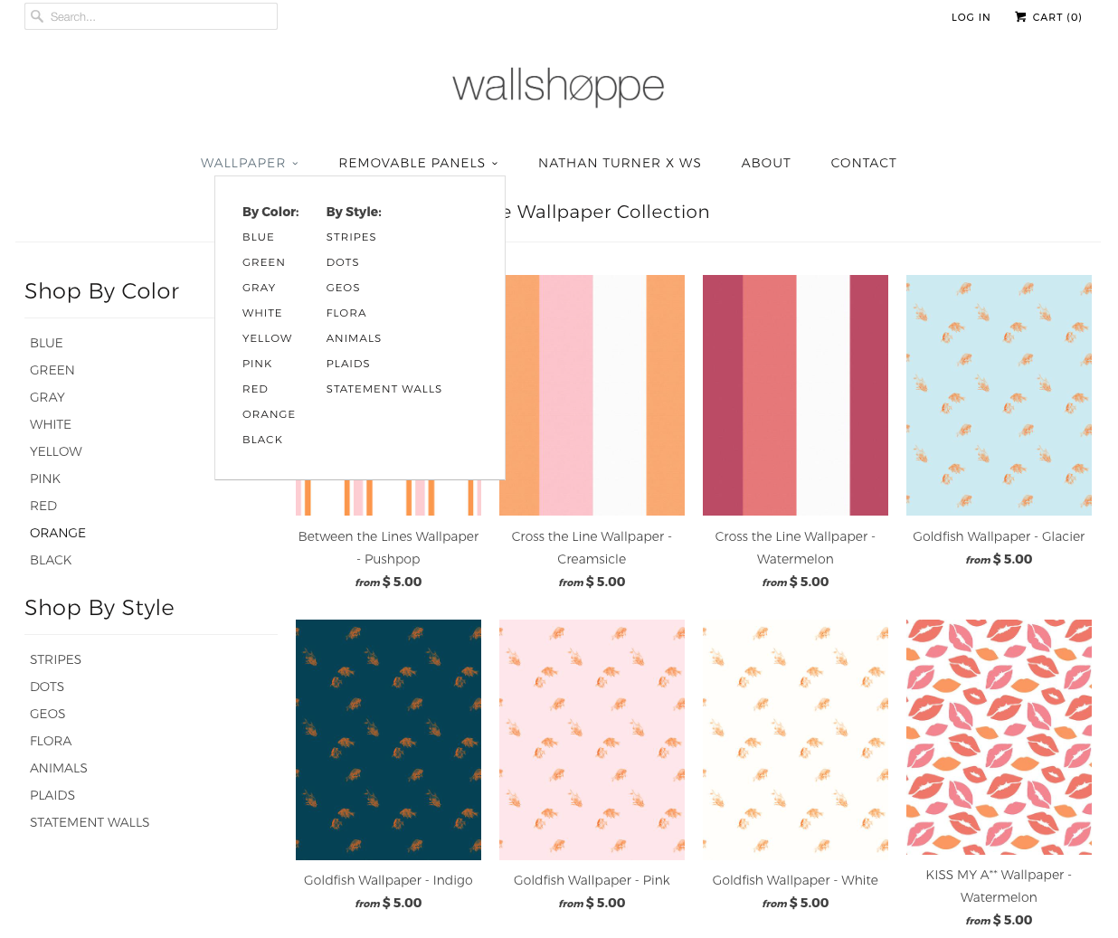
Platform: Shopify
Why We Swoon: Yes, a lot of retailers offer the option to shop by color, but Wallshoppe has built this way of shopping into their main navigational experience. What we see from these makers of fashion-forward wallpapers, is more Shop By Palette. These are not simple boxes of standard colors. Instead, Wallshoppe draws us in with their specific take on color–all throughout the site.
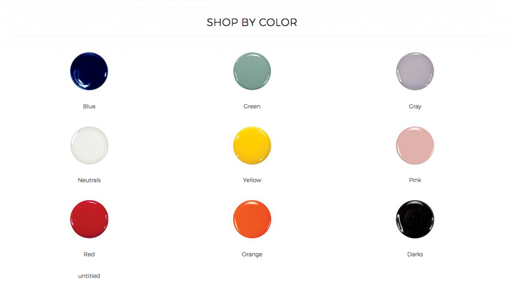
Wallshoppe’s green has nothing to do with St. Patrick’s Day. Their gray has shades of periwinkle in it. Their pink is close to Pantone’s Color of the Year, rose quartz. In taking a common shopping feature and making it their own, Wallshoppe shares their updated approach to wallpaper right from the homepage.
7. Communicating Product Customization: Bend Goods
Platform: Shopify
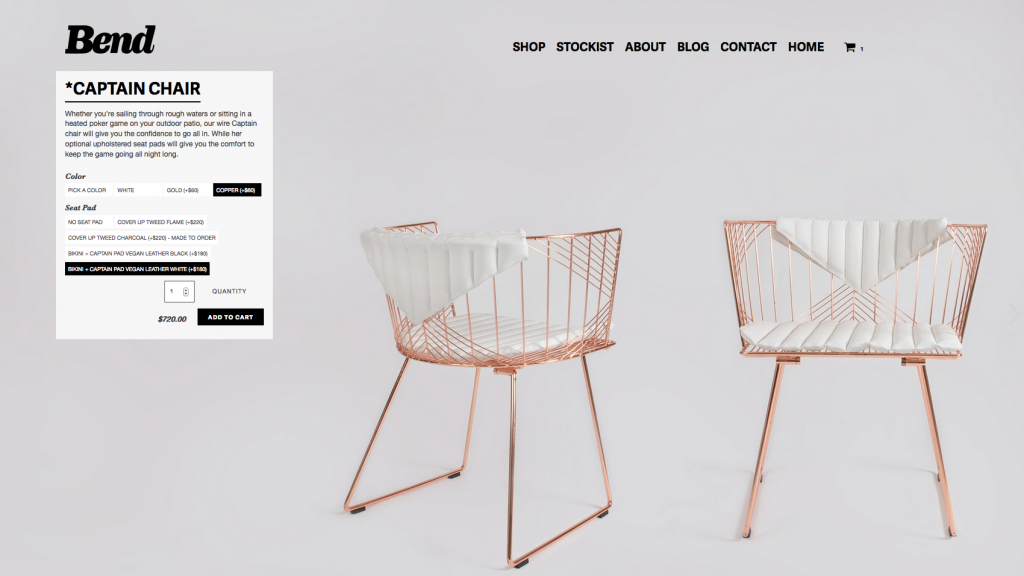
Why We Swoon: The home furnishing industry understands the draw of big, beautiful imagery. When we select a product on Bend, the next page becomes a full screen product photo. The product information and selector are displayed towards the top left of the image. Here, as we customize our Captain Chair by selecting the color and padding, the full screen photos change to reflect the updates. And, the pricing updates on the fly. Nice.
8. Elegant Add to Cart: TRNK
Platform: Woo Commerce
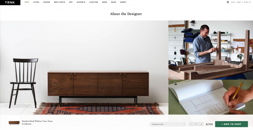
Why We Swoon: Contrary to some of the reasons why we like other ecommerce stores listed here, we like TRNK because they have streamlined options in their products. Take the Handcrafted Walnut Four Door Credenza pictured above. We don’t an option for wood or finish or the number of doors. We have two options for hardware, and that’s it. We’re not “over-choiced” here. We’re going to let the designer who crafts this credenza make it as he’s inspired to do so. Speaking of the designer, as we scroll down on the product page to read about him, an Add to Cart bar pops up along the bottom on the page. We like how TRNK is keeping the cart easily accessible as we learn more about the credenza.
9. Shipping the (Seemingly) Impossible: Stone Forest
Platform: Shopify
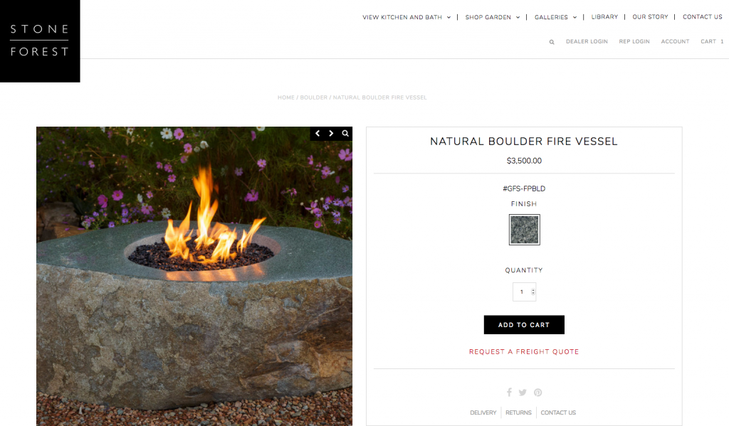
Why We Swoon: Stone Forest shows us there is no limit to what you can sell and buy online. The day we can add a Natural Boulder Fire Vessel to our cart is now. This exquisite, unique product weighs approximately 1200 lbs. As shown above, we can get a quote on freight shipping prior to our purchase. Yes, there will be extra steps in the buying process when we get something this unusual in terms of size, weight, and shape. We’ll want to get the shipping quote, and we’ll likely make calls to their customer service department. Nonetheless, we’re able to research and buy this product online. We admire that ecommerce entrepreneurs keep updating the definition of possible.
Are you feeling inspired to update your store? Or ready to launch a new one?
We noticed that a lot of ICFF exhibitors – companies that represent some of the most creative work in the world – are still selling offline using tearsheets. We hope this article encourages studio owners to refresh their thinking of online sales. To quote Tobi Lütke, the CEO of Shopify, the platform used in most of our examples here, “We’re no longer talking about the future of ecommerce, but rather the future of commerce as a whole.”
We’d love to hear what you’re planning for your retail business, and we’ll share how we can help you get you there.
