Top 5 Accessibility Updates for Ecommerce Stores
As an ecommerce operator, you’ve seen the rise in the need for accessibility on the web. We walk through 5 updates you can make to your store to improve accessibility for visitors with disabilities or other impairments. Learn how and why to make your store more accessible for more people and how to get an accessibility audit.
Transcript: Top 5 Accessibility Updates for Ecommerce Stores
Today, we are talking about accessibility. How can you make your website user-friendly for everybody? In this video, you’re going to learn:
- Why you should care about accessibility,
- Easy accessibility updates to make
- How you can get an accessibility audit.
Why Care About Accessibility?
Why is accessibility important? There are people who want to navigate the web but they might have a visual impairment, they might be color blind, they might deal with hearing loss and because of those disabilities, they have to navigate the web using special tools or they require sites to adhere to certain standards so they can navigate better.
By making your website adhere to these accessibility standards, you’re helping people with disabilities be able to navigate and shop on your site.
It also helps prevent future legal action. There’s been a trend of law firms sending out legal action to different e-commerce stores or other types of websites over accessibility, so that’s something you definitely want to get ahead of.
And then, just the fact that you will be ahead of the trend. 94% of stores, that’s estimated, are non-compliant with accessibility standards.
Hidden Challenges of Navigating the Web
Some of the common accessibility challenges are that screen readers are used by people with visual impairments and screen readers are reading each element, so each of those elements really needs to be labeled properly.
Color blind users need contrasting colors on the site. I’ll show you a way you can test your color contrast. And then, deaf visitors, if they are seeing any video content, will require captions, in order to understand the video better.
An Easy Fix to Help Color Blind Visitors
One of the accessibility updates you can make is making sure all of your text color contrasts. In this instance here, using webaim.org, you can see using this, kind of, light-ish gray color on a light gray background does not pass the color contrast standards.
You would need to use a darker color, in order to make the site easier for people with visual impairments, as well as people who are color blind. Here, for Alo Yoga, you can see that their light gray contrast on the white background passes the contrast test.
Make Images Visible for Screen Readers
Another easy accessibility update to make is adding alt text. You want to make sure all of your images have a descriptive alt text and name, so when screen readers are going through the different elements and images, it’s easy for visually impaired people to understand what the image is.
Help Hearing Impaired Understand Videos
For videos, making sure that there are captions. So, if you’re using YouTube, there’s a setting that will auto add captions or you can use an external site to pay for your video to get captions, that way people who are deaf or have hearing impairments can turn the captions on and understand the context of the video.
Properly Label Fields
With form fields, so you want to make sure that they’re labeled properly and have a name. Here you can see that this field is first name, so that way when screen readers are going through and reading each of these forms, that they know what the field is referencing.
Navigate Your Site Without a Mouse
And then, lastly, keyboard navigation. There are some people with disabilities who don’t use a mouse, instead they will use the keyboard to navigate.
Primarily using tab and shift tab, so tab go through the elements, shift tab to go backwards and other keyboard clicks, such as enter, to click on an element. You want to make sure that your website is easy to navigate with a keyboard.
Also, including the things like skip to main content, so that’s a feature you can add, that will help people navigating with a keyboard. Using proper heading structure and then, also testing your own site.
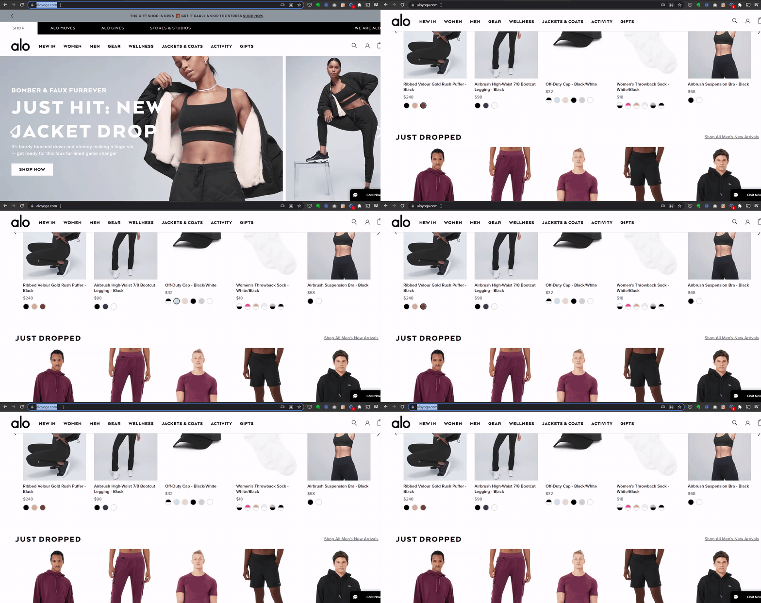
We can see here for Alo Yoga, when I went through on their homepage and I was tabbing through, it did not initially or it didn’t tab through the navigation, it went straight down to these color variants. That would make it very difficult for somebody navigating with the keyboard to really navigate through their homepage.
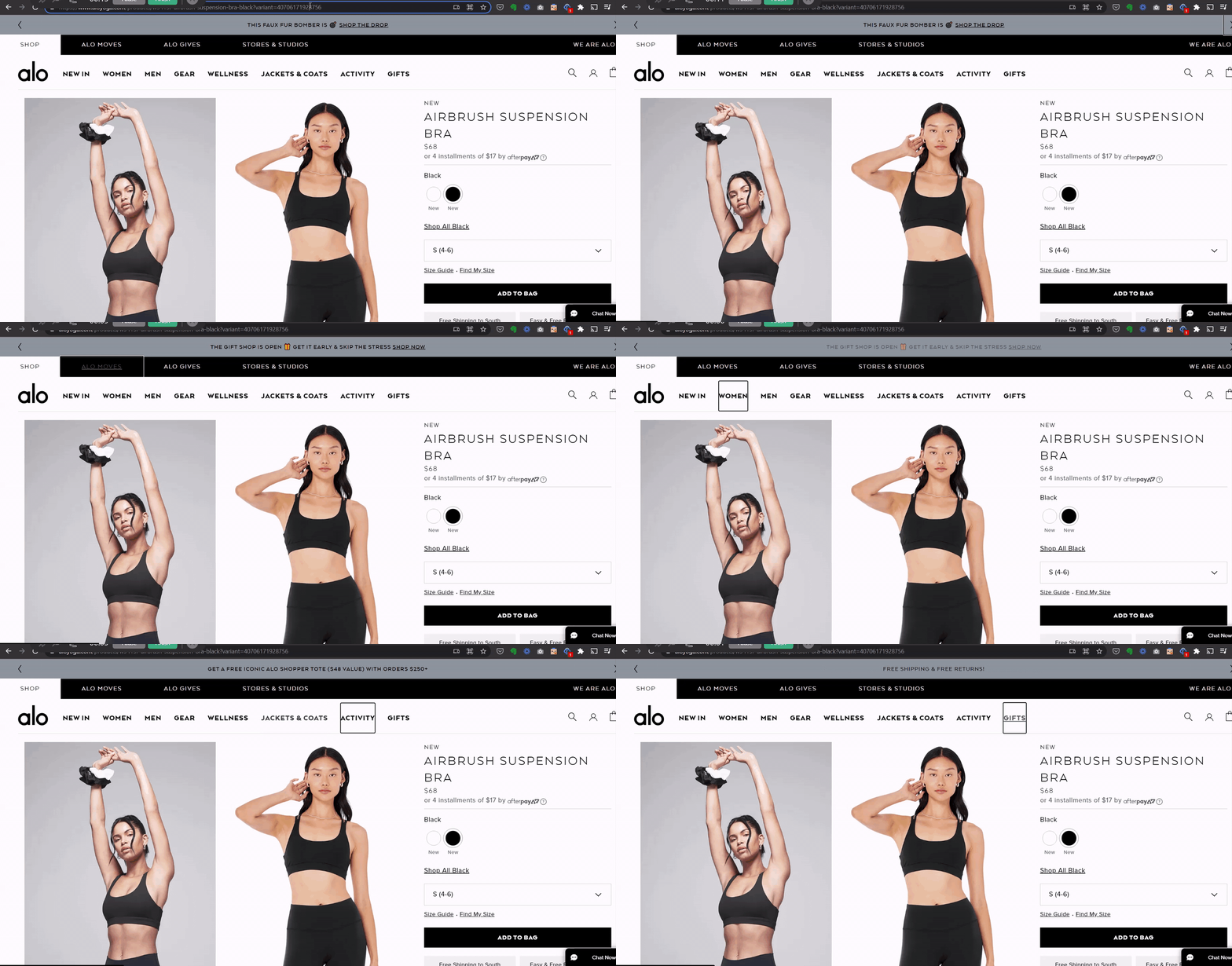
But then, navigating on the product page you can see that, you can tab through starting from top to bottom here. It’s quite easy to tab through and shift tab back to get through the different elements.
Audit Your Website for Accessibility Issues
Something we definitely recommend here at Command C is, signing up to get an accessibility audit.
The team here would run through your site and:
- Recommend specific implementations to be compliant
- There would be a timeline
- Best practices for your internal team, so going forward, how to make sure your site stays up to date and compliant
- Estimates for getting your site completely compliant
- How to prioritize those changes because likely, there’s going to be a lot of changes.
Definitely, if that’s something you’re interested, make sure to reach out and we would be happy to set up an audit for you. Hopefully you got some good tips here to get started on making your site more accessible and I’ll see you in the next video. Thanks.


