How to Optimize Product Variants to Improve the Customer Experience

As retailers grow their stores, they experience the paradox of ecommerce: the simpler something seems to the customer on the frontend, the more complex it is on the backend. At Command C, we often talk of the need to have an ongoing strategy as an underpinning and lens through which any site changes are made. One reason is because ecommerce stores are digital ecosystems; when a merchant adds new functionality, it can start a chain reaction of technical events. The other reason is because it takes planning to present complex functionality in an easy, streamlined way for your customers. Product variants are a prime example of this.
Consider this: when people shop for shoes in a physical shoe store, we begin by looking at all the various shoes available. Then we take a pair to the sales associate and ask for them in our size and color preference. It’s an easy in-person conversation. When this experience gets transferred online, however, it gets more complicated. It becomes the merchant’s responsibility to help customers express what they want, i.e. the exact shoe, color preference, and size. The merchant also has to communicate stock availability. Online customers get frustrated if they select a size, color, etc. only to learn later that their preference isn’t available.
Fashion and apparel brands, in particular, usually have products that come in dozens of variations. It’s critical to communicate all these options to customers, while at the same time, not overwhelming them with too many choices. Plus, some popular ecommerce platforms have product variation limits. Shopify has a 100 variant limit, and BigCommerce has a 600 variant limit, for example. To work within these constraints – and to make the online shopping experience appealing to your customers – here’s how we help retailers plan their product variant strategy.

How are your products visually different?
Retailers with a high number of product variants have to break them up into smaller categories in order to work within platform restraints. This also helps communicate the variants to customers. In deciding how to divide what is essentially the same product into multiple “parent” products, the key question is how are they visually different? For instance, with shoes, it’s easy to see when they vary by color. But customers likely can’t tell the difference between shoe sizes from a photograph.
Keeping with the shoe example, the best practice would be for the retailer to create an individual parent product for every color. There will be a parent product that’s a black high heel and it comes in 10 sizes. Likewise, there will be one for the blue high heel that also comes in 10 sizes. It will be much easier for the retailer to manage 10 products that come in 10 combinations, rather than one product that comes in 100 combinations. Customers are likely to have stronger feelings about some colors than others, and letting them see the shoe itself could provide a better experience for some customers and some products. And breaking up the product into smaller, visually-different categories will work within potential platform limitations.
How does your ERP or inventory management system organize product variants?
But before you break up your products by color variants and call it a day, it’s important to know how your ERP handles variant data. (Shout out to strategic planning here!)
ERPs are probably not going to have limits on product variations like some ecommerce platforms do. Further, you might not want to structure your products in the ERP like you do on the website.
Let’s suppose that you use Netsuite as your company’s ERP. You have one parent product, and it houses 10 colors and 10 sizes. That’s 100 individual product combinations available. But you can’t just push 100 individual combinations into your Shopify store if you want to break them up by color instead. In this case, you’ll need to push the products into a middleware (a piece of software, out of the box or custom, that sits between two other pieces of software and transfers data back and forth between them) that takes these 100 combinations, sifts through them all, and finds all the black ones (then the blue ones, etc). The middleware then needs to make one product that is the black one, and it comes in 10 sizes. Then it needs to find all the blue ones, and make one blue product that comes in 10 sizes, and so on.
The key takeaway here is that if you’re not managing your product data entirely within your ecommerce platform, and you have some sort of external integration, you need to be clear about how that data is structured and how it will be mapped between systems.

What does clear communication for product variants look like for your customers?
If we split product variants by color, the number of items on the Product Listings Page (PLP) is going to increase. For every one product (color), you’re going to have 10. This will be the case for every single product in the category. If your products only come in one or two colors, this isn’t a big deal. But for retailers with a wider range of variants, it could get confusing or overwhelming, especially for your customers.
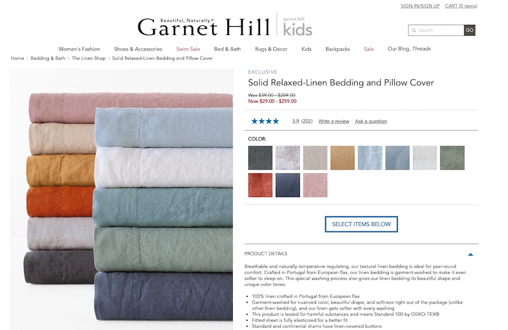
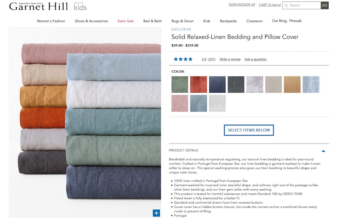
When merchants need to display a large number of variants, we work with them to adjust the PLP template to take better care of their customers. This is where we apply some magic programming dust. (The magic is just a well-written loop and some logic to recombine multiple parent products into a single displayed product.) This logic inside the theme directs it to get all of the products of this high-heeled shoe, and display them as though they were a single product, even though they are technically not. Then, if appropriate, we can even display swatches underneath the product imagery to indicate that it comes in multiple colors.
As a result, the merchant displays a default image, and the customer sees all the color options in the various swatches. When they hover over the blue swatch, the product image reflects the blue option. This is a more traditional way to present things on the PLP, but it does require some programmatic work if you want to do that after you’ve already split the products up by color. The beauty of this solution is that it gives you the best of both worlds. Sometimes, you may want to aggregate products like this, while other times, you may wish to merchandise strictly by color. With the experience controlled by frontend logic, you have the capability to accomplish both.
Consistent variant communication to the Product Details Page (PDP) is key
Now let’s say the customer hovers over the blue swatch, likes it, and clicks on it. The theme code (the programming magic that isn’t really magic that we mention above) has to know which product details page (PDP) to show the customer. And as the customer, I should expect to land on the PDP that shows the blue one. Though we’ll still want to show the customer that there are other available color options, we don’t want to take the customer to the default PDP and make them have to choose their preference a second time.
A common implementation when products have been split by color is to simply redirect the user to a brand new page upon swatch selection, the PDP for the color they’ve selected. This can be problematic because you’ve introduced the time for a full page load, and in some browsers, the transition between urls, even with cached assets on a fast connection, will not appear to be seamless. Color selection and visual display needs to be fast because customers will be fast when using it. If we think about our real-life example above, the action of looking at two shoes (assuming you have a clear preference) and indicating that preference in real life is instant. If your online customer has to wait three seconds just to see the image in a different color, that’s just too long. Retailers have to make certain that your customers experience consistency in color selection and visual display, and that you smooth the interaction as much as possible.
Other important considerations in product variants
As you can see, it takes a lot of internal strategy work to effectively display product variants in certain situations. In addition to platform restraints and ERP considerations, there are other important elements. For instance, as you work on your product variant plan, keep in mind that it gets more complicated when you sell through product bundles. Also, if you merchandise your inventory through auto-generated product grids, you need to be able to pull from all variants to populate the grids. A further consideration is how will your plan for displaying product variants affect the product search filters on your site? Will the filters be set up to reflect your product variant data structure? And, thinking internally, what does your operations team need? How about the marketing team?
No matter how you choose to define and display your product variants, the goal is always to make it easy for your customer. It’s critical to make your customer experience as friendly as possible, while also fitting into platform and operations-level constraints. Need some help thinking your plan through? Let us know, we’re here to help.
