Marie Oliver
is empowering women through the joy of style
Empowering Marie Oliver with a Vibrant Shopify Transformation
The Challenge
Marie Oliver, a women’s fashion retailer based in North Carolina, was ready for a digital transformation. Known for their bright, colorful garments, their outdated ecommerce platform couldn’t keep up with their vision. Their existing site was restrictive—so much so that even something as fundamental as a scrolling homepage was not possible. They knew where they wanted to go but felt stuck in place, unable to showcase their products and brand in the way they had imagined.
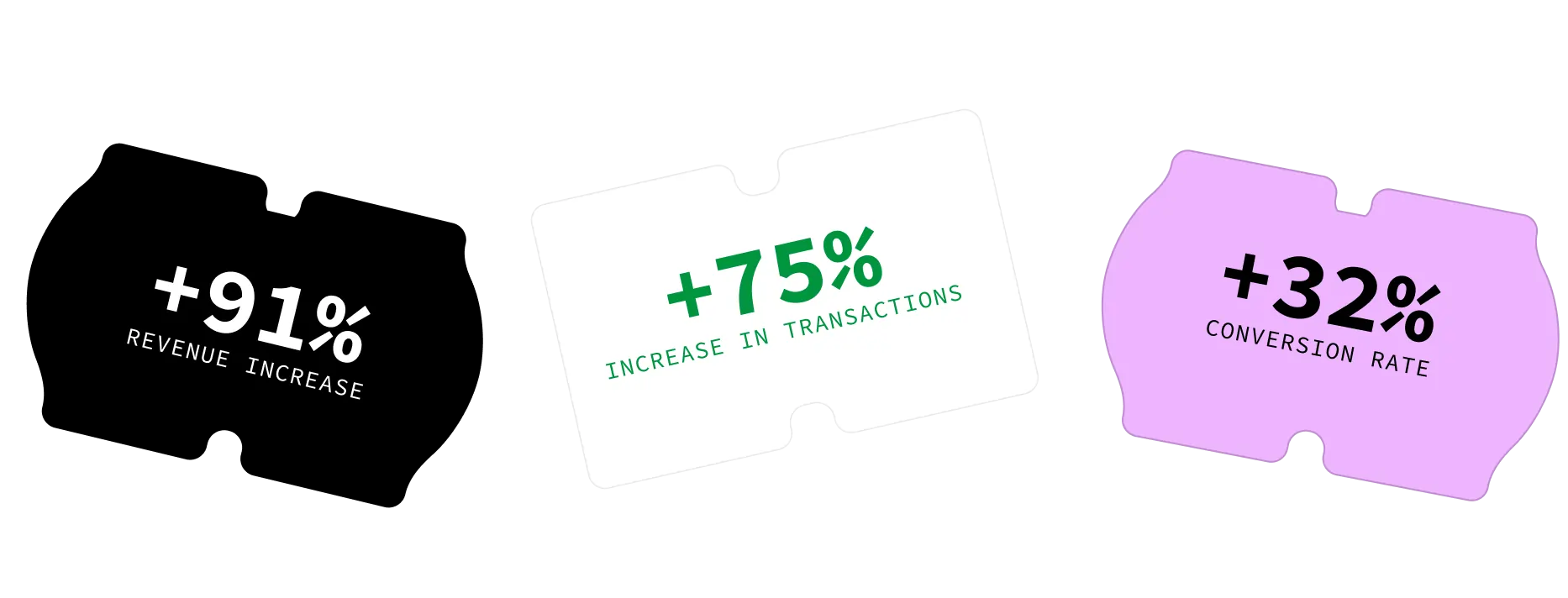
Command C partnered with Marie Oliver to migrate their store to Shopify and create a dynamic site that truly captured their brand’s vibrant essence. And the results speak for themselves:

Our Plan
To achieve these impressive results, we collaborated closely with the Marie Oliver team, transforming their ideas into reality through a series of thoughtful decisions.
Collaborative Development Process
Website development is a complex, multi-layered process that requires constant iteration and adaptation. From the outset, we chose to work with live content—real product data, images, and pages—rather than placeholders. This approach had two major benefits:
- It provided a true-to-life preview of the new site, eliminating the guesswork around design decisions.
- It allowed us to create a precise launch plan, ensuring a seamless transition between the old and new themes.
By providing early access to the new theme, we fostered a level of collaboration that exceeded expectations. The Marie Oliver team was able to engage deeply with the new site, making content updates and providing feedback in real-time. This hands-on approach empowered both teams to explore creative solutions and customizations together.
Optimized Color Swatches and Product Presentation
One of the major challenges of the previous site was the absence of color swatches. Each color variant was listed as a separate product, making it difficult for customers to see all available options for a given style. We leveraged Shopify’s built-in components and custom development to create a unified product experience. Customers can now view all color options for a product directly on the product page, streamlining their shopping experience.
Product Listing Page Enhancements
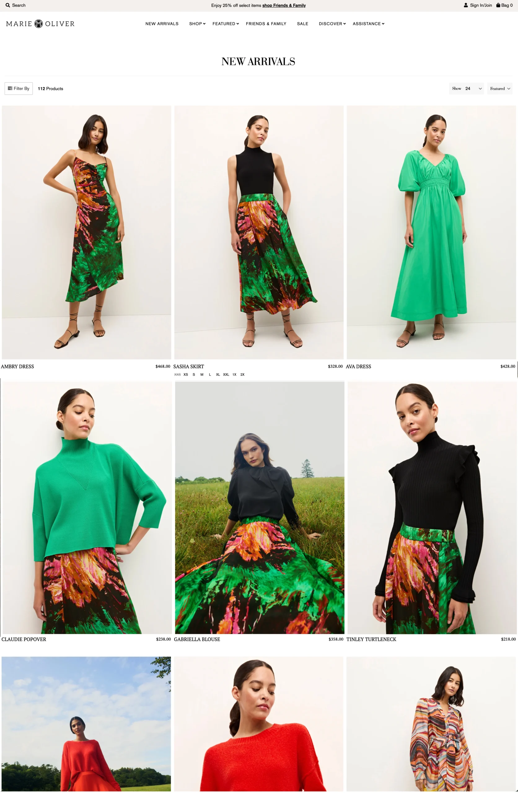
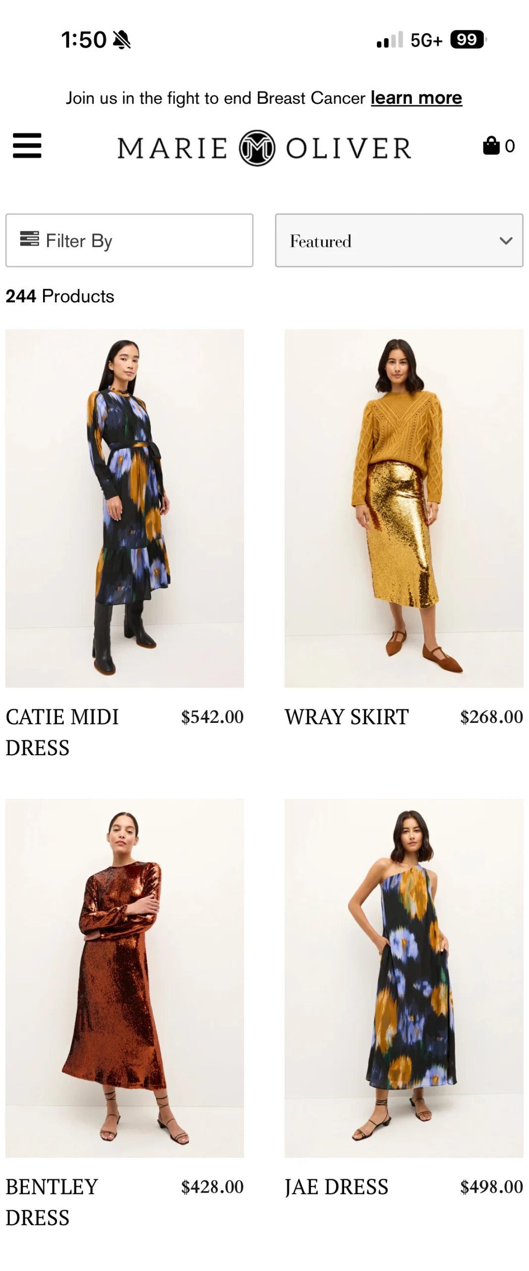
The out-of-the-box theme for the product listing pages (PLPs) didn’t fully utilize the available space, displaying small, widely spaced images with minimal interactivity. We customized the PLP layout to showcase large, beautiful images that align perfectly with the brand’s vibrant aesthetic. Hover effects were enhanced, and a new zoom feature was added on the product detail pages, giving customers a closer look at the intricate details of the garments.
Additionally, we improved the usability of the existing filters app. Originally, filter icons were hidden at the top of the page, requiring users to scroll back up to access them. We modified the interface so that the filter options stay visible as users browse, making it easier to find the right products.

The Results
- Increased Customer Engagement: The new color swatch feature has been a game-changer, allowing customers to easily explore different options and make informed purchase decisions. According to Kate Sykes, Ecommerce Manager at Marie Oliver, “Everyone is raving about the color swatches. I’ve never seen a group so excited about a square. Wholesalers are using it to browse and re-order.”
- Improved User Experience: The revamped product listing and detail pages, along with intuitive filtering, have made navigation seamless. Customers now have a richer, more immersive shopping experience that better reflects the quality and style of Marie Oliver’s offerings.
- Significant Growth in Key Metrics: The results of this project are clear in the numbers. With a 91% increase in revenue, a 75% increase in transactions, and a 32% boost in conversion rates, the new site is driving tangible business growth.
Looking Ahead
The transformation of Marie Oliver’s ecommerce site is a testament to the power of collaboration, creativity, and strategic planning. By migrating to Shopify and embracing a more flexible and dynamic platform, the brand is now well-positioned to continue its growth and explore new possibilities in digital retail.


“Everyone is raving about the color swatches. I’ve never seen a group so excited about a square. Wholesalers are using it to browse and re-order. I feel like we’ve been gifted this amazing new toy to play with – one that really works at converting visitors to customers.”
– Kate Sykes, Ecommerce Manager
