8 Best Practices for Online Shoe Retailers to Know
As experts in the magic and mechanics behind ecommerce, sometimes we find an online store with beauty only homepage deep. Yes, the frontend experience has to draw in customers with appealing photos and product copy. There’s no doubt about that. Yet with the average cart abandonment rate hovering around 70%, far too often shoppers leave an online merchant when they see a rough buying process ahead.
Here at Command C, we love to talk about the inner workings of websites. We often discuss what works and what doesn’t while navigating the evolving seas of ecommerce.
We’re also a woman-owned, female-led company. Recently, we got talking about online shoe stores, primarily mens shoe stores. As we were looking together, we came to the conclusion, “I’d wear any of these!”
With this in mind, here are 8 of our favorites. Not only do these sites lure us in with their products, but as we took an item to the shopping cart on every site, we found something of beauty in every company’s process.
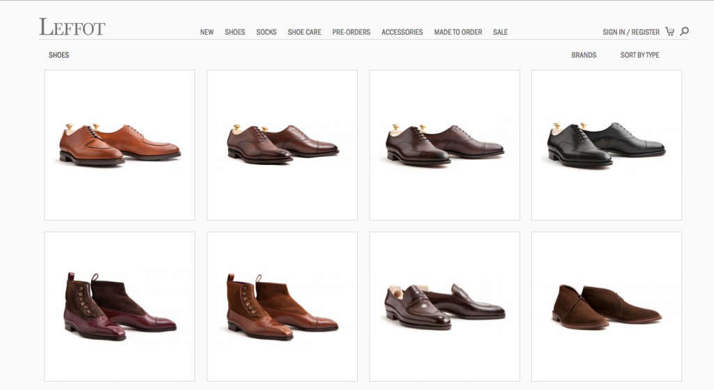
1. Offer Pre-Orders via Custom-Built Feature: Leffot
Platform: Magento
Nuts and Bolts: In their own words, their motto “Nuquam Jactate, means “Never Boast,” which is to say looking good doesn’t have to be ostentatious.” Born out of Manhattan’s West Village in 2008, Leffot offers a handsome and effortless line of shoes and socks.
Why We Swoon: We admit it: we built this site. We swoon because they were a delight to work with, and they make beautiful products. The site incorporates several functions we believe make for seamless online buying: easy shipping estimates, the option to check out as a guest, and the short breadcrumb trail that shows customers the buying steps. But our favorite feature is by far the custom crafted pre-order tool we built for them.
2. Communicate Expectations Early: Rancourt & Co.
Platform: Magento
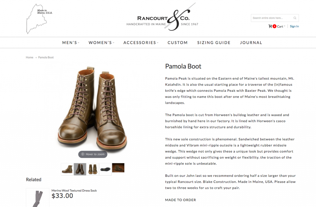
Nuts and Bolts: Rancourt & Co. celebrates fifty years of shoe-making in 2017. Through the years, they have developed dozens of styles of loafers, boots, sneakers, and more. They offer a range of colors, both in leather and suede, as well as lots of options for custom-made shoes.
They have built up a loyal following as well. When we selected a pair of their Pamola Boots for purchase, a notice appeared on the same page that read, “This product is not available but will be made for you in approximately four weeks.” When we advanced the purchase to the shopping cart, we were notified once again of the four week timeline. Rancourt & Co. is doing a great job of communicating expectations.
Why We Swoon: Three cheers for local pride! Ecommerce is used beautifully here to build a strong local business. Online selling isn’t just for the big boxes. As Rancourt & Co. shows, it can help small-to-midsize businesses, with roots in their local communities, reach new customers. Here Rancourt & Co. touts their Maine heritage four times: the state image on the upper left corner, the centered company tagline, the product story, and in the last paragraph of product description.
3. Engage with Clear Navigation: Wolf & Shepherd
Platform: Shopify
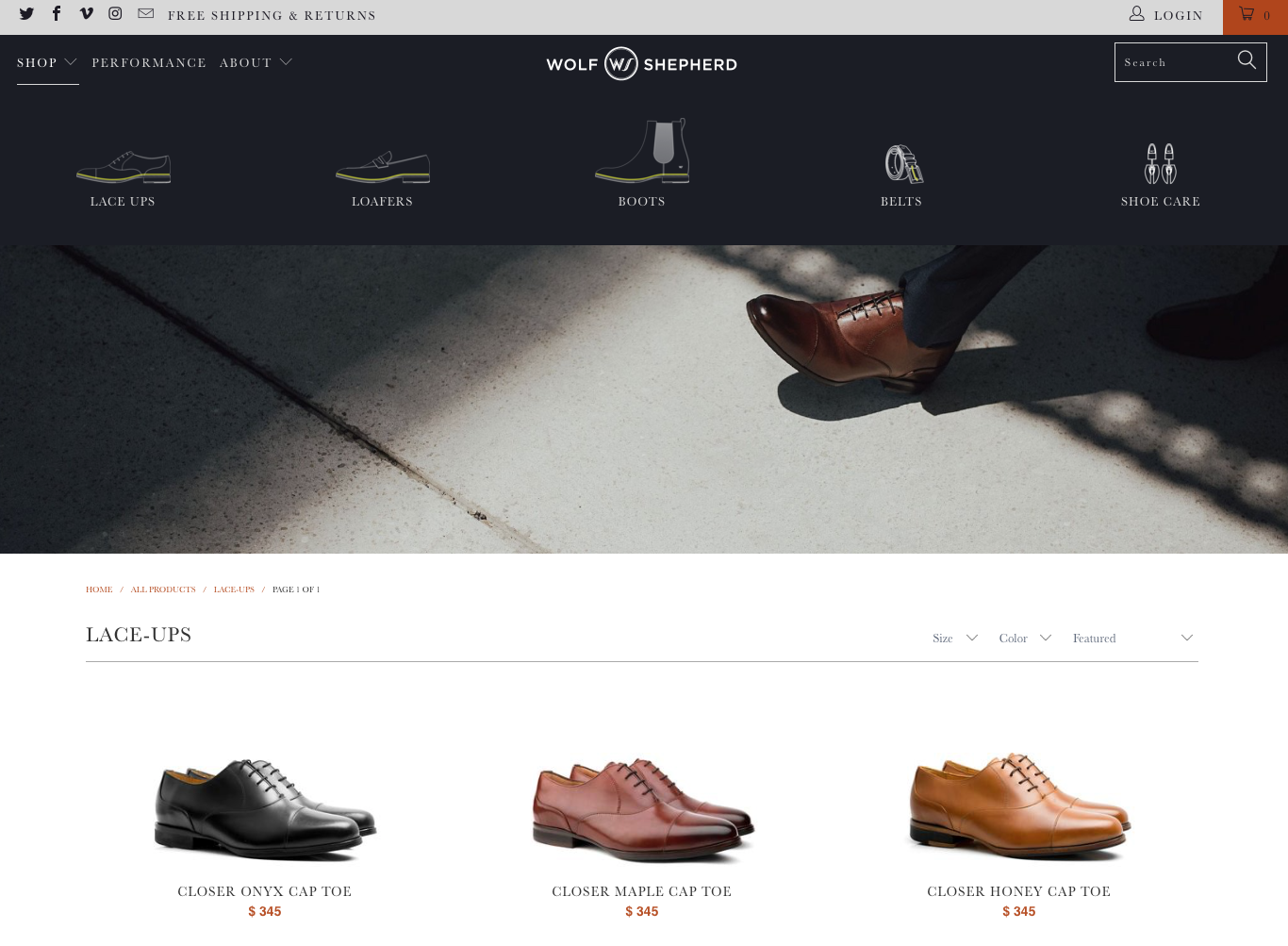
Nuts and Bolts: Designed in America and hand-sewn in Portugal, Wolf & Shepherd combined the “best principles of athletic design and applied them to dress shoes you can wear all day.”
Why We Swoon: We love exploring an elegant ecommerce store. When we click on Shop on the upper left corner, the nav bar expands down and across the top quarter of the page. Through simple line drawings with headings, it shows the available style silhouettes. We can view all their products by scrolling down, or with this feature, we can go directly to the style we have in mind. Wolf & Shepherd gives their customers a graceful shortcut, while still keeping their full inventory easily accessible.
4. Always Keep the Buy Button Accessible: Jack Erwin
Platform: Shopify
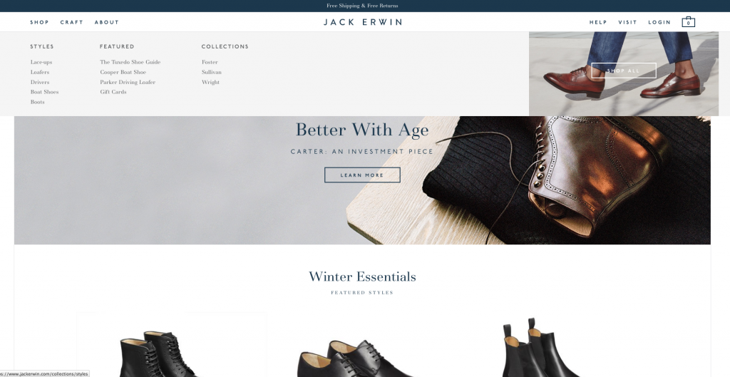
Nuts and Bolts: Jack Erwin was founded by Ariel Nelson and Lane Gerson, who set out to make the shoes that they could not find for themselves: high-quality, stylish, and affordable. Now they sell boots to boat shoes, all designed in New York City and crafted in Spain.
Why We Swoon: This is a beautiful ecommerce site through and through. From the homepage, when we click Shop, a drop down bar appears with all the categories. To the right of the categories, in real estate often left blank, they include a nice lifestyle shot of their shoes on a walk. We see the “Shop All” button aligned well in the photo, too.
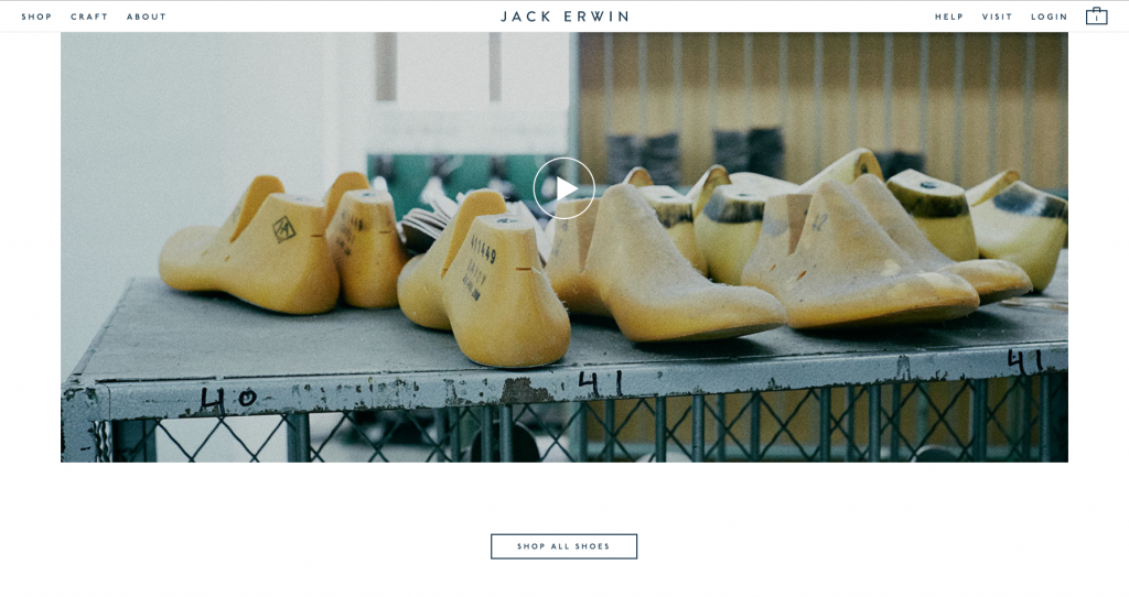
Above, we see them capitalizing on video with their super charming, “Making Our Shoes.” When you click on their Craft page, this video comes up. Through every step of exploring their back story, we always see the button: Shop All Shoes. As soon as the video finishes, this button comes up again. When the video wraps, all we want to know is how do I get a pair of these beauties? And, they never drop the answer. The Shop button is always in view in an elegant and accessible way.
5. Let Customers Shop in Currency of Their Choice: Oliver Sweeney
Platform: Magento
Nuts and Bolts: For the past twenty years, Oliver Sweeney has crafted their shoes in the same family-run factory in the Marche region of Italy, an area with a long legacy of shoe-making. They sell their products in seven stores located throughout the United Kingdom, as well as online. They also offer an option to tattoo your shoes!
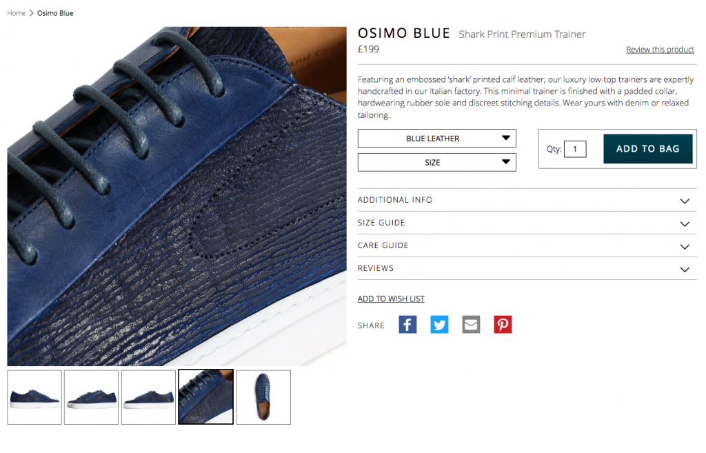
Why We Swoon: First and foremost, on the upper right hand corner of their home page is a drop-down menu to select your currency. There are four options: British Pound or any dollar of the Australian, Canadian, or American varieties. Once you select your currency and begin to view products, the site has a very nice zoom (pictured above). You can bring the shoe right up to the eye to see the details.
Lastly, their checkout process is only two steps. On the first page, fill out your shipping address. They do not charge anything for international shipping – amazing incentive. On the second and final page, review your order and enter payment info. This buying process is so short and efficient, it’s hard to believe that in contrast, our new shoes will travel across the Atlantic.
6. Allow Customers to Make Their Own: Undandy
Platform: Magento
Nuts and Bolts: Working in Portugal, Undandy crafts a collection of mens footwear, as well as custom-made shoes.
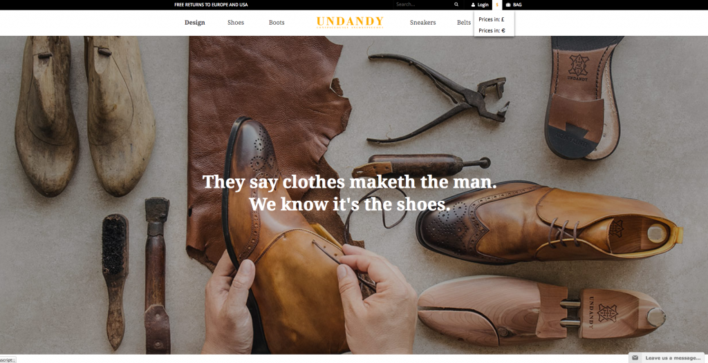
Why We Swoon: On the upper left corner of the homepage, Undandy establishes trust with their customers through a simple phrase: Free returns to Europe and USA. Also, the site intuitively knew we were shopping from the USA, and gave us pricing in USD. It’s easy, however, to switch to pricing in Euros through a two-tier drop down menu on the homepage. AND not only did the site offer prices in USD, it also listed shoe sizes in both UK and USA sizing. This was the first international site we reviewed that did this.
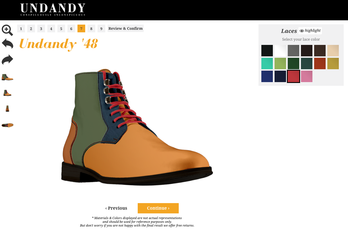 But beyond all of that, their ‘design your own shoe’ configurator is impressive. We’re not going to claim these as the most delightfully designed shoes, but for the sake of really pushing this thing as far as it can go, we was pleasantly surprised by this.
7. Offer Online Support: Awl & Sundry
Platform: We’re not sure, but this site is too cool to leave off the list.
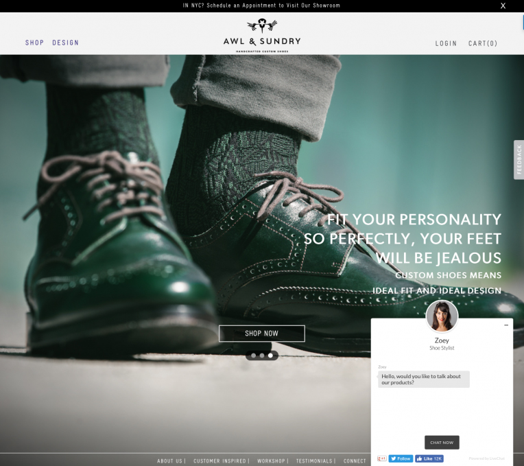
Nuts and Bolts: Awl & Sundry’s mission is to “democratize luxury footwear for the modern man.” They offer customers the opportunity to custom design their own shoes.
Why We Swoon: It’s an adventure to design our own shoes, and Awl & Sundry isn’t going to make us go it alone. Right from the homepage, their chat feature pops up on the bottom right-hand corner. She’s a knowledgeable stylist named Zoey, and she stays with us through the entire design process. She’s available, but not intrusive. This is an excellent example of ecommerce customer service.
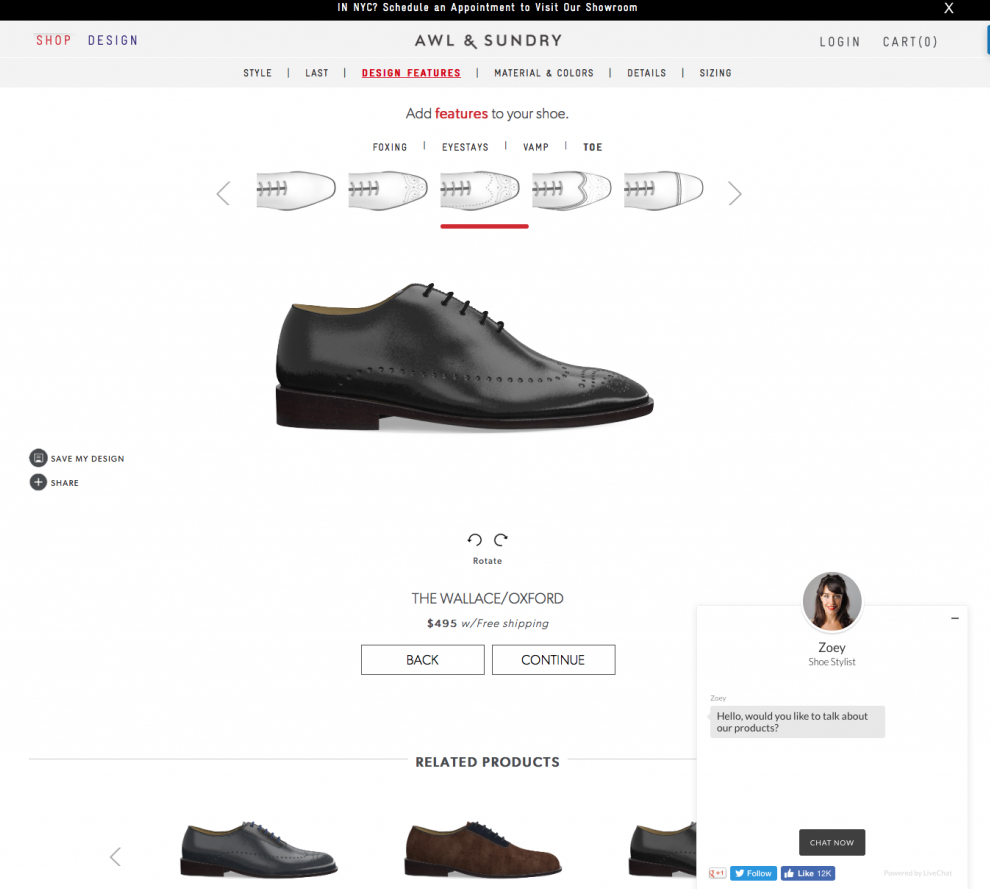
Awl & Sundry also has their own custom shoe configurator. We’ve worked on a few different product configurators here at Command C, so we’re always curious to see how other sites handle these. Their process is clear and clean, breaking the build into several different “slides” the user is taken through as they make their decisions. One thing we might add is some way to show the user where they are at in the process. Like a checkout flow, it’s important to communicate to the user just how far in they are and how much further they have to go.
8. Facilitate Shopping From Around the World: Nisolo
Platform: Shopify
Nuts and Bolts: Nisolo sells beautiful shoes for both men and women, as well as jewelry and accessories. They are based out of Nashville, Tennessee, and committed to ethical sourcing of their leathers and other aspects of good, fair trade.
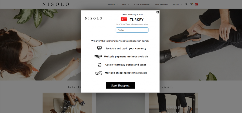
Why We Swoon: When we landed on their home page, we spotted a little American flag in the upper right corner of their site. The site automatically knew we were in the USA. But when we clicked on the American flag, we had the option to update our location to another country. For the sake of experimentation – and our fantasy travel life – we updated the site to say we were shopping from Turkey. We were impressed to get a pop-up window of services the site would provide for us as we shopped from our home on the banks of the Bosphorus River in Istanbul.
On a final note, we chose each of these sites because they approach ecommerce in the right order: product first, supported by a great user experience on the shopping front. We know that you can’t cover up a bad product with a great shopping experience, but a great shopping experience can exponentially sell a great product. Graceful and thoughtful ecommerce process is not expendable; it’s essential.
If your agency or someone you know designed or built any of these sites, please leave a comment and let us know. We’d love to credit you in the post. And of course, please feel free to share other great sites we should have on our radar!
