Product Category Page Inspiration: Search Filters, Variant Display, and More
As an ecommerce director, we’ll bet that you work on your company’s site everyday. That’s a great thing, but often times it’s helpful to take a step back and get the bird’s eye view. Plus one of the exciting aspects of ecommerce is that things are always changing – so there’s always more to learn.
This month, our conversion strategist, Lauren, walks us through three different examples of product category pages from popular furniture sites. In each case, the merchant conveys a lot of information in a little bit of space. Even if you’re not a furniture retailer, we believe this short video will help you and your team think about how to best display inventory of any kind right from the category page.
Transcript: Product Category Pages that Communicate Many Varieties Well
Hi, I’m Lauren. I’m a conversion strategist at Command C. And I’m going to walk you through some popular furniture sites, so you can gain some insight into how they display their product catalog. You’ll see how sites like Home Depot and Wayfair display thousands of products, and also see how up and coming furniture sites like Article showcase much smaller catalogs. You’ll see what information they choose to show per product, what information they don’t choose to show, what filters they offer and much more. So hopefully you’ll stick around and get some ideas for how to display items on your category page. Even if you’re not selling furniture, it’s really insightful to see how other companies display different types of information.
Example #1: Wayfair Excels at Product Filters for Search on Category Pages
Let’s jump into Wayfair. For each of these sites, I’m going to take a look at their sofas. So Wayfair chooses to show quite a bit of information. They are displaying the wishlist icon, the product image, and color swatches. So they show up to five on desktop and then they include if there’s you show up there’s any more product name, manufacturer pricing. If there was a previous pricing, some products offer financing, reviews, number of reviews, free shipping, sponsored product labels. Some of these even offer free samples, which is quite nice. Lots of information is shown here. It can be kind of overwhelming, but this is the important information that a lot of customers really want to see when they’re shopping. I like up here how they do their filters. So they show what they determined have been the most important pieces of information that customers need when searching for sofas.
So material color in the sort and filter, they offer tons of other ways to filter. If you’re really picky and you care about wood tones or armrest style or things like that. They like that they don’t assume all the customers are experts in sofas. They show images for the different types. You can see the difference between sleeper, convertible. You can see what the heck a Chesterfield sofa is, which now I kind of get an idea, but it really helps customers browse and find what they’re looking for on mobile. They do essentially the same layout.
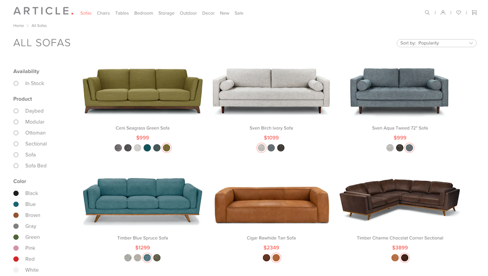
Example #2: Articles’s Smaller Inventory & Consistent Product Photography Creates Cleaner Look
Next I will show you Article which has a very small product catalog compared to Wayfair and their 20,000 products. So with Article, the nice thing about their category page is, if you wanted to look at all the sofas, you could do that, you could spend 20 or 30 minutes and look through all of their products and kind of compare which sofa you wanted. But on Wayfair, you can’t look through all 20,000. Article has a little bit easier where they also manufacture all their own products so they can have consistent product photography. Their catalog category page looks very clean and consistent, very on brand. They show these nice product swatches. You can hover over and see these nice images.
They have a few filters on the side, so in stock color, product type, material, if there’s a sale. Also, they do quite a good job of showing just enough information to entice you to click, but they don’t overwhelm you. It’s good to see that they stay very on brand with the minimal category page.
Example #3: Home Depot Communicates Sofa Category Well (Especially as Customers Don’t Expect It)
For Home Depot, so I choose to show them because their core competency is not in furniture, unlike with Article and Wayfair. How do they choose to show information for sofas? Well, they actually show quite a lot of information, but I think they do a good job of including the important information you need. Maybe not to special buy icon. I think this is not clear what this is to all customers, but hey, maybe they A/B tested it and it did a good job. They show things like delivery and things that are relevant to their physical location.
So if you want to go pick it up in Fort Lauderdale, you can also see if products are out of stock or not sold in stores. So they do quite a good job there. They have a little bit of social proof, which would be interesting for sites to test. If you have enough of this data per product, and they have filters on the side. So they do pretty good job of having some relevant filters like shape, sofa design, print. So they do a good job of going in depth with their filters, which I thought was quite interesting since they’re not known for selling sofas, but they put a lot of effort into offering those.
This has been three examples of category pages, displaying furniture and showing quite a lot of information. But I think each of them does well showing just enough information to get customers, to click without really overwhelming you with too much information. I hope you got an idea of how these different sites, display products on your category page and get some ideas for your insight. Thank you for watching.