3 Add To Cart Examples to Consider in Optimizing Store Checkout
At Command C, our area of expertise is helping retailers maximize onsite conversions. All too often we see companies spend a lot of money driving traffic to their online store – only to have customers fail to convert due to a myriad of site issues.
Once your site is optimized for conversions (which is an ongoing process), you can get the full return on investment from marketing campaigns and other efforts to bring customers to your site.
Site optimization can be subtle, but it has a massive impact. In this latest video from Lauren, a conversion specialist at Command C, she walks through three Add To Cart experiences. As you’ll see, just a slight change to the Add To Cart can encourage more conversions. Take a look.
Transcript
Hi there. I’m Lauren, a conversion specialist at Command C, and I’m going to take you through some Add To Cart options on a few different ecommerce sites. We’re going to see how these sites do their Add To Cart. They’ll do it a little differently, and there are some pros and cons to each different method. It’s important to test what works best for your site and your audience, and I’ll provide you a few different examples that you might want to try on your site. That way, you can give your customers the best possible experience.
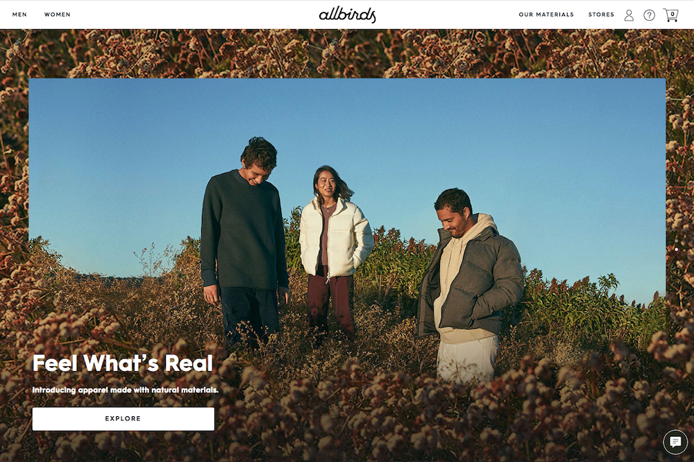
Example #1: Allbirds Offers Seamless Cross-Sell with Add To Cart
First, we’re going to take a look at Allbirds. So over here, I like that they don’t let you click the Add To Cart yet. You have to pick your options first. All right. So now we can Add To Cart, and they use one of these side carts here. You can see we get a lot of information here. We have free shipping. We can see the item that was added. We can include a note if we’re giving them as a gift. Subtotal, shipping, we can go straight to checkout.
And then there’s also these socks that we can easily add. And the cool thing here is that they already put it in the size of the shoe that you got, so that’s really handy. You can even change the color right from in here. No need to leave the side cart. So we can quickly add that. That’s really nice. I really like how they set this cart up here. I think this type of cart is very useful if you have add-on items, if you think people are going to be purchasing more than one item. Instead of sending them straight to the cart, this gives them the option to click out. They can continue shopping or they can go to the checkout, so it’s not too intrusive.
Example #2: Varidesk Cross-Sells But Customers Have to Go to New PDP
And here on Varidesk. They do standing desks and different desk accessories like chairs, stuff like that. So, here if we add a standing desk, let’s add it to the cart. And they do a modal like this, so similar to the side cart. Just a little bit bigger. We can see what was added. We can do an add on, this cable management tray. We could go to cart. We can continue shopping. We can also take a look at these “you may also like” items. What I like here is that you get the opportunity to provide people other products they might be interested in. So someone buying standing desks might also want a chair. They might want this outlet and other different accessories. You’re giving them that chance instead of sending them straight to the cart so they can continue shopping.
But what I don’t like is this cable management tray – I can’t easily add this from here. I’d have to go to that product page. It takes me out of this area here, unlike Allbirds, which had it very seamless, some of these recommendations. So I just bought a standing desk. Not sure how relevant this is really going to be unless maybe I wanted to switch and get a different model. I’m not really sure. The power hub, I think that’s actually useful, so I think that should be just a one-click add to your order.
Example #3: Outdoor Voices Takes Customers Straight to Checkout with One Item Added
And then, finally, we have Outdoor Voices. They are a clothing store. And usually for clothing stores, it’s recommended to have an Add To Cart option that allows people to continue shopping, because typically there will be some people who want to just add one item, but you want to give people the chance to continue shopping and add more items to their cart. And typically for clothing stores, that tends to be the case. You end up buying more than one item, though it’s not always the case.
So here we picked our options. Let’s add to cart. All right. And Outdoor Voices has chosen to take us straight to the cart after adding one item. So if you plan to buy multiple items, let’s say five different items, it takes you out of that shopping experience. It’s a little clunky to have to go to the cart, then you have to go back to the page you were on. This type of Add To Cart setup is usually best for a one and done type of purchase, but they do a good job of making it clear you moved to the cart. They also have some add-on items. You can go to the checkout. Their continue shopping button’s a little bit small, but something definitely to test.
So those are three examples of add to cart options. Hopefully you got some ideas to test out on your site, and you can get an idea of what works for certain audiences. Be sure to test and see what works best for your site. Thanks!