Top 5 Features of an Ecommerce Collection Page
Video: Top 5 Features of an Ecommerce Collection Page
Today we are talking about product listing features. We’ll take a look at optimizations and examples for product listing pages, also known as collection pages. In this video, you’re going to learn about the key features of a collection page, what visitors want to see, and the nuances to A/B test.
When it comes to collection pages, according to Baymard, 46% of stores get them wrong. There are certain elements that should be displayed, things like price, product name, and we’ll get more into that. There’s also the issue of how much information to display, and it really depends on the product type. You could be showing too much information or not enough information. Visitors also have difficulty comparison shopping if the right features aren’t shown on the collection pages. And lastly, you have to consider loading times. If you’re going to be displaying a product slider for each product on the collection page, showing different images, that will likely impact loading time. So you need to consider the trade-offs of doing that.
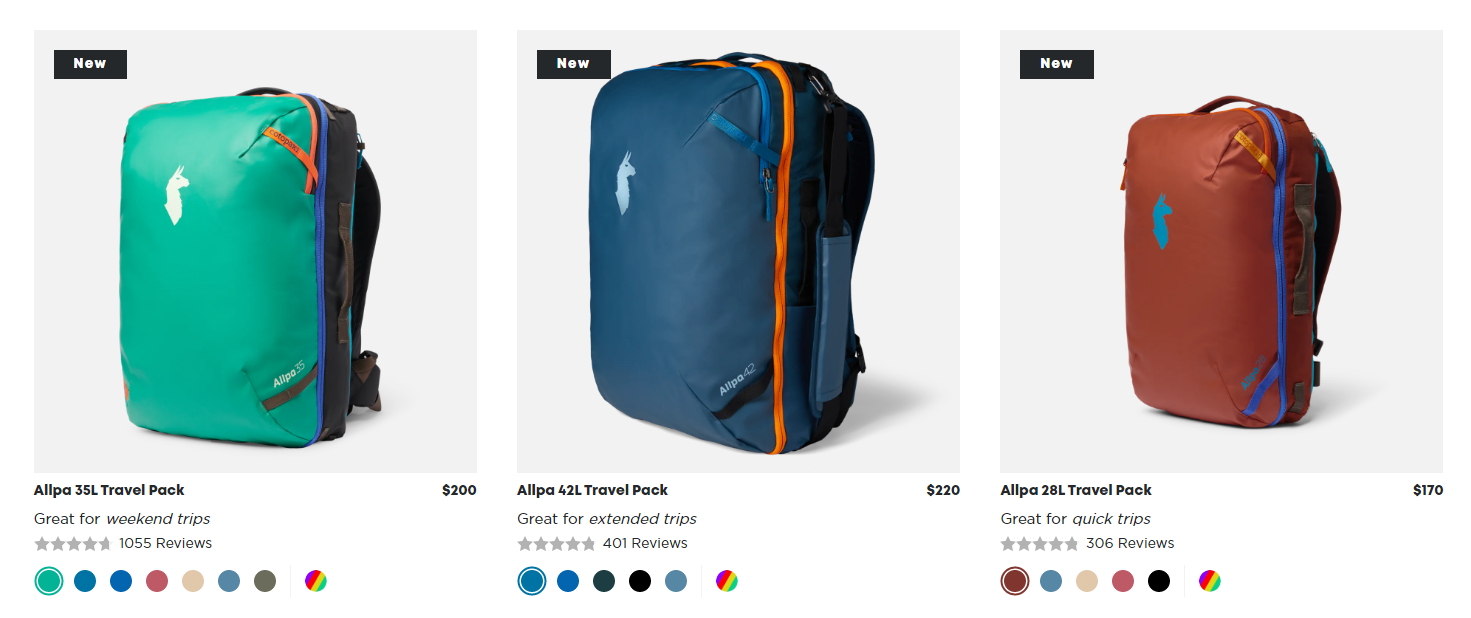
When it comes to the basics, of course, you need to have the product name, but not only a product name, a very clear, descriptive product name. When it comes to backpacks and hiking bags, people are really interested in the sizing. They’re often looking for a very specific liter size. Cotopaxi does this with their product name. You can see that they mention 35 liter travel pack, 42 liter, and 28 liter to help give that differentiation to customers.
You can also consider adding product features for each specific product. Outer shows these as icons for each product. They showcase things like the fact that the product is washable, it has a 10-year warranty, it has an outer shell. These are things that help people find the right product while they’re comparison shopping on the collection page.
A product description can also be very useful to have on the collection page. Here for Outlier, you can see these different pants. And customers might wonder, “Well, what’s the difference between these?” And the product description really helps give clarity to why a particular pair of pants might work better for someone than a different one.
Also, as I mentioned before, more versus less information. For Tom Bihn, they have a really cool feature up at the top where you can toggle on and off whether you want more details or you want a more minimal looking collection page. On the left you can see the minimal version and on the right you see the detailed, which shows stock, it shows product copy, it shows the colorways that are in production. It shows different sizing further down here. This is a really cool way to give visitors that option of whether they want to see more or less information.
When it comes to the number of products to display per row, often that’s something to A/B test. Here for Yardbird, it’s quite cool. They have this feature that lets visitors choose if they want to see two items per row on desktop, or they want to see three items. Having less products per row means a larger image size, more information can be displayed, but it can also mean more scrolling for the user.
When it comes to images, you really want to consider what type of image is best on the collection page. Do you want to show the product on its own? Like here for Article, they show by default the couch here just on its own. But if you hover over on desktop, you can see it in context in a living room. Article is giving both options. And this is also something you can A/B test whether you want to show product packaging, the item on its own, the item in context, and see what your visitors prefer.
And lastly, stock information is very important. You don’t want to give visitors a ton of different options. They go through the collection page. They find something they like, click through, and then find out that the item is out of stock. It’s important to give this information on the collection page. You can also consider adding or testing out things like mentioning low stock or going fast. Out of stock is important for showing on the collection page, just reduces that frustration that visitors will end up having while they’re browsing.
Those are the key features of a product listing page. It’s not necessarily everything. There are tons of different other options. As you can see here, Osprey has a compare button, they have reviews. A lot of these things are definitely things you should be testing. Really depends on the space that you’re in, the products you’re selling, the type of customer you have. There are a ton of things to consider for the collection page. And hopefully you got some ideas from the video and I’ll see you in the next one. Thanks.