How to Communicate Product Variants from the Category Page
Product category pages are crucial to your customers’ momentum in purchasing from your store. The fact that people are on a product category page at all shows they are motivated to buy.
Now it’s up to you to give them the information they need, in a visually appealing way, to entice them to keep going and learn more about the individual products. If your company provides too much information on the product category page, customers may feel overwhelmed and leave. If you share too little, however, they may not realize that your inventory includes what they’re looking for.
In this latest video from Lauren, a conversion strategist at Command C, she walks through examples of product variant display from the category pages of a wide range of retailers. As you build or optimize your product category pages, her feedback here provides useful information – and inspiration.
Transcript: How to Communicate Product Variants from the Category Page
Hi, I’m Lauren. I’m a conversion specialist with Command C, and today we are looking at product variants on category pages. This is really important. As much as we want to focus a lot on product pages and the checkout and the cart, it’s really important, especially for customers new to your site, and that are browsing around, to provide enough information for them on the category pages without overwhelming them. We’re going to take a look at a few stores, give you some ideas of how they’re doing it, and what you might want to do on your store.
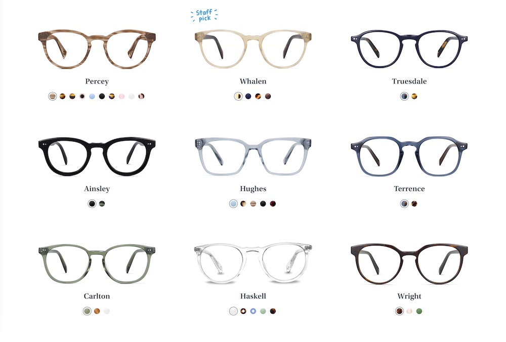
Warby Parker Excels with Strong Visual Overview and Easy to Use Interface
There are a couple of different options for displaying this type of information. For very visual products, especially ones in fashion and furniture, a lot will want to display product swatches. Here on Warby Parker, you can see that we can easily get an overview of all the different frames, as well as how they look in different colors.
The great thing about this is it prevents something called pogo-sticking. What that means is jumping back and forth between the category page and the product page. That can be really frustrating for customers. It causes a lot of friction. And over time, if they keep doing it too much, they might end up abandoning their shopping and come back later. Or they might not come back at all.
On Mobile, Allbirds Chooses Product Swatches Over Thumbnails
Another example of this is with Allbirds. They display their shoe and they also show you that shoe in different color stylings. The way they do that on mobile – which is something else you need to think about – is how to differentiate your product variance between desktop and mobile. Here they show a more minimal view. They show these product swatches rather than the actual shoe thumbnail, since the screen is a lot smaller.
This is important because Allbirds will have this wool runner and they can show the different product variants, whereas a site like Keep Cup shows all of their different product variants as separate products. Rather than have one cup here with all the different color swatches, they’re showing them as individual products. Something to think about, maybe if you have a smaller product line, is whether you want to do this or you to show one main product and the different options available.
Another example we’re going to take a look at is Bang & Olufsen. Here on desktop, you don’t see any product options, but when you hover, you’re able to see them. And on mobile, they choose to show the product swatches by default. So, a different approach to showing product variants.
The Optimal Approach Often Depends on Product Catalog Size
And then, we get to some furniture stores. Furniture can often have multiple variants to display. Here on Brosa, they choose to show that in text forms, three options available. When you hover on mobile, they show the color options here.
On a site like 2Modern, they don’t show any swatches. They just mention that there are more colors or more options available. Something to think about, if you have products with a lot of different variants, how many do you want to show, which are the most important, and do you want to show them as texts or the actual swatches?
Bugaboo Strollers Organizes Product Variants Based on Custom Icons
And then, we get to see it like Bugaboo. They sell strollers, and here on their category page, it’s quite interesting because they’re using these icons to differentiate the strollers they have here, but they don’t give any context about these icons. Okay, if I click, I can see some extra information, but that also introduces some friction for the customer having to click through each one of these, remember what the icon means, and then differentiate between them. And then, when you actually go to the product page for each stroller, you see there are other color options as well. It’s interesting that they chose to show these, these options here rather than color or a different variant.
Burrow Only Shows Main Product on the Category Page; Customers Click Through for Variants
And then, lastly, we have Burrow. They are specializing in furniture, and you can see here that they’re showing color swatches for the fabric, even though they also offer the ability to choose different wood types, to change the table out here, they’re choosing to just show this main product variant, changing the color. That’s something else to think about. Do you want to show just one product variant or multiple, and how do you want to display those?
A couple of different options among these different ecommerce stores that you can test out on your site. I hope you got some ideas out of this video. Thanks.