How to Structure a Product Configurator That Helps Boost Conversions
When product configurators are done right, they can benefit both customers and retailers. Customers like configurators because they get to personalize products to their preference. Merchants like them because they learn a lot about what people want. Further, when people build their own products, they get motivated to buy what they created. Read: product configurators can boost conversions.
But not all configurators are created equal. Some give too few options, while others offer too many choices. In order to get the full benefits of adding a product configurator to your company’s online store, it’s critical to strike the balance. Take a look.
Transcript: Optimizing Online Product Configurators
Hi there, I’m Lauren, a conversion specialist here at Command C. Today we are diving into product configurators. So these are really cool. They are the way to walk a customer through building a product, putting it together, customizing it.
They’re really important for conversions, for increasing average order value. You really want to focus on optimizing this process. By doing that, you’re going to get a lot less customer service requests. You’re not going to overwhelm customers with way too many steps or too much information that they don’t really need to be concerned with. You’re going to reduce friction. And you are going to know how to put important information into different steps of the configurator, so customers don’t get confused and leave the process.
You want to stick around because we’re going to walk through two stores and how they are doing a good job of guiding customers through the product customization process. You’ll see some things that you can test on your store. And then we’re also going to take a look at one store that has too many steps in the process – it is pretty overwhelming. We’re going to talk about some things they could do to improve the process.
Example #1: Levolor Reveals Information Step-by-Step with Strong Visuals
All right. Let’s take a look at the first site, so that’s Levolor. They are the one of the leaders in blinds. So blinds don’t seem like they should be that complicated. But I really didn’t know all of the things that go into designing a good blind, all of the different considerations. Levolor does a great job of using tool tips to put information into context to explain interesting facts for customers. So instead of putting all this information right upfront, they put it here behind these tool tips so only customers that really want to know this information can see it. It’s not going to be super overwhelming.
And their product configurator does a really good job of helping customers visualize. So I can even change the wall color, change the trim to match what I have in my house. I can see really what these blinds are going to look like in my home and really feel a lot less doubt about buying these blinds. They do a great job showing all the materials, showing different mounting sizes, position. There’s tool tips for every single one of these. There wasn’t really a point in this process where I felt like I needed to ask a question, or leave, or call customer support, though I do think they should have some sort of live chat here. Maybe they want to test that so customers can easily just chat with someone while they’re still in the product configurator that way they don’t have to leave the process.
Helpful Tip: Levolor Also Flags Errors in the Configurator Process
So they even have things like this warning here that they have to put in place. They do a good job of showing errors. Yeah, see here, so I can’t pick motorized, if I pick the top down bottom up, so very clear, I know what I need to fix. All right, and I can save it to my cart. The only thing that I noticed that I think they could do a good job of improving is showing which of these options, how much they cost, because now I see that my price is $556. And when I started it was in the hundreds. So I think that’s something they could check, but overall, a really good experience.
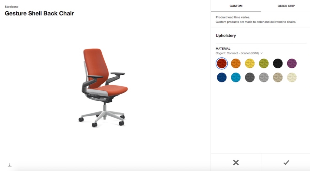
Example #2: Steelcase Offers Streamlined Configurator
Then we go here to Steelcase and their gesture chair. This is a much simpler product configurator, but still I think they do a really good job of laying out all the steps here. It doesn’t look like a whole lot. It doesn’t feel overwhelming. They show price differences. If I pick the stool, it adds an extra $150. Very quick, very easy process and really simple for a customer to go through.
Example #3: Fully Could Simplify Steps for an Easier Process
And then lastly, we have Fully and their standing desk. I’ve seen the standing desk around, it’s really popular. And their product configurator here, I felt like has way too many steps. If you look at this and maybe aren’t reading the different steps here, it looks like it’s going to take a long time to get through.
I feel like they could test maybe making some of these less prominent here or even remove some of these options. Because it feels like maybe they’re trained to increase average order value, but it could be hurting conversions, if visitors see all of these steps and then leave before actually completing the process.
But I do think they’re doing a good job of providing tool tips for each of these. They do update the image if you click different options here and they also show price differentials as well. And they do a good job of showing you what options are available and which aren’t. So if I click this dark bamboo, I can’t pick contour and I can’t pick these different sizes here.
All right, so those were three examples of product configurators, and hopefully you got some ideas of what to test on your product configurator and what you might want to do to improve. Thanks.