New Virgin America Website Takes Flight
Virgin America just took a huge, bold step in the world of web design. Their new site offers a brand new approach to online booking with full responsivity: the site works seamlessly across desktop, tablet and mobile devices.
Online shoppers are looking for simple, straight-forward experiences. Long gone are the days of fine print in footers and pages upon pages of checkout steps. Multitasking as they fumble to cash out is a huge barrier to entry. Virgin America has both realized and responded to this with their new design: they have just upgraded you to first class, so sit back, relax and enjoy their fresh new ride.
Let’s take a quick glance at Virgin America’s new homepage:
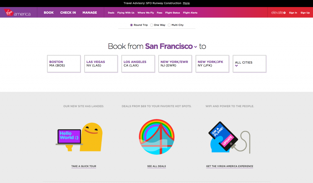
It’s balanced, simple and puts the customer’s needs front and center. Virgin has completely done away with the clunky homepage that is littered with the task of specifying travel dates or finding the best deals. So what are we greeted with when we click the beckoning button labeled “Get Booking”? The same beautiful layout that keeps the finely tuned process simple.
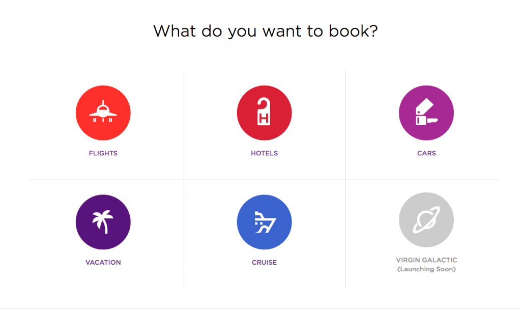
While shopping for a flight or a cruise on a desktop, the website appears to operate just as a mobile app would — with large beautiful buttons, clean font, and spare-me-the-details call-to-actions. This is a trend we’re seeing more and more – be on the look out for the Mac’s new operating system, Yosemite, designed to look much more like an iOS device or app.
Rather than moving the shopper from webpage to webpage, the entire process is step by step, all within a singular interface. The shopper makes one single decision at a time and upon each one, taken to the next step. Content and action is delivered in bite sized chunks.
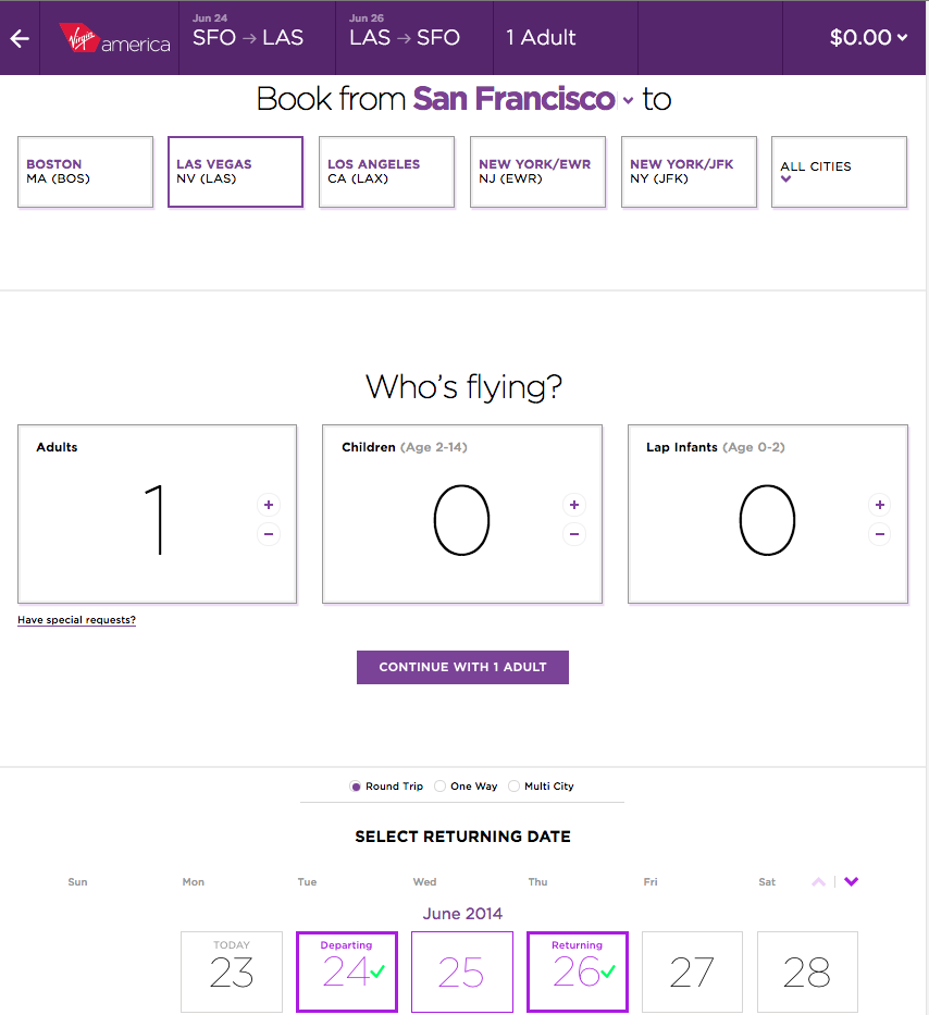
The sticky nav (meaning the nav remains fixed to the top of the screen as the user scrolls down) offers a consistent recap of the choices made thus far. And, easy ways to go back and edit those choices with one click.
In adjusting the size of my browser, the website has responded appropriately. This is extremely important with the prevalence of the mobile user (more on mobile). Not only did the page change for the size of window it is being viewed on, but it provided a new layout with the same, clean information. If I need to adjust any of that information, I easily scroll up and change it rather than hitting the “back” arrow and growing impatient (as with some other sites).
These are just a couple of the highlights in the redesign of the Virgin America Airlines website. The large strides that were made in this revamp are exemplary of great eCommerce, brilliant branding and attention to visitor behavior.
Visit this site to learn more about the Virgin America site redesign.