8 Features to Test to Get More Onsite Email Sign Ups
Ecommerce teams know the challenge: how do you get people to engage with your emails – especially when they haven’t bought from your store yet? Marketing teams spend a lot of time and money directing traffic to an online store. Once people get there, how do you hook them in for the long term?
This where pop-ups and email opt-in forms come in. Merchants tend to think that site visitors get annoyed by pop-ups. But that’s often not the case.
Sure, a poorly-timed pop-up without any useful offer is not going to get very far. But a well-designed pop-up with an enticing offer shown at the right time can have strong engagement rates. Visitors will be happy to sign up.
The key to getting more site visitors to sign up for emails begins with testing – and lots of it. To demonstrate this, we’re going to share examples of compelling pop-up ideas you can test and optimize for your site now.
8 Features to Test to Get More Onsite Email Sign Ups
1) Test Email Pop-Up Timing
You know the feeling: you’re on a site, you’ve barely looked for two seconds, and a pop-up instantly flashes. It’s annoying, not well timed, and something you just want to get out of your way.
This is not the experience retailers want customers to have. Timing in pop-ups is something that is not a given – it needs be tested.
Timing can include how long someone has been on the page, the number of pages visited, scroll depth, and intention of leaving.
Start by testing with an exit intent or a pop-up that does not take over the whole screen. This way you’re less likely to interrupt the user while they’re in the middle of something.
Poor timing is one of the top reasons why customers don’t engage with email sign ups. If you show a pop-up too soon, or if it interrupts their experience, they’re going to click away lightning fast. So it’s extremely important to get timing right.
2) Test Email Pop-Up Offers Based on Customer Behavior
Consider where the buyer is at on the site before giving them an incentive. Someone who is on your homepage for the first time and has seen the store for 10 seconds is not likely to hand their email over.
But, someone who is in the cart and decides to leave to think over their purchase is someone who is more ready to buy – and more receptive to the right offer.
Tools like JustUno can help you granularly target different users. Consider these questions about how to segment your visitors:
- Product type: Are they on a product page where you could offer a free accessory with purchase?
- Page type: Are they in the checkout, close to purchasing, or further away, on the home or category page?
- User type: Are they new or returning? Return visitors need less context. New visitors will require more information.
- Prior Pop Ups: Have they gotten other pop ups and dismissed them? Perhaps they need a stronger offer.
- Location: Can you geo-target specific offers or visuals? (ex. Free beach towel in Florida vs. free gloves in Minnesota)
- Purchase Behavior: Have they added a specific item to their cart? Provide them with an incentive around that product.
- Cart Total: Is their cart total twice your AOV? Provide them with an appropriate offer, especially if they are about to leave the cart or checkout, so you don’t lose a high value customer.
Depending on the tool you use, you can get extremely targeted with your email sign-up forms.
Now, that doesn’t mean you HAVE to have any specific tools. But be sure to consider who’s coming to your site and what type of specific messaging and offers this type of person wants to see. The more relevant the offer, the more likely someone is to sign up.
3) Test Different Offers for Engagement
Arguably the most crucial way to boost email conversions is through the offer. You could probably get 50% of people to sign up if you offered 70% off coupons, but that also wouldn’t be very profitable.
Convert found that 42 of 50 retailers in their study give an offer in their pop-ups and have email sign up rates almost double those with no offer.
There’s no “best” offer. It’s something that needs to be tested. Even the way an offer is framed can make an impact. In Convert’s pop up study, they found that framing an offer as “Win $2000 Worth of Watches” converted at 13.4%, while “Win 20 Free Watches” converted at 6.7%.
Perhaps your visitors are more enticed by a “free gift” with purchase versus getting free shipping.
You also don’t need to be married to one offer. A general pop-up could offer 10% off, while an exit-intent in the cart offers something more enticing in order to get a visitor who’s close to purchase.
If your company is unable to give discounts due to margins, test copy that lets visitors know they can eventually get something of value by signing up.
4) Test the Email Sign Up Copy (and the Psychology Behind It)

Speaking of copy, it’s important to quickly convey the offer and why people should sign up now.
A pop-up typically consists of a headline, short sentence, and call to action. Just 3 elements, but the wording can make all the difference.
The Bark Box pop up above highlights the offer “Double First Box For Free!”. Then they add “with a multi-month subscription” to qualify it. Rather than saying “Get 2 boxes for the price of 1”, they went for framing their offer as something you get “free.”
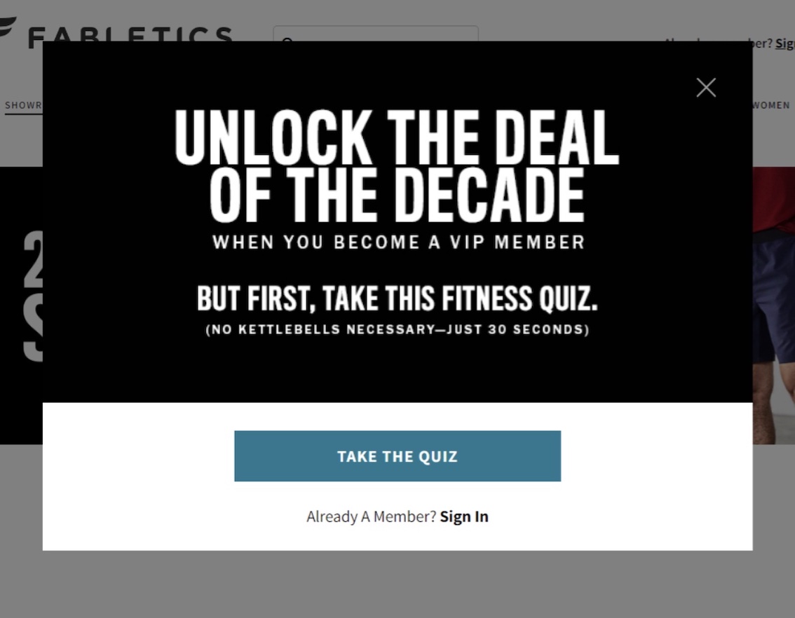 This quiz pop-up from Fabletics uses a headline that evokes curiosity: Unlock the Deal of the Decade. If you’re really curious as to what this “deal” is, you’ll take the quiz to get it.
There’s a psychological aspect behind copy, too. For instance, consider introducing a sense of urgency. Test mentioning how long the offer lasts on the pop-up or even on the post-engagement page. For example, “Use this coupon within 48 hours.” This can help increase the number of visitors who take action after signing up. Test this urgency messaging to see if this leads to more revenue.
Also commitment bias can get people to keep going with an action. To test for this, try an “Accept Offer” button that, when clicked, displays the field to enter an email address. Clicking the button is easy to do, and once someone takes that action they will likely enter their email. Whereas if they just see the email field, they might not choose to sign up due to the friction involved.
5) Test Eye-Popping Visuals
Visuals are not absolutely necessary for pop-ups, but they’re an element that should be tested. A visual can help illustrate an offer, provide an emotional response, or just catch someone’s eye.
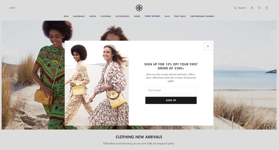
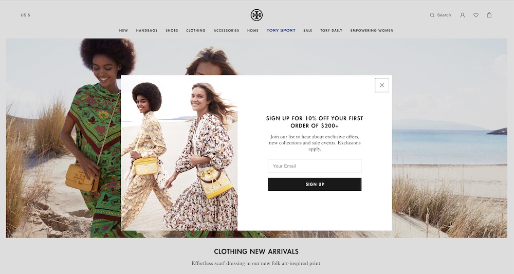
This pop-up from Tory Burch focuses more on the visual than the copy. The visual is what catches your eye, then you stop to read the offer.
The added bonus with visuals is that they can make a pop-up feel more on-brand. A plain rectangle with text can feel out of place on a beautiful site. But when you include a striking lifestyle image, the pop-up often works more seamlessly into the overall site.
6) Test Retrieving Customer Info from Minimal Number of Fields
Retailers want to know everything about their customers and potential customers. But you have to weigh the urge for information against asking for too much.
In a pop-up, ideally you ask only for a user’s email address and/or phone number, depending on how you want to communicate. This leads to the least amount of friction when signing up.
There are exceptions though, such as for apparel stores.
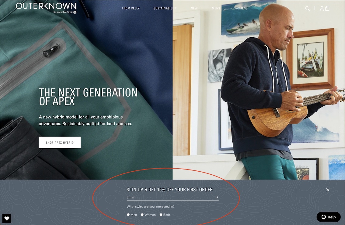
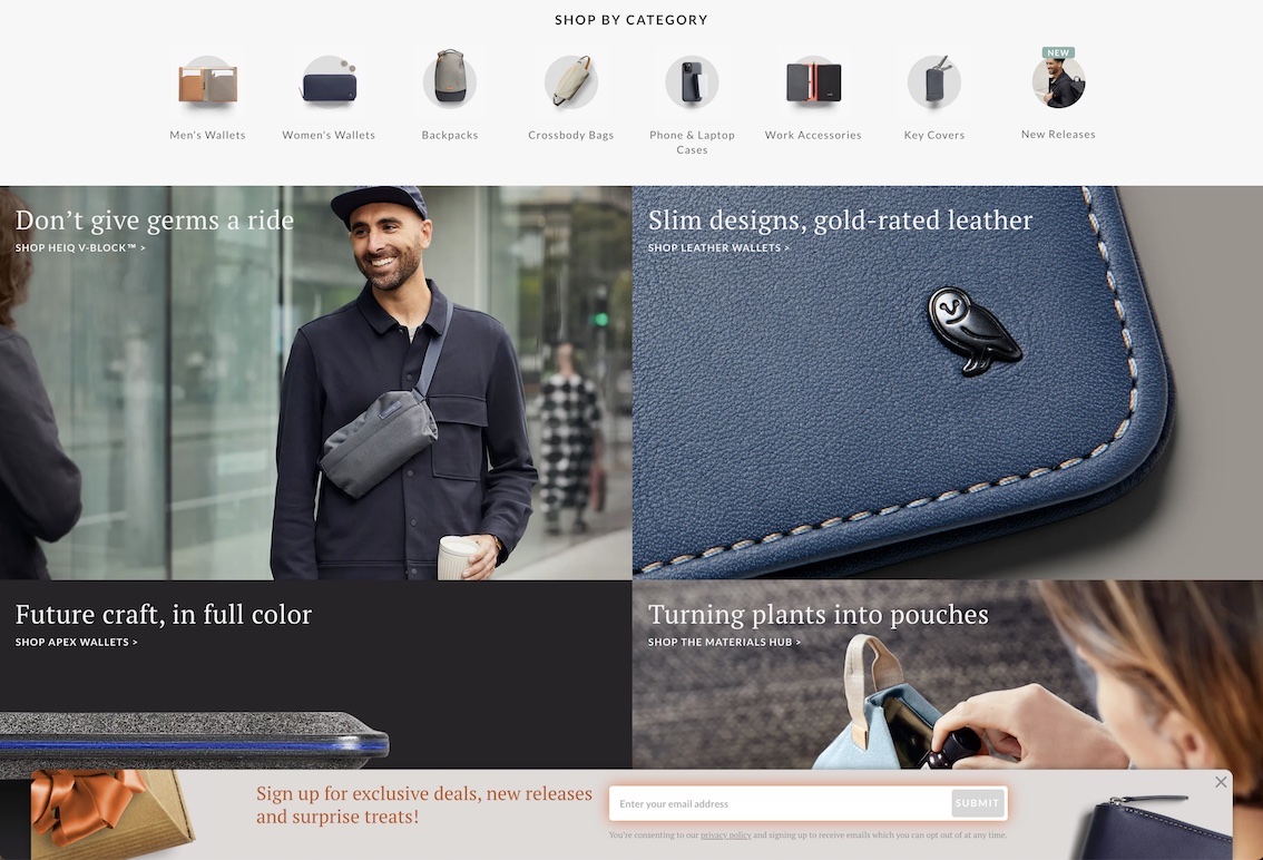
Outerknown sells apparel to men and women and it’s useful for them to know which style of clothing interests people. With this info, they can share more relevant content. This is a piece of information a customer also likely doesn’t mind giving, as they want to get relevant content.
At most, you should be asking for an email and one other piece of information, but only if that information is extremely useful for tailoring content.
Sleeknote analyzed 1 million popup views and found that “pop-ups with five input fields have the lowest conversion rate (0.81%).” Then “pop-ups with two input fields (3.31%) convert better than pop-ups with three input fields (1.08%) by a whopping 206.48%.” (One input field converted at 3.2%)
That’s a huge difference! It means that you could be losing email subscribers by asking for too much from them. The friction involved with filling out five fields is just too high for many visitors in return for a discount or other reward.
If you plan to ask for extra information, test that against asking for less, to ensure it is not hurting email sign up conversions.
Then – insider secret – if you find that the extra field is hampering conversions, try asking for extra information on the post-engagement page after someone has signed up.
7) Test Different Areas for Email Opt-Ins

The place most users expect to find an email opt-in is in the footer. It’s best to have one there by default for visitors who don’t see the pop up or just know they want to get more information from your site.
Opt-ins can be tested on the home page, category pages, specific landing pages, and they should definitely be featured if you have blog pages.
The next time you run a sale, test an email opt-in in a site-wide banner. Show a text link to sign up and then display the email field once that is clicked.
The checkout, especially for Shopify, lets visitors quickly click a checkbox to indicate they want to sign up for more emails. This can be checked by default, but it should be tested.
Visitors can be annoyed if they have to uncheck the box, feeling like they’re being forced to join the email list. Requiring visitors to indicate if they want to sign up for emails can also improve the quality of your list, since these are visitors who are telling you they want to hear from you.
Make sure all of your out-of-stock items have email sign ups. This is a quick and easy way to not only get email subscribers, but also to generate revenue later on once the item comes back. It’s surprising how many stores don’t do this! You should be emailing visitors to confirm they signed up, and test offering an initial coupon upon sign up.
8) Now Do All of the Above for Mobile
It’s important to know that Google has started penalizing “intrusive pop-ups” on mobile. This rule includes:
- Showing a pop-up that covers the main content, either immediately after the user navigates to a page from the search results, or while they are looking through the page.
- Displaying a standalone interstitial that the user has to dismiss before accessing the main content.
- Using a layout where the above-the-fold portion of the page appears similar to a standalone interstitial, but the original content has been inlined underneath the fold. (Google)
Aside from appeasing Google, you don’t want to annoy your mobile visitors. (Mobile customers are often the majority of site visitors.) A pop-up on mobile can seem more intrusive due to the lack of screen space and inability to click out as quickly as on desktop.
Therefore it’s critical to make mobile pop-ups easy to leave. Make buttons and fields nice and large, so precise clicks are not necessary. If you require a checkbox or radio button in your pop-up, make sure it’s large and can be tapped easily.
These are small details, but they help reduce the friction involved with signing up.
Now you know how to balance what your visitors want (relevant offers) with what you want (more email subscribers and more customers). The goal with email sign-ups is to test, test, test. We’ve provided you with some tips and A/B testing ideas to start improving. Think through your audience, the types of offers they should get at each stage of their journey, and how you can create messaging to entice them to convert.